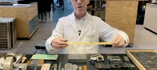
Our friends at the Hamilton Woodtype Museum asked me to show the audience of their annual Wayzgoose event how we work at p98a. As this year’s event could only happen offline, it was renamed the Awayzgoose and I had to make a video instead of going to Wisconsin. Here it is.
Printing a digital newspaper
Krautreporter is a news service, run by journalists in Berlin. More than 16,000 subscribers pay a minimum of 5 Euros a month to get daily updates on the news and well-researched long-reads. Just like newspapers used to do.
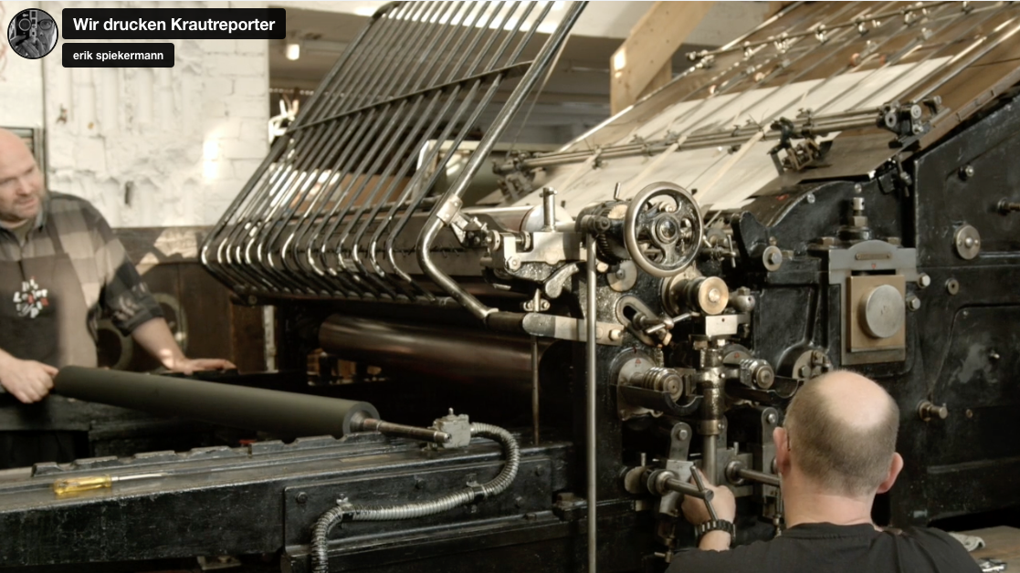
Printing a digital newspaper on a large Johannisberger press: video on Vimeo.
Once we had finished restoring our Johannisberger stop-cylinder press from 1924, we were looking for projects to test the machine. When I suggested to the friends at Krautreporter that perhaps we could print one special issue, they immediately went for that crazy idea.
We had already built our laser-setter and were able to make metal-backed plates up to 52 by 72 cm (approx 20×28in) directly from data, without going through photographic negatives. These plates fit our Heidelberg Cylinder press where we can print 8-up, i.e. 8 book-size pages on one plate. For the newspaper, however, we wanted to print the classic Nordic format, 44×57cm. In Germany we still have a few daily papers which are printed that size, the FAZ – Frankfurter Allgemeine Zeitung – being the most prestigious one.
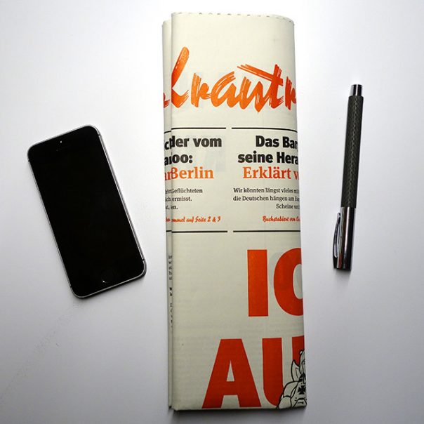
Making four aluminium bases to get the thin plates to the height of metal type (23.56mm = 0.928in) was an adventure in itself. All the other things we didn’t know about this large press took us five months to figure out, but eventually we started to print. We had enough paper (60gsm newsprint) to print 6000 copies, 8 pages, all on one sheet, back and front, 88×114cm plus some trim. One side black only, the other black and red. 18,000 prints altogether, at a speed of not much more than 300 an hour, with 2 people at the press at all times. We ended up with almost 5000 good copies. The sheet was perforated in half inside the press but not separated. We wanted the readers to get the full effect – the exact opposite of a smartphone screen. For the mailing we folded the large sheet into a narrow strip with a label around it.
The movie shows our own Daniel Klotz at the press. His buddy Sebastian came to help whenever he could. Daniel spent more than half a year figuring out how to make everything work. Now we know why printers used to go through a three-year apprenticeship. That press wasn’t made to print from polymer plates, and it still holds a few secrets. But we have our proof of concept, a full-size newspaper. It is so popular with Krautreporter subscribers that we may have to print more issues.
***
All our stuff is now on the Hacking Gutenberg website
We keep making all sorts of things – posters, magazines, notebooks, house numbers – and we finally have a proper backend which works out sales tax (or not) and shipping cost and provides you with a proper invoice that you can print out and show to your accountant (or not). The shop is here.
And even if you don’t need house numbers or posters (but who doesn’t?), you can find other information; about the typefaces we hold at the workshop, some of the presses we have and what else goes on there at Potsdamer Straße 98a in Berlin. We make display type, publish our own magazine, PAPER, and even roast our own coffee, inevitably named Letterpresso.
Back to Basics – why the old is new
Graphic designers have been bending over backwards for years, pulling all the stops in order to turn a message into communication. We’ve spent hours finding the right typeface, fussed with tiny increments in size, introduced refinements in OpenType fonts containing hundreds of ligatures, alternate characters and content-sensitive positions.
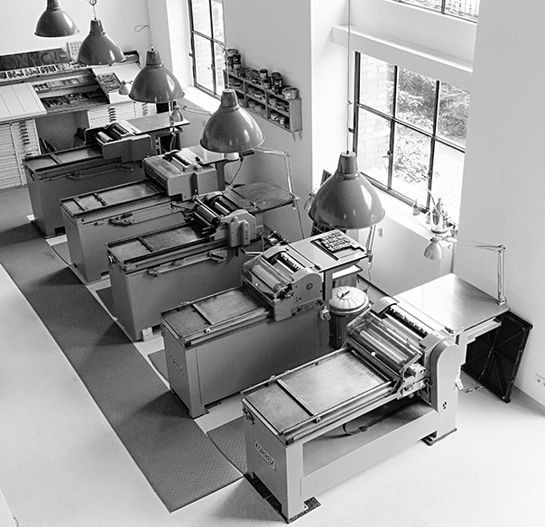
The workshop at Potsdamer Strasse 98a in Berlin
And now “letterpress” is back. Suddenly we’re happy to take a lowercase l and use it for a figure 1 because that particular typeface doesn’t have enough figures? WTF? Wood type sucks when it comes to kerning because you would have to cut away bits of the letter itself in order to achieve “perfect” spacing. There are no half sizes, let alone fine increments in letterspacing, unless you want to spend hours inserting slivers of brass or thin paper to refine a line of type. The material defines not only how you work but also what the result will look like. If you only have a large wood type font in one size, you run out of certain characters very quickly. So you’ll pick a smaller size which will have more of each character or you’ll choose another typeface altogether. If that doesn’t help, you’ll change the message.
The typographic system of letters and spaces – horizontal and vertical ones – has been refined since Gutenberg first invented printing with movable type almost 600 years ago. The whole system is one giant grid systems that can be divided and multiplied in myriad ways. Pages will always look good as long as you work within the constraints, time being one of them. If you spend too much time tweaking the system, things will look mannered and inappropriate. Modesty is a virtue when working with well-defined but finite elements and tools.
You need to know what quads are, spaces, reglet, furniture. You learn to use a composing stick, chases, cases, hacksaws, pincers, awls, spanners, screwdrivers and heavy lifting equipment. You’ll be working with dirty rags and virgin white paper, inks, grease, machine oil and petroleum. And you’ll find out that the work isn’t done until all those materials are back in their proper places and that cleaning up can take almost as long as setting up without being any fun. Everything you touch is either very heavy or very delicate. Or both.
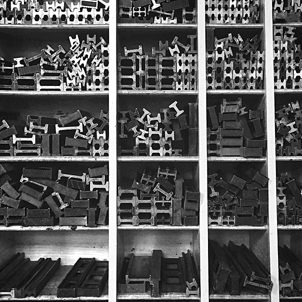 Furniture and reglet, the “invisible” parts of the page
You’ll never have the right size type, never enough characters and you’ll always run out of the right size paper just a few sheets from the final print. At the weekend. Mistakes will manifest themselves in loss of materials and too much time spent in the shop. But there is nothing like setting up a forme (yes, with a silent e at the end) from bits of lead, steel, aluminium, brass and wood – a very messy sight, as these materials have all been around and aged differently – and then running a clean white sheet of paper through the press and over that colourful forme. Suddenly and quite magically, there is a message: words on paper, exactly where you wanted them.
You know what it took to compose the words into the forme, with all those bits of metal in between. (No return key here and no tabs either; the white space isn’t.) The dear reader doesn’t know, nor needs to. But she senses that this message is the result of a physical process, made with things that have been touched by many hands. The process communicates itself. It doesn’t get in the way of the message, it enhances it.
Photos: Norman Posselt
Cheap is no good
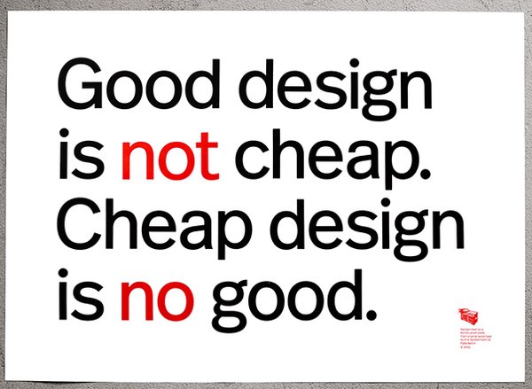 No idea where this line comes from; I’ve heard it often, not necessarily with “Design” as the keyword. After 50 years in the business, I can guarantee that it is entirely true.
We set the words from our brand new Real wood type (based on FF Real), 20cicero tall, cut for us by Tudor Petrescu in Romania. Tudor is busy right now, cutting a smaller size of 12 cicero in Real Regular as well as in Real Demi.
As always, the poster is printed on MetaPaper Rough Warm White 160 gsm in Black and Pantone Warm Red ink. From original wood and metal type on our Korrex Frankfurt, 50×70 cm.
The 50 posters each are numbered and signed by Erik Spiekermann. We ship everywhere and you can pay by PayPal. Price is the same in these currencies: £, $, €; always 98, including tax (where applicable) and shipping, wrapped in a solid cardboard tube. Please go to spiekerstuff to order. You can also check out the other prints there as well as the metal housenumbers I designed a few years ago. Some of them are still available from spiekerstuff.
Ui/Ux et al
A few days ago I replied to an article on Medium about User Interface design. A lot of the issues brought up sounded familiar, so I dared add a few remarks to put things into perspective.
> Again and again I am pleasantly surprised that, as an older designer (69 now and computer literate since the late 70s) I find that what is considered a specialty discipline (UI, UX and whatever the flavour of the month) keeps finding the same constraints and thus solutions as us old print designers. When I design a magazine or a book or a newspaper, I need to consider the substrate (resolution, grain, coarseness…), the audience (viewer, reader, user, the client!), the content (long, short, informative, vital, not-so-urgent, entertaining), the audience’s situation (sitting down, in meetings, traveling, at a table, in a hurry, at work, under water), the audience’s motivation (interested, bored, dependent, adverse, reluctant) and, of course, the technology that generates the marks (not always pixels), how many colours it can display and how the pages are marked (offset, inkjet, flexo, silkscreen, letterpress, laser).
Now that resolution on screens often matches that on paper and typographic features can pretty much all be emulated across browsers, we get down to the real issue: taking the information apart and reassembling it for the specific purpose. I always start with the smallest element and work up from it. In a book that may be the footnotes, in a timetable that would be the numbers, in a magazine the main text. If those elements work, the other ones are scaled up from them. The baseline for the footnotes is the common denominator and all other text follows multiples of it. As you go up in sizes for subheads or headlines, certain sizes are eliminated for certain formats. A tabloid newspaper will have smaller headlines than a full size Nordic spread. If you count the hierarchies, the biggest element will be H1 and you may have to get down to H5 or more for complex publications.
You do the same for screens. So what’s new? The present generation of UI/UX designers may think that they invented a new way of designing, but we’ve had these issues forever. Trying to fit a lot of text onto the how-to page inside a pharmaceutical package is probably more difficult than doing the same on a screen. There’s no zoom on that paper, so it has to be really well done just for that one version and circumstance.
My method? Think. Consider. Sketch. Think again. And look around you. It’s all been done before, albeit with different code. My code was having to convince clients with rough sketches, pencil lines emulating small text. If you can do that, everything else is easy. You can call it Mobile First or Small Screen Rules or Whatever Makes Us Feel Important. Ultimately what we do is take messages apart and rearrange them. We are the interpreters and our purpose is to serve our clients and their customers, the users. We can only do that if we understand all the constraints as well as the content. I couldn’t design a book I haven’t read nor a website in a language I don’t understand. <
EDC
Another buzzword: Everyday Carry. I didn’t know it until the people from everydaycarry.com asked me to show the contents of my pockets, or rather the stuff that I carry with me all the time.
Letterpress workshop at P98a
One of the joys of running a letterpress studio is to share the experience with others. At galerie p98a we regularly set up workshop sessions for a group of individuals or an entire team. We’ve had design teams here for a team-building exercise, for a day of reprieve from sitting in front of their screens or simply for the fun of getting their hands dirty.
You’ll find a list of planned workshops here. That page links to Eventbrite, from where you can reserve a workshop and find out about the financials.

Old press runs again
Our friends at Lettertypen in Berlin have quite a few old presses, all of them operational. The biggest one of them is Johannisberger Schnellpresse from 1924. It prints sheets up to A0 format, 88×126cm (i. e. 35″×50″), with manual feed but automatic delivery. See here for a list of other equipment our combined workshops have.
After a long search, he recently found a few missing parts and last week Daniel ran the first sheets through the press. Watch it here:
Stuff from Spiekermann
Our workshop at Galerie P98a in Berlin has been producing posters for a while now, plus other stuff. In our cellar, we also keep some of my older products, like the metal house numbers I designed for Design Within Reach in San Francisco a few years ago. We now have a shopping cart installed that makes buying posters or house numbers or all the other stuff painless – apart from having to pay for them, of course.
You can also book workshops here.