Ever since I led the team that designed a new passenger information system for Berlin in 1990, I’ve become a total public transportation nerd. I seek and find information about transportation information systems and their application everywhere. At the time, we were lucky enough to be presented with a historic opportunity: the two halves of the city had been divided for 30 years with two distinct transportation systems. We had to start from scratch, and as the work had to be done while passengers were using the existing services, we had to learn by doing. There were a few things we found out very quickly: the new information system had to look distinct from either of the two existing systems to avoid confusion. People had to trust the new maps, diagrams, schedules, and vehicles. A common denominator was needed. Buses, trams, underground trains and ferries all had different liveries which stemmed from a time when they had been run by separate companies. In the East, the provider was called BVB, in the West it was BVG (don’t even ask)! The tram people didn’t talk to the bus people while the underground people considered themselves to be the best and most up-to-date service. There were beige buses, orange trams, lemon-yellow trains in the East and dark-yellow ones in the West. The answer was: yellow. Vehicles were to be yellow, bus- and tram stops featured yellow posts, the letters BVG were featured in a yellow square (that became a heart shape during the pandemic).
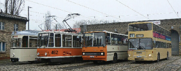
Buses and trams in East Berlin, before the redesign of the city’s transit system
–
The underground used the U in a blue rectangle as their symbol, while the other services spelled out their names: BUS and TRAM. They each got their symbol in different colors and easily distinguished shapes on signs that are dominated by a horizontal yellow stripe.
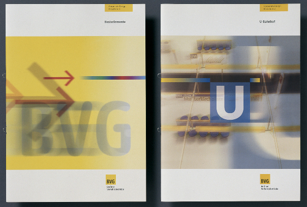
BVG design manuals: the company logo and the product logos
–
It took a few years before the majority of vehicles had been repainted or ordered in the new livery. Today the BVG is yellow. The logo features rounded lettershapes in a yellow square. Berliners know that you can trust any large yellow vehicle to get them to their destinations. The blue, red, purple and green symbols point to the individual services within the system but are always subservient to the big yellow square. When they want to go somewhere, people simply say that they take the BVG – it’s the trusted friend for getting around the place. The BVG logo has become the most known and best liked symbol for Berlin, way ahead of all the attempts to design a graphic identity for the city.
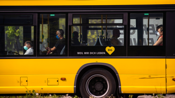
Berlin buses, trams and trains color the city yellow
–
Wherever I’ve traveled since the early 90s, I’ve taken a close look at how public transit works in cities around the world. Our diagram for Berlin’s trains was very much influenced by the iconic London Tube Map, which has become the model for most other such diagrams. When the bus and train services in London were brought together under one roof in the early 2000s, it was a no-brainer to use the famous roundel as the symbol for the whole system. Without the word Underground on it, the roundel can appear in the colours of the tube lines as well as in a neutral grey, black or white on bus stops or on printed literature. While bus services are run by several private companies, their logos are limited to appear over the driver door only, so not to confuse passengers about who actually runs the system. The London Transport roundel has become the graphic shorthand for London, beyond its application for public transit.
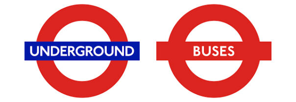
When you see the roundel, you know that you’re in London
–
Other cities I frequently visit, like NYC or San Francisco, are far behind when it comes to public transit. They don’t even have a common fare structure, let alone coordinated passenger information for their MTA, PATH, BART or MUNI services. That is a shame, but also a chance to learn from other cities in order to attract passengers and increase ridership. The budgets will be there!
New York City and San Francisco Bay Area transit logos look like competitors rather than integrated systems
–
One thing we did learn was that insufficient information is a bigger obstacle to people leaving their cars for public transit than the price of a ticket.
I was very happy when colleagues recently pointed out to me that at least one large North-American area had got its act together and emulated what makes Berlin and London so successful. I’m not familiar with politics in Greater Toronto, but I believe that like London, they have several municipal transit companies running buses, streetcars and trains across the region. Of course, as other cities have found out, passengers don’t really care about the business side of it – they just want to recognise and trust one service. So I was very impressed to see that the regional authority, Metrolinx, has taken on the task of producing a single identity and standard for public transit information.
Using a big T in a circle is an obvious and thus brilliant solution as a symbol for this one coordinated service. T for Transit, T for Together, T for Toronto! The strong letter in a circle looks like a sheltered stop itself. It has immediate authority and visitors will presume that it’s been there forever. The T is visible from far away and easily reproduced in all sizes for all media. I don’t know how many operators and city officials providers had to be brought together to agree on this simple and effective device, and experience. Experience tells me that discussions weren’t easy. I am sure egos may have been hurt and compromises were necessarily made, but the end result has made the effort worthwhile. Not only will it help the region’s residents get more from an expanding network but visitors, who tend to gravitate to Toronto, will experience a city intent on Every visitor will immediately identify Toronto’s transit system above or underground, while Toronto natives can be proud of their city for making good passenger information a priority and public transit more accessible.
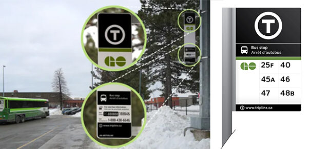
The T is a great symbol for the region’s transit systems
–
Metrolinx and the region’s operators will be paid back in loyalty and higher ridership once people have understood that it has become much simpler to use public transit across the city and the region. I wouldn’t be surprised if Greater Toronto was followed as a shining example by other cities in North America.
In Berlin, the larger organization; BVG, become the umbrella identity because that had the most brand equity with the most people. Alignment happened quicker because most were not dealing with a new brand, identity or way finding.
In Toronto the organization with the strongest brand identity is the TTC not Metrolinx. Metrolinx however has more political power and decided to implement their new way finding system as they try to integrate regional service (where they came from) with the big city service (TTC). It’s kinda like Slough deciding that the London transit system needs triangles because Slough processes all the invoices.
Users of public transit do not care much about the company behind the services, let alone when it concerns regional or local administrations and political issues. They just want to trust a service to get them through the city or region. A simple design device like the T will make it simpler for passengers to identify the service and rely on it. And if the Slough triangle were the symbol for all transport in the London region, then people would accept it. (Luckily, Slough doesn’t want to interfere with TfL, so the roundel remains the trusted service symbol)
As someone not familiar with the Toronto transit system, I’m not sure I would understand at first-glance that the circle-T symbol is a logo, and not a letter representing an aspect of the system (such as representing a specific ‘line’ of bus or train, or perhaps standing in for the word “train” itself if viewed in a rail context).
While ornamentation for its own sake can of course be bad, it can also help distinguish that what you’re looking at is a logo and should not be interpreted an informative symbol.
whether you call it logo or symbol is irrelevant. If the T gets repeated everywhere people can get onto a vehicle run by the regional transit authorities, it’ll be what they’ll be looking out for. In Berlin it’s enough these days to be a yellow vehicle and people will trust it to get them to their destination.
That’s repetition for you. If London buses weren’t red, nobody would trust them.
I always like to read how well thought through your design work has been, and continues to be. I take a lot from the level of simplistic thinking that returns deep solutions.
I really liked the phrase you used: “One thing we did learn was that insufficient information is a bigger obstacle to people leaving their cars for public transit than the price of a ticket.”
The barriers to entry are rarely thought about by companies. I see a lot of them assuming that people will understand, and they do not give enough well structured and easily digested information. Likewise, some organisations try to tell you everything all at once. I feel that these transit systems are utilising such simple and accessible communication methods, that as you say “…operators will be paid back in loyalty and higher ridership once people have understood that it has become much simpler to use…”
Thank you
Boston’s Massachusetts Bay Transportation Authority (MBTA) has used a T in a circle for as long as I can remember. The system is widely referred to as “the T”. https://www.mbta.com/guides/boston-visitor-guide
(Design trivia from that link: “The MBTA subway line colors weren’t random choices! The Green Line travels through Boston’s Emerald Necklace park system; The Red Line travels to Harvard University, where the school color is crimson; the Blue Line travels along and under the ocean; and the Orange Line travels along Washington Street, formerly named Orange Street.”)
Yes! Wouldn’t it be great if the T could be the symbol for all transit across the States? In Europe, most cities use an M for Metro, even if it’s not an underground train. In German-speaking countries, the U denotes U-Bahn which can also be understood as Underground. In Berlin, bus-stops are labeled BUS – works for everybody everywhere.
In D.C. everything is the Metro or M — bus and underground.
But there is also the Circulator downtown which is a free bus line for moving around the Mall (and some other places), and there are several smaller lines run in the suburbs under different names and liveries. Local people get used to them, but doubt tourists understand it.
I’m sure someone more familiar with our system could speak more knowledgeably about it, but as an outsider the fact that the transit system covers 2 states, the district, and includes 7 or more counties has a lot to do with how it is set up.
planning and designing these systems always involves a lot of politics. Every stakeholder wants to protect his/her part of it, quite understandably. In the end, however, common sense usually prevails: we’re doing this for the passengers and – even more so – the potential passengers. And they do not care whose money was spent, it’s always the taxpayers’. If you design it well, they’ll come and use it and will have their taxes back in cleaner air, emptier roads, less stress, more time, better cities
Yes