Schon immer haben Grafik-Designer keine handwerklichen Mühen gescheut, eine Botschaft in Kommunikation zu wandeln. Wir haben Stunden auf der Suche nach der passenden Schrift verbracht, uns in winzigen Schritten der richtigen Größe genähert und dann versucht, in riesigen OpenType Fonts die vielen hundert alternativen Zeichen, Ligaturen und inhaltsbezogenen Formen zu finden und einzusetzen.

Die Druckwerkstatt p98a in der Potsdamer Straße 98a (!) in Berlin
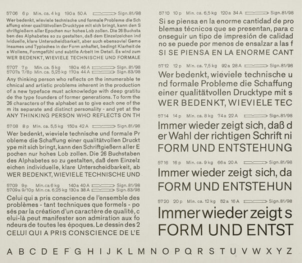
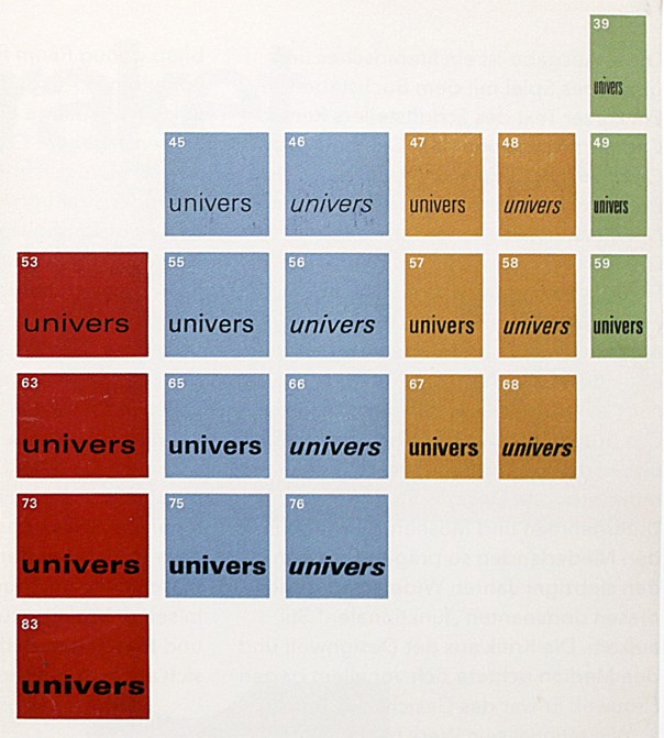
Und nun ist der Buchdruck wieder da, natürlich eingedeutscht als »Letterpress«. Plötzlich haben wir kein Problem damit, ein kleines l anstatt einer 1 einzusetzen, weil die gewählte Schrift nicht genügend Ziffern hat. Was geht ab? Holzschriften sind eine Katastrophe, wenn man bestimmte Zeichenpaare unterschneiden will, weil man wirklich Teile der Buchstaben mit der Säge wegschneiden muss, unwiderruflich, nur um einigermaßen guten Ausgleich zu haben. Es gibt keine halben Größen und den Buchstabenabstand kann man auch nicht fein justieren, es sei denn, man verbringt viel Zeit damit, feine Messing- oder Papierschnipsel auf eine Zeile zu verteilen, bis sie einigermaßen gleichmäßig erscheint. Das Material bestimmt nicht nur wesentlich die Arbeitsweise, sondern auch das Ergebnis. Wenn man eine bestimmte Plakatschrift nur in einer Größe hat, gehen einem schnell einzelne Zeichen aus. Also nimmt man eine kleinere Schriftgröße, weil es in der mehr von jedem Zeichen gibt. Oder man nimmt gleich eine ganz andere Schrift. Wenn das auch nicht hilft, muss man eben den Text ändern.
Das typografische System von horizontalen und vertikalen Bausteinen – Buchstaben, Zeichen, Zwischenräume – ist immer mehr verfeinert worden, seit Gutenberg das Drucken von beweglichen Lettern vor fast 600 Jahren erfunden hat. Es ist ein gigantisches Rastersystem, das unendlich oft dividiert, multipliziert und addiert werden kann. Gesetzte Seiten sehen eigentlich immer gut aus, wenn man sich an die technischen Beschränkungen hält, also »systemimmanent« arbeitet. Die Zeit ist einer dieser Parameter. Wenn man zuviel Zeit damit verbringt, das mechanische, aber feinfühlige System zu überlisten, wird das Ergebnis bemüht und unangemessen aussehen. Bescheidenheit ist eine Tugend, wenn man mit gut durchdachten, aber endlichen Elementen und Werkzeugen arbeitet.
Das Material
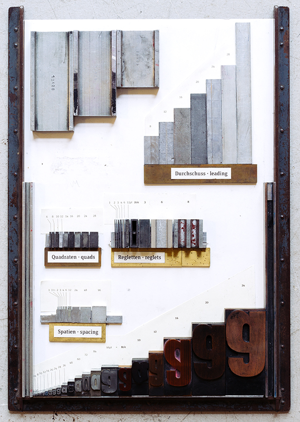
Man sollte wissen, was Quadraten sind, Regletten, Stege, Ausschluss. Mit dem Winkelhaken muss man umgehen können und mit Ahle und Pinzette. Schließrahmen, Schließzeuge, Satzschiffe, Zeilensägen sind genauso erforderlich wie Schraubenschlüssel, Schraubendreher, Hammer und hin und wieder ein Hubwagen, der zwei Tonnen bewegen kann. Es gibt Schmutzlappen und blütenreines Papier, Druckfarben, Walzenwaschmittel, Petroleum, Öl und Maschinenfett. Man wird herausfinden, dass die Arbeit erst beendigt ist, wenn hinterher alle diese Dinge wieder an ihrem richtigen Platz sind und dass Aufräumen fast genauso lange dauert wie die eigentliche Arbeit, aber viel weniger Spaß macht. Alles, was man anfasst, ist entweder sehr schwer oder sehr empfindlich. Oder beides.
Man findet nie die genau richtige Schriftgröße, hat nie genug Buchstaben und das Papier geht immer aus, wenn man gerade die letzten paar Bogen drucken will. Am Wochenende. Fehler werden bestraft durch Verlust an Material und damit, dass man zu viel Zeit in der Werkstatt zubringt. Aber dafür gibt es nichts Schöneres, als eine Form einzurichten aus Blei, Aluminium, Messing, Eisen und Holz, die sehr unordentlich aussieht, weil diese Materialien oft sehr lange in Gebrauch waren und unterschiedlich gealtert sind. Aber dann nimmt man ein jüngferliches Blatt Papier in die schmutzigen Hände und lässt es durch die Presse über diese bunte Form laufen. Plötzlich und ganz wundersam erscheint eine Botschaft: Worte auf Papier, genau da, wo du sie haben wolltest.
Du alleine weisst, welche Arbeit es war, diese Botschaft aufzubauen und welches Material dazu gehört, vor allem das zwischen den Buchstaben und Zeilen. Hier gibt es keine Löschtaste, keine Tabulatoren: der Weißraum ist keiner. Die Leserin weiß das alles nicht und muss es auch nicht wissen. Aber sie spürt, dass diese Botschaft das Ergebnis ist von körperlicher Arbeit, aus Gegenständen gebaut, die viele Hände angefasst haben. Der Prozess teilt sich im Ergebnis mit. Er steht der Botschaft nicht im Wege, sondern er edelt sie.
Fotos: Norman Posselt