A little skyscraper in the centre of Berlin, right by the Außenministerium/Foreign Office is for sale.
More information: info@niederwall32.com
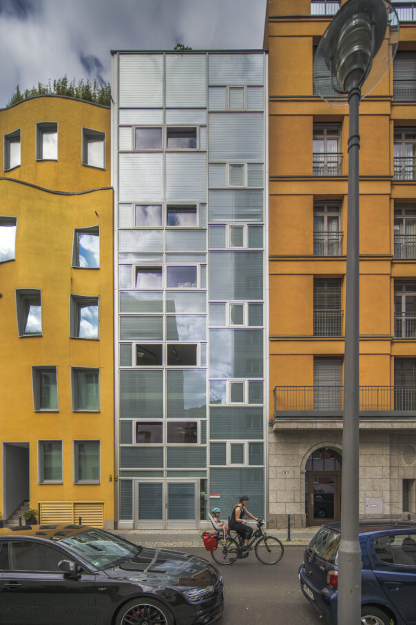
A little skyscraper in the centre of Berlin, right by the Außenministerium/Foreign Office is for sale.
More information: info@niederwall32.com
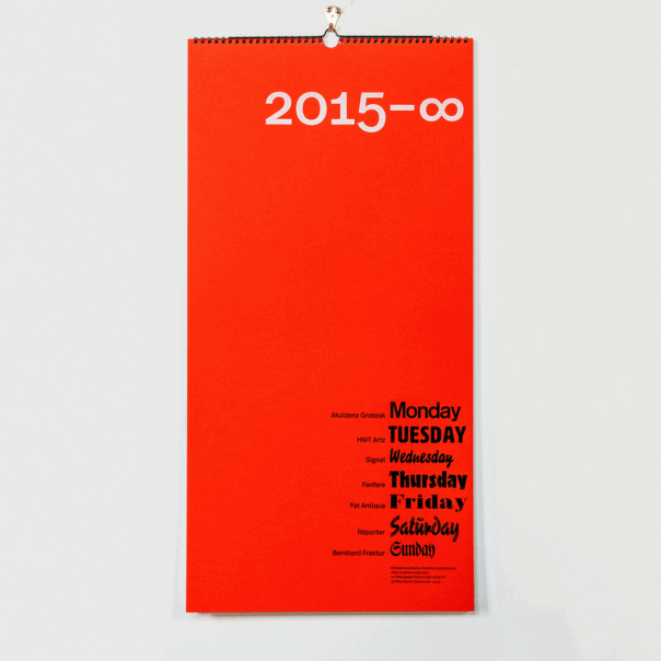
Our calendar will last forever, literally:
Each day of the week has its own page and its own typeface. All printed by hand on a Korrex proof press at Galerie P98a in Berlin by Dylan Spiekermann, Erik Spiekermann and Ferdinand Ulrich. Jan Gassel organized production and had the calendar backed with a heavy grey card and spiral bound by Ralf Fischer in Berlin. The calendar is 35×70cm, printed on 160gsm MetaPaper Rough in three colours, including white on the red cover.
Just like the animated gif below, the calendar will run forever. Or at least until we run out of Monday, Tuesday, Wednesday, Thursday, Friday, Saturday and Sunday. For those of you unable to live with English words on the wall, we can provide translations.
There were exactly 75 prints, all signed and numbered, but by now we’re down to the last few. They need to go for $/€/£ 20, including shipping, tax etc, regardless where you are. Order it here.
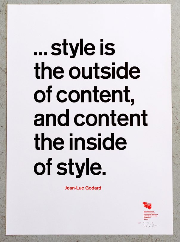 This quote by Jean-Luc Godard has always intrigued me. The discussion about style versus content is as old as the profession of graphic design, and he puts it into perspective.
This is a longish quote which uses quite a few characters (eight lower case /e and five /o – all we have in that size), so we couldn’t resort to our larger Akzidenz Grotesk, but had to go to 12 cicero instead. In the end that turned out to be a wise move as the copy wouldn’t have fitted the page at the 16 cicero (i. e. pica or lines in English) size that we normally use for short quotes.
As always, the poster is printed on MetaPaper Rough Warm White 160 gsm in Black and Pantone Warm Red ink. From original wood and metal type on our Korrex Frankfurt, 50×70 cm.
The 50 posters each are numbered and signed by Erik Spiekermann. We ship everywhere and you can pay by PayPal or credit card. This poster as well as a few others is on sale now for half price. Please go to p98a to order.
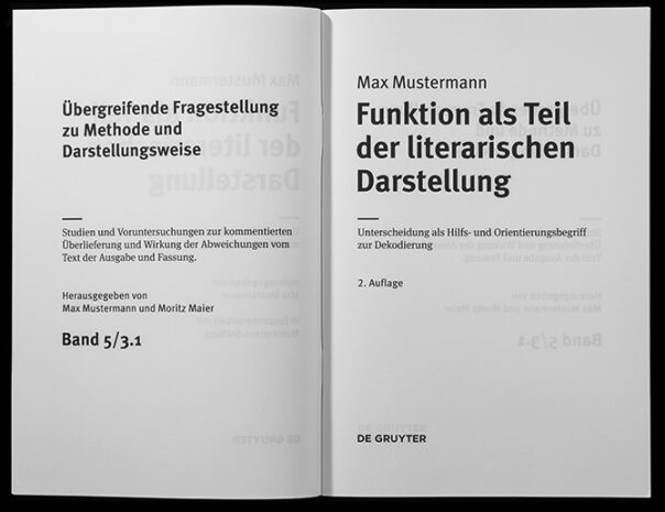
Going through this blog at the end of 2023 reminded me of the work we did for De Gruyter, a publisher of science books in Berlin, in 2011. After we (at Edenspiekermann) had finished designing layout templates for the science books, Ralph du Carrois and I designed a family of typefaces for these books which would need mathematical and chemical symbols, letters for extinct languages (!) and many more very specific applications. They are extensions of FF MetaSans and FF MetaSerif, each with four weights, and each one of those with approx. 2500 glyphs.
As always, our friend and typographic expert, Andreas Eigendorf, did all the quality control on the fonts and produced this “spitter”: a document with all the characters in it. I made it into a movie, which is the least painful way to see them all.
True typomaniacs will notice that quite a few characters hadn’t had their overlaps removed at the time.
A few weeks ago I got carried away and wrote a spontaneous reply to a LinkedIn post about the new Johnson&Johnson logo.
Normally, I don’t really care very much about the shape of one logo or another, but that particular project reminded me of the decades I spent designing brands, the fights I had had with clients and colleagues about why we did what we did and why it mattered that we found out what our clients really needed, not simply executed what they told us to do. I suppose I am too old for this fight now, but now and again something awakens my old rebellious spirit.
Of course I don’t know the full story, all the obstacles that are a reality when working for clients. But some of them are only excuses, and we need to remind ourselves that we don’t get hired to agree but to think different, even and especially when that is difficult.
So here is my rant on LinkedIn that started quite a wave of reactions:
***
I’m so fed up with marketing people running projects without acknowledging that we designers might have an idea or two about what communicates and what doesn’t. They’ve been told by tech guys and lazy designers that things have to be simplified to work on screens. This is knowledge from the 90s and not true anymore. Risk and guts have been replaced by bullshit “narratives” invented by people who’ve never taken a risk in their lives. This is the blandification of our world, where fun has to be taken out of the equation because it cannot be quantified. No consumer cares about a company’s internal reorganization, they want to like a brand. When all brands are beige, the beigest one will not win but will be forgotten. The enshittification* of our world is run by people who read spreadsheets in bed and look at their smartphones to tell the weather instead of sticking their heads out of the window.
Sometimes I’m glad I’m old and don’t have to take orders from gutless employed managers anymore. My best clients were those I could argue with. It wasn’t about winning or being right, it was about doing the best work.
Thank you Audi, Deutsche Bahn, BVG, Bosch, Ottobock, The Economist …
***

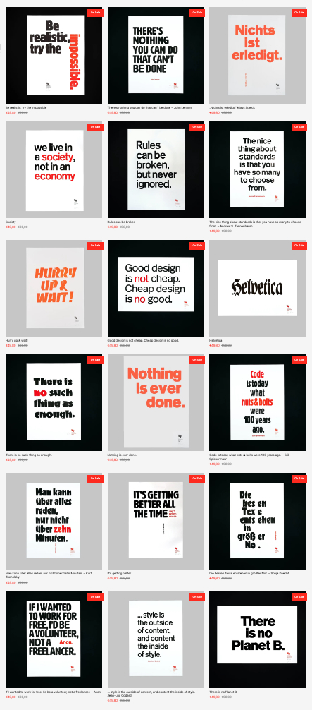
Some of our posters are out of print and we had to reprint them, sometimes several times, albeit each time in a different style, lest we break the promise of a limited run for each of them. Check here which ones are available, out of print or on sale. As we take photos of the printed pieces on the workshop floor at different times, with different cameras and even different photographers, they come out quite, well: different. But they’re all printed on the same MetaPaper Rough Warm White 160 gsm in Black, Pantone Warm Red ink or our favorite color, PMS Daylo red or orange. From original wood type on our Korrex Berlin Special, 50×70 cm.
The 50 posters each are numbered and signed by Erik Spiekermann. We ship everywhere and you can pay by PayPal. Price is the same in these currencies: £, $, €; always 98, including tax (where applicable) and shipping, wrapped in a solid cardboard tube. Orders with shipping address please to our shop.
Here’s a screenshot of the posters on sale right now (end of 2023):
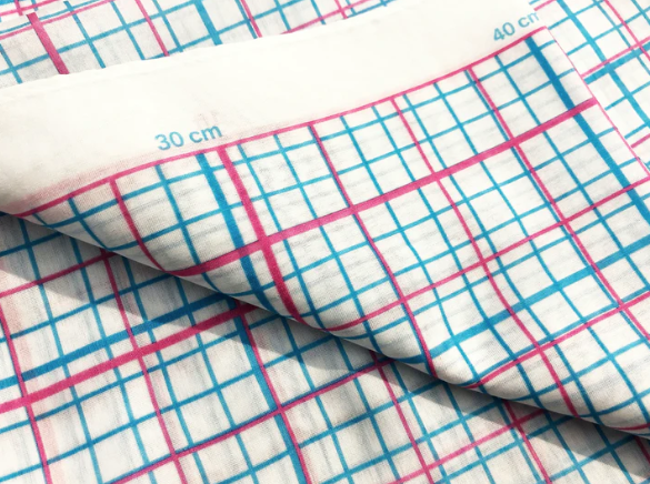
15 Years (!) ago, Unamono persuaded us, Susanna Dulkinys and myself, to design silk scarves for them. In the video here I explain why I did what I did: I simply wrote the measurements along the edges, in millimeter and inches, and showed those measurements as lines in different colours. Now, if you don’t have a ruler handy, you can pull out your scarf and tell how long or short things are.
Some of the scarves Susanna and I designed are still available from our shop, here and here.
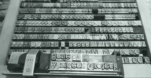
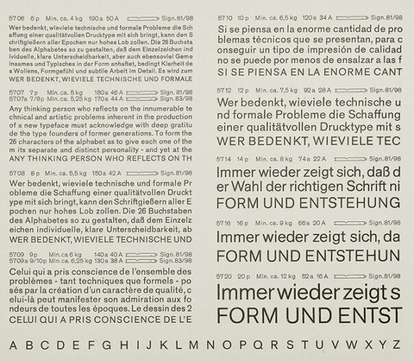
The original Akzidenz Grotesk Serie 57 in 16pt lead type in a case a p98a workshop
Of course I had seen Akzidenz Grotesk Serie 57 in the Berthold specimens and knew that the weights from 14 point onwards looked different from the smaller text weights, which had been made available for the Linotype. But I had never thought about the design process, even though 1957 was such an important year for typography: Helvetica, Univers!
We do know that the first publication of a hot metal typeface rarely marks the beginning nor the end of a years-long process of development, but there must have been a reason why Günter Gerhard Lange chose exactly this year to name the face.
The design of the text sizes for machine setting was not changed, only the widths were adapted for the Linotype system. They were available as early as 1957 and could be combined with the Akzidenz Grotesk weights for handsetting. But the spirit of the times wanted more of a system: the members of the AG family had never been coordinated, they had just come together over decades. Adrian Frutiger’s Univers, on the other hand, was designed as a system: tidy, comprehensive, modern, while Neue Haas Grotesk was not yet called Helvetica but had been planned to end the dominance of AG.
A spread from a Berthold specimen book
In 1959, AG 57 sizes from 14 to 48 point were released. GGL had caught the spirit of the times and tidied up, smoothed out and simplified the youngest child of the family. Unfortunately, it was never made into a complete family of faces. Until we discovered a mis-labelled case with AG 57 in 16, 20 and 28 point
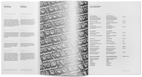
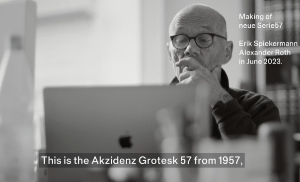
The neue Serie57® is not a revival, but a new digital typeface. It is dedicated to Günter Gerhard Lange, my teacher and role model.
We printed a 64-page brochure describing the development process from the first digital version to the complete family which can be ordered from Alex Roth’s website here:
Our friend Stefan Nitzsche made a short video:
The human impuls to make something for its own sake, to do it as well as you can.
The craftsman’s realm is far broader than skilled manual labor; the computer programmer, the doctor, the parent, and the citizen need to learn the values of good craftsmanship today. The result of physical work, made from things which have passed through many hands, is imbued with its process. It carries a message beyond the mere practical application.
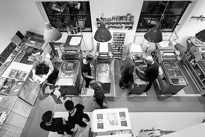
In English it’s called “coming to grips with something”. In German the word is “begreifen”. Without our hands, our brain does not work properly. At p98a we call our craft Post-Digital Printing or Hacking Gutenberg.
Preservation through production.
Digital pre-press enables us to make productive use of the old equipment which connects us with our industrial and cultural heritage. Apart from looking after old hardware, we need to maintain expert knowledge and professions otherwise threatened by extinction. Quite a few of the old machines and processes are still around; they are in working order and will probably survive all of us, but using them for commercial projects is difficult. Taking part in one of our workshops in Berlin will reconnect you to the basics of the design process; you’ll realize that slowing down is fun, constraints are relaxing and using your hands is a skill you may have forgotten but will quickly appreciate again.
Ever since I led the team that designed a new passenger information system for Berlin in 1990, I’ve become a total public transportation nerd. I seek and find information about transportation information systems and their application everywhere. At the time, we were lucky enough to be presented with a historic opportunity: the two halves of the city had been divided for 30 years with two distinct transportation systems. We had to start from scratch, and as the work had to be done while passengers were using the existing services, we had to learn by doing. There were a few things we found out very quickly: the new information system had to look distinct from either of the two existing systems to avoid confusion. People had to trust the new maps, diagrams, schedules, and vehicles. A common denominator was needed. Buses, trams, underground trains and ferries all had different liveries which stemmed from a time when they had been run by separate companies. In the East, the provider was called BVB, in the West it was BVG (don’t even ask)! The tram people didn’t talk to the bus people while the underground people considered themselves to be the best and most up-to-date service. There were beige buses, orange trams, lemon-yellow trains in the East and dark-yellow ones in the West. The answer was: yellow. Vehicles were to be yellow, bus- and tram stops featured yellow posts, the letters BVG were featured in a yellow square (that became a heart shape during the pandemic).
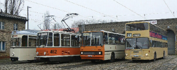
Buses and trams in East Berlin, before the redesign of the city’s transit system
–
The underground used the U in a blue rectangle as their symbol, while the other services spelled out their names: BUS and TRAM. They each got their symbol in different colors and easily distinguished shapes on signs that are dominated by a horizontal yellow stripe.
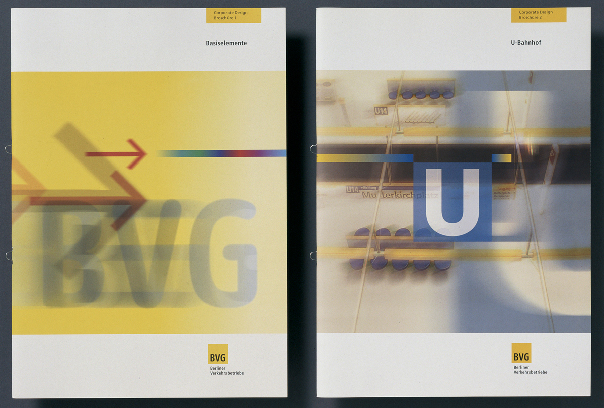
BVG design manuals: the company logo and the product logos
–
It took a few years before the majority of vehicles had been repainted or ordered in the new livery. Today the BVG is yellow. The logo features rounded lettershapes in a yellow square. Berliners know that you can trust any large yellow vehicle to get them to their destinations. The blue, red, purple and green symbols point to the individual services within the system but are always subservient to the big yellow square. When they want to go somewhere, people simply say that they take the BVG – it’s the trusted friend for getting around the place. The BVG logo has become the most known and best liked symbol for Berlin, way ahead of all the attempts to design a graphic identity for the city.
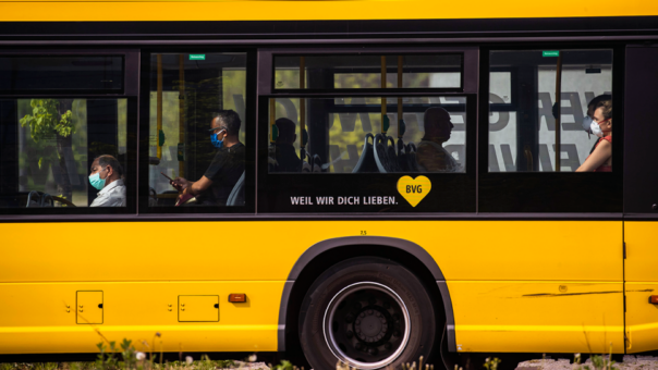
Berlin buses, trams and trains color the city yellow
–
Wherever I’ve traveled since the early 90s, I’ve taken a close look at how public transit works in cities around the world. Our diagram for Berlin’s trains was very much influenced by the iconic London Tube Map, which has become the model for most other such diagrams. When the bus and train services in London were brought together under one roof in the early 2000s, it was a no-brainer to use the famous roundel as the symbol for the whole system. Without the word Underground on it, the roundel can appear in the colours of the tube lines as well as in a neutral grey, black or white on bus stops or on printed literature. While bus services are run by several private companies, their logos are limited to appear over the driver door only, so not to confuse passengers about who actually runs the system. The London Transport roundel has become the graphic shorthand for London, beyond its application for public transit.
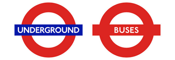
When you see the roundel, you know that you’re in London
–
Other cities I frequently visit, like NYC or San Francisco, are far behind when it comes to public transit. They don’t even have a common fare structure, let alone coordinated passenger information for their MTA, PATH, BART or MUNI services. That is a shame, but also a chance to learn from other cities in order to attract passengers and increase ridership. The budgets will be there!
New York City and San Francisco Bay Area transit logos look like competitors rather than integrated systems
–
One thing we did learn was that insufficient information is a bigger obstacle to people leaving their cars for public transit than the price of a ticket.
I was very happy when colleagues recently pointed out to me that at least one large North-American area had got its act together and emulated what makes Berlin and London so successful. I’m not familiar with politics in Greater Toronto, but I believe that like London, they have several municipal transit companies running buses, streetcars and trains across the region. Of course, as other cities have found out, passengers don’t really care about the business side of it – they just want to recognise and trust one service. So I was very impressed to see that the regional authority, Metrolinx, has taken on the task of producing a single identity and standard for public transit information.
Using a big T in a circle is an obvious and thus brilliant solution as a symbol for this one coordinated service. T for Transit, T for Together, T for Toronto! The strong letter in a circle looks like a sheltered stop itself. It has immediate authority and visitors will presume that it’s been there forever. The T is visible from far away and easily reproduced in all sizes for all media. I don’t know how many operators and city officials providers had to be brought together to agree on this simple and effective device, and experience. Experience tells me that discussions weren’t easy. I am sure egos may have been hurt and compromises were necessarily made, but the end result has made the effort worthwhile. Not only will it help the region’s residents get more from an expanding network but visitors, who tend to gravitate to Toronto, will experience a city intent on Every visitor will immediately identify Toronto’s transit system above or underground, while Toronto natives can be proud of their city for making good passenger information a priority and public transit more accessible.
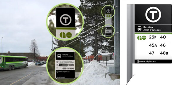
The T is a great symbol for the region’s transit systems
–
Metrolinx and the region’s operators will be paid back in loyalty and higher ridership once people have understood that it has become much simpler to use public transit across the city and the region. I wouldn’t be surprised if Greater Toronto was followed as a shining example by other cities in North America.