The BBC movie by Stephen Fry has finally arrived on YouTube. It was broadcast last week but is only available online in the UK. This is the link to the first part:
San Francisco walks, 2.
I always carry a camera, but the extremely sunny weather (and the sun is brighter here than anywhere in Northern Europe) makes it difficult to get some motives. It is, for example, almost impossible to photograph shop windows because there is so much reflection in the glass.
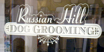
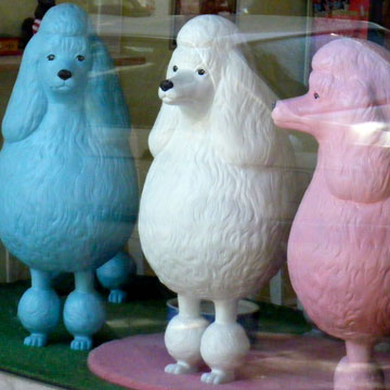
I was initially only interested in the typography in this window. It may be a little over-designed in its nostalgic style, but it is a 100% fit for the subject matter and the clientele in this neighbourhood. That also clearly shown by the type of dog displayed in the window next to it, which I had not seen at first. Poodles are almost cartoons of dogs in the first place, but three of them in lightblue, pink and white certainly make a statement.
San Francisco walks, 1.
In San Francisco I walk a lot. Some of the hills are too challenging for my simple road bike, taking the car out just to get to the newspaper shop is stupid, and I have never worked out how the bus system works here. 
I do, however, see people – usually older women with shopping bags – hanging around near street corners a lot. While enjoying my Swensen’s ice cream the other day, I saw them again: more and more women gathered by a shop on a corner. Then, suddenly, they were gone.
I waited a few more minutes, eating my ice cream, and more people appeared. Then I saw what brought them to that corner: it was actually a bus stop. As I walked over, I noticed that there was a yellow band painted onto a lamp post. It actually had two numbers stencilled onto it, obviously the numbers of the busses that stop there. 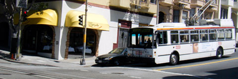
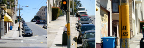
With this attitude towards passenger information I am not surprised that people in the US stick to their cars as much as they do.
The stop on the other side of the street at least had the words BUS STOP painted on the lamp post, but nothing else. No timetables, destinations, routes, fares. A closely guarded secret for the natives. Nobody seems to want more passengers.
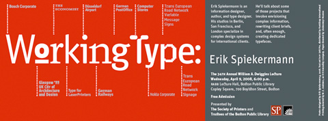
34th Williams A. Dwiggins Lecture
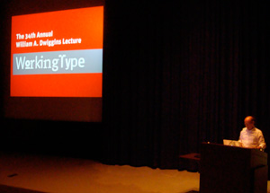
It’s already a week ago that I held a lecture at the Boston Public Library. It was the 34th. William A. Dwiggins Lecture. As lectures go, it wasn’t all that special (apart from it being a great honour to be asked to speak in front of all those dignified printers and historians), but it was the first time that I had a lecture interrupted by a fire alarm. I just had the first slide up (see small picture) when the alarm went off.
We actually all had to move out into the street. There was the usual display of emergency hardware (I always find that on those occasions in the US they really like to show everything they have) – big trucks with and without ladders, ambulances, patrol cars, dozens of firemen (who like to be called Firefighters these days) with helmets and axes – until it transpired that it had only been a malfunctioning microwave somewhere that caused all this fuss!
Nick Sherman had the presence of mind to film the moment when the alarm went off. He also took the little picture here that I just downloaded from his flickr site. I designed a poster and an invitation for the evening. The card is shown below.
I’ve also added a download for the pdf that was sent to the printers: dwiggins_sheet.pdf.
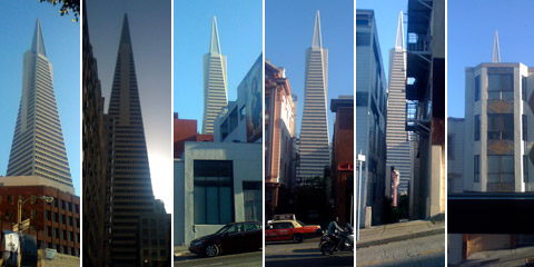
San Francisco
Not every city has a landmark, but San Francisco has more than its fair share of them. And I can see one of them from our window – if only the very tip of it.
Last night on my way to the mailbox (April 15!) I took some photographs of the Transamerica building. For snapshots of that size in good weather the iPhone turns out to be perfectly adequate.
Less is more
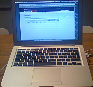
This is my first post on my MacBook Air. The photo of the new computer on the kitchen table was shot with an iPhone. Not the best quality thinkable, but adequate for this type of message. I’m waiting for blogging software for the iPhone. The update to 2.0 in June should bring some cool stuff.
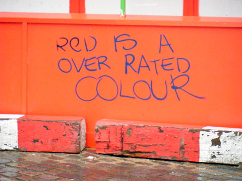
Red is the Helvetica of colours
Saw this in London recently. Not the best spelling, but a valid observation nonetheless. The construction fence it was sprayed on was painted solid red – more than anyone would need for warning purposes.
Rub downs
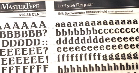
Can anyone remember Letraset and other dry-transfer type? A few years ago, I threw away hundreds of sheets of it, which I now regret. Younger designers might find this type of lettering funny, perhaps even informative. Technology has, after all, always influenced design, if not defined it.
Friends in The Hague gave me a few sheets of transfer type featuring LoType, which I had never seen before. The manufacturer obviously didn’t have a license contract with me, or they might have spelled my name right.
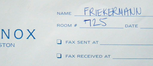
Friekermann
I see many versions of the spelling of my name, which in German is quite ordinary. A phonetic equivalent like Speakerman is the most frequent one. Last week in Boston, however, the lady at reception may have wanted to make a statement. Or she simply couldn’t read the type in my passport.
Helvetica can be nice
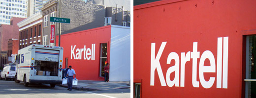
Every typeface needs its own layout that will make it look good and appropriate. An Italian producer of plastic furniture with a showroom in an old industrial building in San Francisco could do worse than displaying its name in large Helvetica letters. Rotis or Meta would have been totally wrong there.