News from SF

I haven’t been to San Francisco since January, and I have not published anything on this blog since then. There is just too much going on in Berlin: the office has more than 30 people now, we have a new house, thousands of books that need sorting, a lot of travel…
Here in SF there are only two people in the office and I can finally get down to some writing.

Around the corner from our little house here is the office for Dwell magazine that publishes under the motto “at home in the modern world”. And by the door I finally found an example for the stainless steel house numbers I designed for DWR last year. These are the “TECH” numbers without any diagonal lines. Design Within Reach has them discounted – apparently there is no market for “designer numbers” in the USA. Luckily, I have the rights to my designs and will be selling them myself very soon, also in Europe.

technumbers.jpg

Unit Rounded

unitrounded_BY.gif

Round typefaces keep going in and out of fashion, for many reasons. One of them always has been the media the face would be used for: type on screens and back-lit signs suffers from radiant light. Sharp type will look blunt, and the amount of bluntness that occurs is usually unpredictable. Enter a font already blunt, i.e. rounded.

block_zdf.jpg

Way back in letterpress days, some of the most successful typefaces for everyday printing (then called jobbing) were faces like Reklameschrift Block with its wobbly outline and blunt corners. The letters looked hand-painted, spontaneous, or pre-destroyed. Even bad treatment on platen presses couldn’t make them look bad.

When I designed FF Info, the corners were made blunt to counteract light shatter on signs at the Düsseldorf airport, where this typeface was first used.

Otl Aicher designed a typeface for Germany’s second TV channel, the ZDF, in the early 70s, which was basically Univers with very round corners. TV then was very low-res.

Other typefaces used round corners – the “Frankfurter (as in sausages) look” – to convey friendliness and were often used for food packages.

Then came Web 2.0 and rounded typefaces made a major comeback. I think they are here to stay, both as a fashion statement and for physical reasons, like in the old days. There will always be bad media which needs indestructible fonts.

FF Unit Rounded started as an exclusive typeface we designed with Christian Schwartz’s help for Gravis, the biggest Apple dealer in Germany. They needed something friendly but precise, to be used on-screen, on signs, in print and on T-shirts.

gravis01.gif

gravis02.jpg

Gravis Round only has two weights, and when I wanted to make a complete family, I turned to Erik van Blokland, inventor of the Superpolator software. You can download one of the little movies here to see the Superpolator live in action. Well, almost.

unitmovie.gif

UnitAlternatives480.mov

preview_UnitRound_07Feb07.gif

Above:
The Superpolator at work.
Each frame of the movie stands for one instance. The amount of radius on the terminal changes independently from the thickness of the strokes. The lighter strokes needed less of as flat bottom than the heavy ones. Without any flatness at all, you get the pure sausage effect.


Erik ran several trials to establish the right amount of roundness for each weight. The lighter weights have almost no flat bottom, whereas the bold weights have straight bottoms on the main strokes, met by rounded corners. The radius had to be different for each weight, so Erik showed me alternatives as little movies with a slider to try out different versions. They all had a number to them so we could decide what worked best for which weight. The Superpolator also took care of a lot of the issues with internal curves and those problematic areas where curves meet straight lines or – even more complex! – diagonal ones.

preview_SuperFamily_07Jun04.gif

Above:
EvB and his Superpolator provided many choices
and made decisions for the right weights and the amount of roundness quite easy.

zacken.gif

There remained quite a bit of manual intervention which was carried out by FSI’s able experts who end up with all the detailed stuff that us type designers are too lazy for. Just look at these screen grabs: the software wants to insert curve point at the extremes of each curve. In this case, however, that not only added unnecessary points, but also created weird artefacts. So all these point had to be removed by hand. And we are talking about 450 glyphs per weight.

unitziffern.gif

FF Unit Rounded is OpenType and has all the features
that come with that format, like four different types of figures.

FF Unit is serious enough to be rounded without becoming a sausage face or one only suited for comic strips. It looks friendly without losing its precision and changes its appearance quite dramatically as it grows in size. The Rounded version should be available at your local FontShop any day now.

Royal Designer, 2.0

I promised to show the real document that I was given when I was made an Honorary Royal Designer for Industry in November. Turns out that I over-promised. The scroll, handset in Caslon by Alan Kitching and handprinted letterpress on handlaid paper, cannot be reproduced in sufficient quality in this medium and at this size to do it any justice at all.

Neither can one possibly appreciate the quality of the tube that the scroll is kept in without holding it in one’s own hot little hands. The lid sits so tightly that it needs no fastening, adhesive tape or anything else.

Here are a scan and a photograph, nevertheless.

Erik_RDI.gif

RDI_rolle.jpg

New Year’s Cleaning Up.

While cleaning up my hard drive I found several videos that may not be totally up-to-date, but could be fairly amusing. As long as I haven’t figured out how to insert the html code for streaming full-size movies, I’ll just post small versions here. If anybody is really interested, I can always provide downloads for bigger files.

That reminds me of why I started the SpiekerBlog in the first place: I still get requests from student almost every day. They have to write an essay or a term paper or even a thesis. Sometimes the subject is me, sometimes one of my typefaces and sometimes a bigger typographic subject. This is why I have archived several interviews and other writings. The questions are never identical, but they certainly cover the same ground, more often than not. The published answers thus save time, both for me and the students.

The first little video was my apology to a conference in Athens last year. I had just been elected into the European Hall of Fame for Communication Design by the readers of several European magazines, but had to cancel going to receive the prize at the last minute. This video was recorded via iChat on my Powerbook. That’s why voice and images are not in sync. I also didn’t have any time to practise, as witnessed by the fact that the signs I hold into the camera are never in the center and hardly in focus.

Picture-1.jpg

erik_greek.mov


Typographic detail, handmade

Applications like Indesign and fonts in Open Type format provide tools for making great stuff that older generations of typographically interested designers could have only dreamed about.

bodoni_sc.gif

As we all know and can witness every day, these tools, however, are no guarantee for great design – not even for good craft. I find it even more gratifying and pleasant to behold when I see someone pulling all the stops to achieve typographic detail even when those tools are not all available.

The van for this company that sells grilled chickens and other goodies on San Francisco’s Farmers’ Market has been carefully lettered, even though those letters may be a little worn by now. The designer had to use Frutiger for reasons I don’t know. But that didn’t prevent him or her from wanting to apply old style figures which are not available for that particular typeface. The simple solution for this problem is to simply move ordinary figures down below the baseline to achieve the effect. The 1 can just be cut off at the bottom as long as it doesn’t have a serif to lose. Figures 3, 4, 5, 7 and 9 look almost like the real thing when shifted down. The only problem is presented by the 2, as that should be redrawn to the size of the x-height and have no ascender.

frutiger_sc_SF.jpg

As seen in Bodoni’s Manuale Tipografico, the master took liberties when it came to designing his old style figures. He does draw a short 2, but doesn’t give descenders to 3, 4, 5 or 7.

Conventions are not necessarily rules, just habits.

Spanish impressions

As the warning above says, I shall now and again publish whatever I feel like. Just found these images from my last trip to Zaragoza and Barcelona a few months ago. A 120-gig hard drive offers a lot of surprises…
stier.jpg

If you ever travelled through Spain, you would have noticed these gigantic metal silhouettes on the mountain tops. Originally these images of bulls had the explanation next to them: they were larger-than-life advertisements for Osborne brandy.
osborne.jpg

After many years, the added brand name had become as superfluous as putting Mercedes Benz under the star. Now, however, these giant sculptures are being taken down, at least in Catalunia. Apparently they are still considered a symbol of Franco’s Spain – from a time when this region was not allowed its language, nor its other cultural expressions.

I cannot help the impression that it might also have played a role here that it is definitely a male animal. In these politically correct times, that seems unacceptable. Too bad.
barcelona_transport.jpg

The authorities are much less concerned with typographical correctness. Officially, Spain uses the US alphabet on its freeways, in spite of that one being badly legible and totally out of date. But it stems from a time when every import from the States was considered superior and beyond criticism.
barcelona_helvetica.jpg

It is quite apparent that the authorities have no idea about typography – just like everywhere else. Every other sign in the region uses good old Helvetica, which is just as unsuited for this purpose, but so easily available and thus ubiquituous.
I have been demanding a Minstry for Typographic Affairs for decades. In vain, obviously.

New Euros, old system.

Two countries will introduce the Euro as currency on January 1, 2008, Cyprus and Malta. The fronts of the coins look the same as that of all other countries, while national symbols are displayed on the back.

This reminded me of the occasion when I got asked by the German news magazine Der Spiegel, back in 1999, to design my own version of the yet to be introduced new European coins. They also asked a few other designers whose solutions I cannot show as I have no data for them.

I noticed back then how little systematic thought had gone into designing the new coins. While there were and still are three different types of metal and several separate sizes and bevels, It would be pushing it to talk of a comprehensive design system. Much worse, however, is the fact that one still can only distinguish some of the coins by looking very closely – not a good idea for money that needs to be available at – dare I say it – the flick of a coin. One ought to be able to sort one’s change inside a pocket and count it even in the dark.

euro_alt.jpg

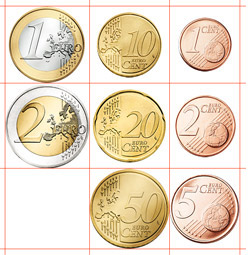
As you can see, the coins are all of slightly different sizes, albeit not different enough to distinguish by touch only. The 2-Euro piece has a diameter of 25.75 mm, the 50-Cent coin is hardly smaller at 24.25 mm, while, strangely, the 1 Euro is smaller than the one half its value, 23.25 mm. The 21.25 mm 5-Cent piece is also larger than the 10-Cent coin, which is worth more but only 19.75 mm in diameter. The different metals can only be told apart in good light.
The 20-Cent piece is the only one with a different bevel, but still hardly distinguishable from the 5-Cent piece of almost the same size. Embossed lines are to be found on the right and on the left or at an angle, but too thin and closely together as to offer any hints for probing fingers. The outline of Europe is more of a political statement than useful for identification.

The backs of the coins are look different from country to country. That offers some interesting choices but doesn’t help keep different nominations apart.

coins01.gif

coins02.gif

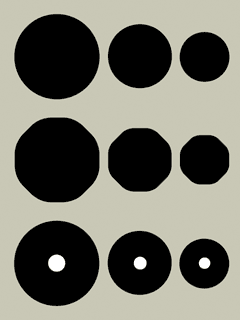
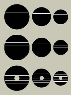
I first distinguished the groups: Ones, Twos and Fives.
The Ones, i. e. the 1-Euro coin, the 10 Cent and the 1 Cent piece, are simply round and each one approx. 20% smaller than each other. If my Euro were 23.25 mm – as is the present one – then my 10 Cent would be 18.50 mm in diameter (about the size of the present 2-Cent piece) and 1 Cent would be 16.50 mm – instead of 16.25 now.

coins03.gif
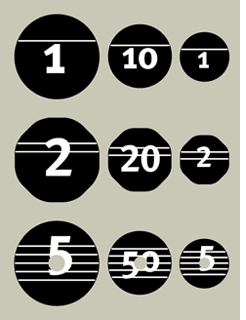
The Twos, that is 2 Euro, 20 Cent and 2 Cent, are octagonal with very round corners, making them distinguishable in the hand. They are of the same diameter as the round coins, but appear a little larger and weigh heavier, while of the same thickness as the Ones.

The Fives are as round as the Ones, but a little thicker and with a hole in the middle, like some Scandinavian coins have been forever. There is no 5-Euro coin as yet, but the system allows for it because it makes sense. The hole in the coin can be felt with the fingers and also looks quite distinct.

Apart from these distinctions if shape and size, the nomination is also symbolized by horizontal lines, of which there are one, two and five (!) The three Euro coins are made from silverm the 50, 20, and 10 Cent pieces from “Nordic Gold” and the three smallest nominations are coined from copper, as they are now.

At first these coins may appear a little sparse and empty. The present design is another one of these compromise as with the design of the Euro banknotes. Nothing was to be recognized as a national symbol of any country. The map of Europe is really quite contradictory in these circumstances. It is incorrect gepgraphically, as Europe is not an island with clear contours. And it is politically touchy as the map includes countries that are not part of the European Union. And where does Europe end? There are big chunks of land missing in the north and the east, and the smaller Balearic islands have been sacrificed to small scale.
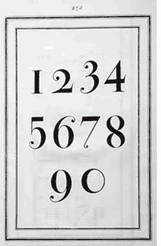
Clear figures and letters are not only less ambivalent, but also help when counting. And I could always incorporate Greek and Cyrillic letters if required.

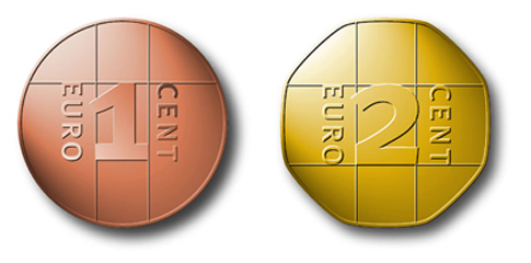
I’ll show my proposals for the backs of the coins some other time. For now, here are two renderings from my 1999 proposal.

euros_erik_vorn.jpg

Dublin Type 2

The art of writing or carving elaborate signs is all but dying out. Self-adhesive plots on vinyl have replaced painting signs with drop-shadows in fantasy typefaces that didn’t come from the FontBook or any other “proper” source.

dublins_signs.jpg

It may only be a matter of time until these handmade signs will have disappeared from buildings in Dublin as well. These are a few that I found on a recent trip.

dublin_uncials.jpg

Uncial type has been the style of Irish writing since before Gutenberg. It doesn’t, however, look very convincing today when applied to everything in order to achieve that “Irish” look. (By the way: This version of Quay Sans looks weird indeed.) Perhaps time for a workshop on Irish typographic identity?

Dublin Type 1

Nobody can design a “classic”; whether a typeface ever becomes a classic will be decided by how it gets used over time.
FF Meta has been around for almost 20 years now, and it’s still selling. While new generations of designers constantly rediscover what the previous generation discarded, after a certain time and enough exposure even a once fashionable face like Meta becomes a standard and gets considered for quite archane applications like the one on this facade in Dublin.

dublin_puballes.jpg

The large type on the house was obviously hand-painted years ago. When that type needed to be applied to the newer signs over the shop-fronts below, two different signpainters used two different solutions. One took Meta as his model and re-invented it for himself – that is Messrs Maguire on the green sign.

dublin_pub.jpg

Somebody else seems to have copied the type for the purple sign from that first copy, adding his own touch.
The metal letters, however, must have come from digital data. It is a fairly faithful rendition of the original Meta. I’m never sure whether this sort of messing with my typeface should please me or annoy me. It certainly proves that Meta is not considered a precious, high-brow designer-typeface anymore. Having arrived on the front of pubs in Dublin, painted by hand, doesn’t quite make it a classic, but it certainly puts in out there.

dublin_pub2.jpg

Spiekermann speaks

If you can understand German, you may want to look at the interviews that my friend and colleague in Vienna, Markus Hanzer, filmed with me and my friend and colleague, Walter Bohatsch, when I was there recently for a lecture.
picture_1.png

stadtgespraeche.com