Achtung Spiekermann!

Achtung! is the title of my monthly column in Blueprint magazine that I have been writing since October 2008. That headline has to do with the Brits’ continuing stereotyping of us Germans as heel-clicking, orders-shouting men in jackboots. I have long since learned that the best way to live with that preoccupation is to go along with it, even bring it up before they do. So when the editors came up with the title, I rolled my eyes but agreed. This was written in September, before the size of the financial crisis became to be fully known. My condemnation of people producing “invisible earnings” could have been much harsher.
erik_blueprint

THESE DAYS, even cities and countries are branded like washing powder. When I hear a line like ‘London is the creative capital of Europe,’ (or was it ‘the World’?), the first thing I ask myself is whether this is the result of objective research, a tabloid invention or another government campaign to take peoples’ minds off increasing inflation, prohibitive property prices, terrible traffic and weird weather. Yet there is some truth behind the slogan. I live and work in Berlin, San Francisco and London, and there is something different about the British capital.

Berlin today is made up of many cities: the old Prussian capital, leftovers of Nazi pomposity, ruins from the War with patched-up bullet-holes on every surviving building, post-war capitalist planning in the West and socialist architecture in the East, plus 18 years of post-post-war developments. A history of disruptions. Low prices attract artists and would-be artists, but hardly any corporate headquarters or serious businesses. Nobody in Berlin has jobs, but everybody has ‘projects’.

London, on the other hand, is the product of centuries of continuity. Everything that has ever happened on the British Isles, from the Roman occupation to the days of the Empire, from Nazi bombing to Thatcher’s hardcore capitalism, has manifested itself in this city. You get to live in one of the centres of the known universe if you are prepared to put up with all the inadequacies, bad air, horrible traffic, atrocious services and ridiculous prices. If you survive in London, nothing will scare you. And having managed to do so is a great boost for anybody’s self-confidence. Walking (or, in mycase, cycling) through the streets of Clerkenwell, I notice that the average age of everybody out there must be half mine. The way they go about looking busy while stroking their iPhones, the fashion they pretend not to wear and the bars, cafes and restaurants they frequent all suggest that nobody earns their money making anything physical anymore. Which leaves ‘invisible earnings’ as their main contribution to the economy. That term was invented for the City, where people make their money by betting other peoples’ cash on anything that grows, flows or might one day be manufactured. However, the Square Mile turned out to be fuelled by greed more than by expertise, and the sex appeal has disappeared with the bonuses.

Enter the creatives. If we place anybody in this category who works in film, TV, publishing, advertising, fashion and design, we realise that practising these occupations poses no danger to anybody. In other words: if all the creative businesses went on strike tomorrow, we wouldn’t immediately notice. Electric power would still be generated, breads baked and concrete mixed. Trains might still leave platforms (which, looking at Britain from a German perspective, is a small miracle in itself), the Congestion Charge would be enforced, newspapers printed and hearts transplanted. But what of the newspaper features? The pictures? The different styles of headlines, the characteristic look of your favourite magazine? If you’ve ever been to a country without advertising (I used to live next door to Eastern Germany), you may have realised how drab everything looks, and developed a longing for even the most stupid washing powder advertisement.

Imagine, for a moment, a typical high street without any advertising at all. An attractive thought at first, until you realise that even neon signs and advertising hoardings deliver crucial information, perhaps decoration and sometimes even amusement. And who would want to go back to the undesigned objects from the past? The complexity of technology may need to be hidden from us for our own good, but the look and function of surfaces and interfaces cannot be left to the engineers and marketing people alone. Things may just about work without designers, but don’t we also derive pleasure from using objects, physically and aesthetically? Without fashion we’d all be forced to wear the same practical gear, Mao-style. Refreshing for some of us for a while perhaps, but every man knows what women are capable of if they haven’t bought a new pair of shoes for awhile. You get my drift: us creatives may not save lives, and mankind would certainly continue to exist without our involvement.

However, we have important roles to play. The first one is to put icing on the cake of capitalism, no doubt about that. The other one could befor us to use our unique talents to actually solve real problems. We can visualise thoughts, ideas, issues. That is a very powerful gift. Also, in spite of all the iPhoning, teleconferencing, button-pushing and Facebooking going on, we like to be around each other. The more creative talent you have in one place, the more you attract. We’re not afraid of moving into ‘bad’ areas, we like to try exotic foods, hang out with interesting people from faraway places, listen to strange sounds, read material that is incomprehensible to outsiders and generally treat bugs as features. Where could there be a better environment for this species than in London? One good thing about Britain’s colonial past is the fact that half the world speaks English as their first language, while the other half takes courses. Many smaller countries are already bilingual. Try learning Dutch or Swedish: impossible – they’ll always answer back in English. Still, nobody speaks it as well as you do here in Britain. If you could be bothered to learn another language, you could appreciate that there are other ways of seeing and saying things. If you could get your tongues out of your cheeks now and again, the contribution London makes to the creative trades, industries and businesses could be even greater. Nobody is asking you to become German and actually make things.

BLUEPRINT OCTOBER 2008
Mr. Univers

adrian80.jpgOn May 24th Adrian Frutiger celebrated his 80th birthday. To mark the occasion I wrote a short piece for the Swiss magazine Hochparterre. At the time, this blog was not very active and I only got the German version published. In the meantime, my son, Dylan, has translated the article into English.


Adrian Frutiger: Mr. Univers
When you get to a certain age, like myself, you often gets asked who your influences were and are. An easy response is to name nationally or internationally renowned favourites such as Gandhi or Albert Schweitzer. Ones own parents tend to score high on the list, at least if they’re still living and able to read the accolades. As far as I’m concerned my choice has been a simple one for over 30 years: I first met Adrian Frutiger in 1976, and to this day he remains my idol.

Adrian as a colleague

He was the best of colleagues; he gave advice, discussed things, listened and had time for questions which a novice like me could barely formulate properly. At the annual ATypI meetings, which in those days were still pretty small, all the type designers knew one another. Most of them were connected to a manufacturer, who sold their typesetting machines as well as the typefaces that went with them. So the designers were really competitors, yet the atmosphere was friendly nevertheless, as is usually the case whenever specialists get together in a business as manageable as type design was at the time.

We met a little later in private at Walter Greisner’s, then head of D. Stempel AG, the type foundry within the Linotype group. In the small world of type designers there was no room for big egos, and as a friend of the house I was allowed to be on first name terms with my hero from the start. I had only just turned 30 and hadn’t yet designed my own typeface, but after having got to know Adrian I was determined to give it a go.

Univers 1957

Frutiger had just released a Linotype typeface named after himself, which he had originally developed for the signage at Roissy airport (now Charles de Gaulle). Nearly 20 years previously, in 1957, his Univers was released by Deberny & Peignot in Paris. The same year, by the way, that the Citroen DS was introduced – a similarly radical design. Helvetica, too, dates from this period. It was conceived as a commercial response to the success of the German Akzidenz Grotesk, which was highly rated by the Swiss designers due to its neutral robustness. The Neue Haas Grotesk, as Helvetica was first known, was from Münchenstein near Basel and was intended as a refinement (or simplification, if you like) of existing typefaces. Univers, on the other hand, was conceived as something new right from the start: as a system of complementary degrees of boldness and width forming a family of 21 weights. This incredible project, for which umpteen thousand steel punches had to be engraved (each character in each size), was the brainchild of a type designer from the Bernese Oberland who, not yet 30 years old, had been given free rein by his employer in Paris to undertake this enormous task.

This revolutionary type project breathed some fresh air into the Swiss design scene. Back then there were design factions which were not only classifiable by cities and schools, but also by their loyalty to certain typefaces. Soon there were not only Akzidenz Grotesk supporters, but also a Univers faction, not to mention the Helvetica community. Every typeface has its own design canon, thus for many designers the choice of typeface was at the same time a choice of direction. There were few choices of typefaces at the time, because apart from typesetting systems, the choice was dependent on the respective printers.

Munich 1972

Univers wasn’t accepted as readily as its Swiss half-sister Helvetica. However, it became a household name to all designers the world over during the Olympic Games in Munich in 1972. Otl Aicher and his team developed an image in which Univers played a leading role. Light, jolly colours and a precise but flexible grid helped the typeface make a unique appearance.

Roissy signage

At that time Frutiger was already busy working on the Roissy project. He had by then notched up some 20 years’ of experience in type design, and had passed from hot metal setting to photosetting and early digital methods of typesetting. He himself was aware of the flaws of Univers when it came to employing it for signage, which has different needs from those of a reading text on paper. Even though airports and train stations still use Univers on signs to this day, Frutiger realised back then that an entirely different kind of typeface was required. He once told me in the early ’90s that Univers wasn’t suitable for signage. At the time we were looking for a narrower version of Frutiger for the Berlin transport system signage, which didn’t yet exist in digitised form. So we had to digitise parts of the typeface ourselves, and have him give his blessing to a few introduced alterations. We also drew an Italic, because the typical Frutigerian slanted cut wasn’t distinctive enough for information on the Underground signs. Adrian would comment on the designs that I showed him by saying ”that’s not bad, but I would have done it differently”; both a go-ahead and a critique in one sentence. For fundamental reasons, he had never designed italic forms in the Roman tradition for his sans serif faces, preferring instead to make slanted versions of the upright cuts. However, for the new edition under the name of Frutiger Next, he let himself be convinced to produce a proper italic in order to meet the market demands, which looks a lot like our Transit Kursiv from 1991.

System with feeling

I know of no other typeface designer who can put so much feeling into a systematic approach. Frutiger’s typefaces are always planned, but they never look it. He developed number schemes for stroke width ratios and width proportions, yet never a priori by equation or interpolation, instead by feel for the right measurements. None of his designs were ever made to be bestsellers or classics, they were always made with the specific requirements in mind, usually demanded by the employer and only occasionally due to the desire to fit a particular genre. Adrian Frutiger long ago decided that he had contributed to every typeface classification and could only repeat himself. It’s a good job he at least let himself be convinced to oversee the new editions of his many classics, because modern technology allows all sorts of details which couldn’t be realised in his day.

Whoever fancies creating a typeface ought to know that we don’t design the black strokes, but the white spaces in between. Adrian Frutiger’s method of cutting shapes out of black paper using scissors and then sticking them together to make letters and characters can be traced, according to him, to the traditions of his native Interlaken. That’s what gave him the best tool – his intrinsic feel for inner and outer shapes, for rhythm, contrast, tension and consistency, and how to transform all these into shapes which are more than mere alpha-numeric characters.

What’s the best typeface in the world for the Latin alphabet? Frutiger, of course. It combines the talent of an unassuming designer who has devoted over fifty years to these little characters with the knowledge and experience of all the technology that has come and gone in that time. It is totally appropriate that this typeface, which started out as Concorde, bears his name today. It means that he stands alongside Garamond, Caslon, Bodoni, Gill and the other typeface designers who expressed and captured their epochs for posterity.

This homage is no doubt extremely embarrassing for him.

Colour of the Year

I have never used many colours, apart from the basic typographic black and red. Twenty years ago, however, Alex Branczyk and myself designed the logo etc for FontShop. We thought light and dark would nicely represent the digital process of one and zero, as well as the process inside the laser printer. Black and white was too plain, so it became black and yellow. That colour scheme has become synonymous with FontShop and its products, like the FontFont library.

Nice to be finally recognized 20 years later by Pantone itself.

WordPress

As even the occasional visitor to these pages will notice, I have switched to WordPress. We use that programme at SpiekermannPartners, so I could enlist the help of Marcus Scheller who imported most of the old content and built the site. Some of the formatting needs a polish, and all the downloads have disappeared into the ether for now. The ether, in this case, is our server, so it only (!) requires me to find the stuff and re-load it.

As it has taken more than half a year to get this far, don’t hold your breath. I am hoping that the inevitable break at the end of the year will allow me to sort this out and also learn more about WordPress features.

It is still the only blog I know that gets written by one person in two languages. Or is it?

San Francisco walks, 7.

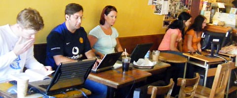
Today is the last day here in San Francisco for a few months. Just enough time left to go down to my favourite newspaper shop and get tuesday’s edition of the Frankfurter Allgemeine Zeitung. The coffee house opposite offers free internet, monday through friday. As I went in to get a coffee, I counted 12 people in there, each one in front of a computer. I couldn’t really take a proper photo without it being embarrassing for myself or the guests, so I just shot one from the hip without looking at the camera or the subjects. It shows five people and five computers on one side of the room.

Starbucks across the street also has online access, but only if you have a T-online account. The city of San Francisco plans to have free online access across the city very soon, so people can once again pick a café for the quality of the food and drink offered.

sf_cafe.jpg

San Francisco walks, 6.

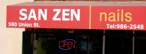
There are a lot of places in California named after saints. And since the Spanish missionaries were here well before any English-speaking Americans (or the Russians, who came down from Alaska and left their mark on place-names like Russian River), these towns start with San or Santa, depending on the saint’s gender. As in San Jose, Santa Barbara, San Rafael, Santa Clara, and, of course San Francisco. This one I found on a shop sign near Washington Square.

Never heard of that Saint.

sanzen.jpg

San Francisco walks, 4.

sf_mercedes.jpg


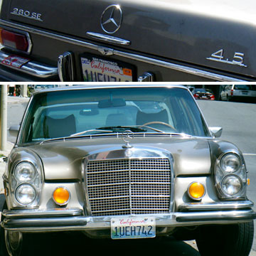
One thing that never fails to amaze me on the streets in California are the classic European cars that are around – not in showrooms, but driving around or parked on the streets. Like this ca. 1969 Mercedes 280SE with a 4.5 l engine. Those cars were hardly ever sold in Europe, because we have always paid more for petrol than here in the US. You can buy one of these classic cars for less than $5000 here, because with gas at $4 in San Francisco, some of the original owners are beginning to feel the disadvantage of these fantastic, powerful, indestructible, thirsty engines.


San Francisco walks, 3.

swensen.jpg


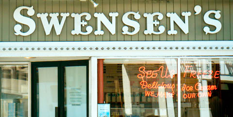
Amongst the things threatened with extinction for a long time has been the apostrophe. Not a big loss for mankind probably, but too bad for the typographically educated amongst us. The apostrophe is neither a foot mark nor a sharp (as in acute) accent. It is shaped like a comma, but raised to the top of the cap height. Very simple.
I’m happy to report that my favourite ice cream shop in San Francisco also has good typographic taste. The fact that the apostrophe in Swensen’s is not only typographically correct and good-looking is, unfortunately, due to the fact that it was put up there by a signwriter a long time ago, when craftsmen still had to learn a trade in order to practise it.