Amongst the things threatened with extinction for a long time has been the apostrophe. Not a big loss for mankind probably, but too bad for the typographically educated amongst us. The apostrophe is neither a foot mark nor a sharp (as in acute) accent. It is shaped like a comma, but raised to the top of the cap height. Very simple.
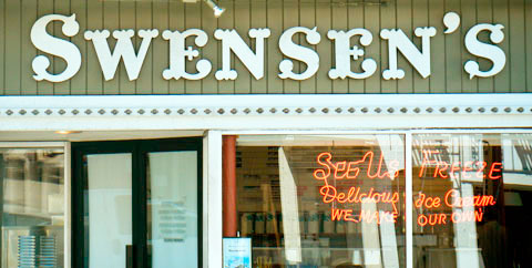
I’m happy to report that my favourite ice cream shop in San Francisco also has good typographic taste. The fact that the apostrophe in Swensen’s is not only typographically correct and good-looking is, unfortunately, due to the fact that it was put up there by a signwriter a long time ago, when craftsmen still had to learn a trade in order to practise it.
Mmm, so tasty.
This kind of sign can only be crafted by hand, as you said, but those wanting a similar flavor in font form can get it (albeit with added ornamentation) in CircusKS.
What is strange is that the “s” letter has a very similar shape as the serif.
San Francisco looks like a nice place to see though!
Looks like the last “s” is upside down — at least when compared to the other two, no?
Doesn’t matter — this place is just a handful of blocks from my apartment and I can attest to the excellency of the ice cream. Nice to see it getting some signage love.
That last s is definitely upside-down, a frequent mistake on signs like this. Still great type.
Oops: not the last s, but the first lower-case s is upside down – large distance between the curly terminal and the cross-stroke.
And the initial cap-S is also upside-down.
This blog has very attentive readers!
I am sad to report that the apostrophe is under daily threat in the UK on BBC News of all places. I’ve lost count of how many inch marks masquerading as apostrophes I’ve seen recently. Maybe we need an equivalent of the WWF for the endangered little chap!
I thought the single marks were feet, and the doubles were inches? Those are the ones we all use as quotes in emails because a lot of email programmes do not support proper quotes.
One of the first jobs I have to do with text as a webmaster is to convert all the curly quotes from a Word doc into feet and inches!
In my very first job in publishing (in the days of hot metal) I had an author called M’Ewen (like McEwen) who insisted we use a ‘turned comma’ for the little ‘c’. The compositor had to remove a comma, turn it upside down and reinsert it into the rest of the type! I wonder if InDesign or Quark can cope with things like that?
It’s my preference to say the last S is correct and the 1st two are rotated. I prefer the smaller upper gap and the forward facing terminus.
But I particularly like the neon in the window. If you’re looking for bad type, try neon. It’s hard to kern/form/adjust connected tubes of gas filled glass I guess.
Wow – I’m English and lived next door to that place for six months. I never thought I’d see it again!!!
“…when craftsmen still had to learn a trade in order to practise it.”
so well-said.