Amongst the things threatened with extinction for a long time has been the apostrophe. Not a big loss for mankind probably, but too bad for the typographically educated amongst us. The apostrophe is neither a foot mark nor a sharp (as in acute) accent. It is shaped like a comma, but raised to the top of the cap height. Very simple.
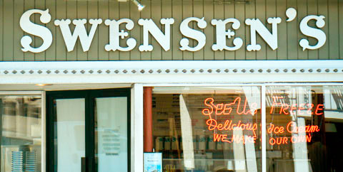
I’m happy to report that my favourite ice cream shop in San Francisco also has good typographic taste. The fact that the apostrophe in Swensen’s is not only typographically correct and good-looking is, unfortunately, due to the fact that it was put up there by a signwriter a long time ago, when craftsmen still had to learn a trade in order to practise it.