 On May 24th Adrian Frutiger celebrated his 80th birthday. To mark the occasion I wrote a short piece for the Swiss magazine Hochparterre. At the time, this blog was not very active and I only got the German version published. In the meantime, my son, Dylan, has translated the article into English.
Adrian Frutiger: Mr. Univers
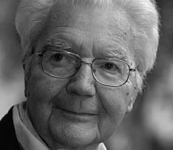
When you get to a certain age, like myself, you often gets asked who your influences were and are. An easy response is to name nationally or internationally renowned favourites such as Gandhi or Albert Schweitzer. Ones own parents tend to score high on the list, at least if they’re still living and able to read the accolades. As far as I’m concerned my choice has been a simple one for over 30 years: I first met Adrian Frutiger in 1976, and to this day he remains my idol.
Adrian as a colleague
He was the best of colleagues; he gave advice, discussed things, listened and had time for questions which a novice like me could barely formulate properly. At the annual ATypI meetings, which in those days were still pretty small, all the type designers knew one another. Most of them were connected to a manufacturer, who sold their typesetting machines as well as the typefaces that went with them. So the designers were really competitors, yet the atmosphere was friendly nevertheless, as is usually the case whenever specialists get together in a business as manageable as type design was at the time.
We met a little later in private at Walter Greisner’s, then head of D. Stempel AG, the type foundry within the Linotype group. In the small world of type designers there was no room for big egos, and as a friend of the house I was allowed to be on first name terms with my hero from the start. I had only just turned 30 and hadn’t yet designed my own typeface, but after having got to know Adrian I was determined to give it a go.
Univers 1957
Frutiger had just released a Linotype typeface named after himself, which he had originally developed for the signage at Roissy airport (now Charles de Gaulle). Nearly 20 years previously, in 1957, his Univers was released by Deberny & Peignot in Paris. The same year, by the way, that the Citroen DS was introduced – a similarly radical design. Helvetica, too, dates from this period. It was conceived as a commercial response to the success of the German Akzidenz Grotesk, which was highly rated by the Swiss designers due to its neutral robustness. The Neue Haas Grotesk, as Helvetica was first known, was from Münchenstein near Basel and was intended as a refinement (or simplification, if you like) of existing typefaces. Univers, on the other hand, was conceived as something new right from the start: as a system of complementary degrees of boldness and width forming a family of 21 weights. This incredible project, for which umpteen thousand steel punches had to be engraved (each character in each size), was the brainchild of a type designer from the Bernese Oberland who, not yet 30 years old, had been given free rein by his employer in Paris to undertake this enormous task.
This revolutionary type project breathed some fresh air into the Swiss design scene. Back then there were design factions which were not only classifiable by cities and schools, but also by their loyalty to certain typefaces. Soon there were not only Akzidenz Grotesk supporters, but also a Univers faction, not to mention the Helvetica community. Every typeface has its own design canon, thus for many designers the choice of typeface was at the same time a choice of direction. There were few choices of typefaces at the time, because apart from typesetting systems, the choice was dependent on the respective printers.
Munich 1972
Univers wasn’t accepted as readily as its Swiss half-sister Helvetica. However, it became a household name to all designers the world over during the Olympic Games in Munich in 1972. Otl Aicher and his team developed an image in which Univers played a leading role. Light, jolly colours and a precise but flexible grid helped the typeface make a unique appearance.
Roissy signage
At that time Frutiger was already busy working on the Roissy project. He had by then notched up some 20 years’ of experience in type design, and had passed from hot metal setting to photosetting and early digital methods of typesetting. He himself was aware of the flaws of Univers when it came to employing it for signage, which has different needs from those of a reading text on paper. Even though airports and train stations still use Univers on signs to this day, Frutiger realised back then that an entirely different kind of typeface was required. He once told me in the early ’90s that Univers wasn’t suitable for signage. At the time we were looking for a narrower version of Frutiger for the Berlin transport system signage, which didn’t yet exist in digitised form. So we had to digitise parts of the typeface ourselves, and have him give his blessing to a few introduced alterations. We also drew an Italic, because the typical Frutigerian slanted cut wasn’t distinctive enough for information on the Underground signs. Adrian would comment on the designs that I showed him by saying ”that’s not bad, but I would have done it differently”; both a go-ahead and a critique in one sentence. For fundamental reasons, he had never designed italic forms in the Roman tradition for his sans serif faces, preferring instead to make slanted versions of the upright cuts. However, for the new edition under the name of Frutiger Next, he let himself be convinced to produce a proper italic in order to meet the market demands, which looks a lot like our Transit Kursiv from 1991.
System with feeling
I know of no other typeface designer who can put so much feeling into a systematic approach. Frutiger’s typefaces are always planned, but they never look it. He developed number schemes for stroke width ratios and width proportions, yet never a priori by equation or interpolation, instead by feel for the right measurements. None of his designs were ever made to be bestsellers or classics, they were always made with the specific requirements in mind, usually demanded by the employer and only occasionally due to the desire to fit a particular genre. Adrian Frutiger long ago decided that he had contributed to every typeface classification and could only repeat himself. It’s a good job he at least let himself be convinced to oversee the new editions of his many classics, because modern technology allows all sorts of details which couldn’t be realised in his day.
Whoever fancies creating a typeface ought to know that we don’t design the black strokes, but the white spaces in between. Adrian Frutiger’s method of cutting shapes out of black paper using scissors and then sticking them together to make letters and characters can be traced, according to him, to the traditions of his native Interlaken. That’s what gave him the best tool – his intrinsic feel for inner and outer shapes, for rhythm, contrast, tension and consistency, and how to transform all these into shapes which are more than mere alpha-numeric characters.
What’s the best typeface in the world for the Latin alphabet? Frutiger, of course. It combines the talent of an unassuming designer who has devoted over fifty years to these little characters with the knowledge and experience of all the technology that has come and gone in that time. It is totally appropriate that this typeface, which started out as Concorde, bears his name today. It means that he stands alongside Garamond, Caslon, Bodoni, Gill and the other typeface designers who expressed and captured their epochs for posterity.
This homage is no doubt extremely embarrassing for him.
I am a young designer working in London. A project I am currently working on requires the use of Univers. I must say I have never truly appreciated Univers until I have been sat staring at it for hour after hour. However I can now hold my hand up and say that I am a true believer in this beautifully crafted typeface.
Happy Birthday Mr Univers!
Thank you for this wonderful appreciation.
And thanks for the acknowledgement that Frutiger is the best. Some might say that’s merely a subjective opinion, but those people would be just plain wrong.
Thank you for writing this. I am a young designer and I love type. It’s really inspiring to me to read accounts of those I look up to (both you and Mr. Frutiger). Hearing the way they think, the things they say, and how they create is an awesome insight.
Thank you.
Same birthday as me…how funny….love his fonts by the way. Clever guy.
I am also a fan of Univers, and Adrian Frutiger. I can relate very well to Tony’s post above.