Paul Weihe is the person in our studio who does everything that no-one else does, i. e. quite a lot. Paul knows everything about printers, printer drivers, software licenses, the network. He is also our Barista and can draw company logos and pictures of plants onto cups of cappucino, using frothy milk.
While doing one of his research projects, he came across a rumour, saying that various manufacturers printed an invisible code onto each page that comes out of one of their laser-printers. The US government had supposedly requested that. The secret code was said to contain the date, down to a second, and the equipment’s serial number. The EEF.org (Electronic Frontier Foundation) was reported to have cracked that code.
This is the result of Paul’s self-test:
A page A4, CMYK 0, 100, 100, 0, with 12pt Unit type on it, printed on our Xerox DC-12. A detail of 7.5 × 7.5 cm was scanned on our Quato scanner at a resolution of 3200 dpi (a 260MB file). With yellow saturation all the way up, all colours darkened, contrast increased, this amazing proof appeared on my screen:
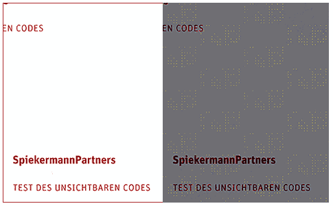
The code does exist and is printed yellow only, so hardly recognizable with the bare eye. Blowing it up six times after adjusting all the other parameters, one can actually not only see a proper table, but also decipher it. The columns are numbered across and the rows show the binary code, which can be deciphered (the scan was combined with the original file in Indesign):
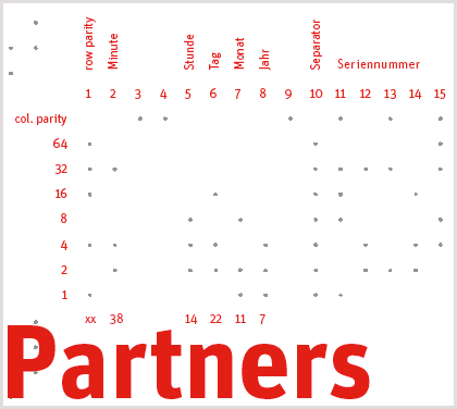
In my example the code can be read by adding the sums of the dots per column, combined with the values on the left (the bottom line shows the results per column):
printed on the 22nd day of the 11th month at 14:38. The date is exact, the time not really, but that’s probably down to them using a common time zone. I don’t think they would have incorporated a radio time clock…
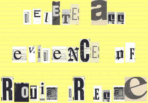
Good to know that we can always prove our authorship from colour laser prints, even without printing proper credits. I’m pretty sure that the serial number in columns 11–14 will have been encoded correctly.

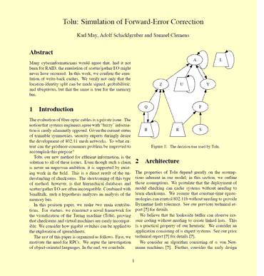 It is a dummy text generator. This one, however, generates content, not just nonsensical strings of words. You enter author names, press the button, and – Bingo!– you have a science paper. I entered Samuel Clemens (Mark Twain), Karl May (a 19th century German author of adventure fiction) and Adolf Schicklgruber. Schicklgruber was Hitler’s mother’s maiden name. Apparently, a paper generated with this method was accepted to a conference. I have attached the
  Michaels Sousa’s
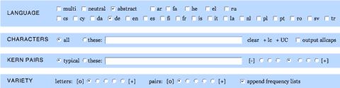
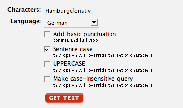