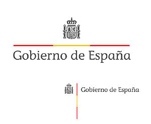
Alexis from Spain just wrote to me about a competition the Spanish government ran to get a new logo. They just published the winning entry (out of 320) which was rewarded 12,000 euros. On the left you can see the new logo for the govenment of Spain. It is supposed to be built into a complete identity system by professionell studios. If you read Spanish, check this link.
Alexis immediately knew where he’d seen that logo before. It looks exactly like the one for the German government that also came out of a competition, but more than ten years ago. It was designed by Jürgen Huber and Lisa Eidt who won an internship at MetaDesign as part of the reward. There the logo was extended into a Corporate Design programme for all the government departments. The original typeface, by the way, was FF Transit, but later got changed to Univers Condensed by another agency working for the government.
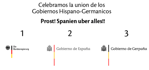
Alexis took the German original and the Spanish clone and built his own logo for German-Spanish cooperation.
Typical spanish!
they just “copy and paste” and that´s all. I think the designer is not the problem (young person, perhaps, saw something in a school trip to Germany, and so on ;>))…)
The big question is who selected it as the best among 350?, is there a copy as well of French, Chinese or Monaco logos?. IF YOU WERE A MEMBER OF THE JURY, PLEASE, STAND UP, and go out of the classroom, you are fired!!!
I am a Spanish graphic designer and you can imagine how angry I am. Besides, I have discovered a new “too much seemed” between the crown of that logo and the one which was designed for the America discovery’s Fifth Centenary logo, by José María Cruz Novillo. You can see the seemed here.
Been a half-spaniard makes me nuts to see that a government prefers to make a competition with such a low budget! It’s like their olive oil, they sell it to Italy which rebrands it under the denomination “made in Italy” and then it ships worldwide…
Look at this interview with the spanish graphic designer:
http://www.adn.es/politica/20070817/NWS-1893-Juan-polemica-politico-sesgo-tiene.html
It’s a shame.
It’s so bad copied, too: the proportions suck.
http://www.summa.es/wordpress/?p=476
I´m a spanish designer. It´s clear that in my country “Design” is not yet a common word. It´s still not respected by people, goberment and cultural institutions. There are not public quality design schools (big part of the problem) and although the situation has improved in the lasts years and there are a lot of excellent designers, our work is still not respected as how it should.
Whoops!
Well, at least it didn’t cost € 100k like this one: http://tinyurl.com/yv94gp . What were the members of the jury thinking, though?
Not all the designers born in Spain have the same wrong blood… Repullés is one of the bad apples.
By the way the contest bases published by the Spanish Government were wrote using the “tipography” comic sans! I think the problem is not here (in Spain) are not good designers… Is a problem about the general graphic culture that have most of the Spanish institutions, beginning for our Government. And it’s very very sad, specially for us, the spanish designers.
How unfortunate – Is it that difficult to vet the results of competitions for originality and plagerism? More importantly, what on earth are governments thinking when to turn this sort of thing into a contest?
Quality is another story of course – Here’s the logo for the Canadian province of Newfoundland.
http://www.gov.nf.ca/brand/
As far as I know this was not the result of a contest.
Oh god. People have just no shame!
http://www.margen.com/aviso.htm
A copy…just a bad copy, bad proportioned, bad harmorny…and a bad tipography choice for a Goverment…
JUST INCREDIBLE! That was the best idea?.
Like Ortega y Gasset said “When you copy, you stole others solutions for others problems… so you can not know if it works because you didn´t think in your own problem and how to solve it…”
Saffron Consultants were there and the Spanish government didn’t used Wally for such a task? Too bad.
Public contests will give poor quality almost every time. Plus, you can ruin your reputation in a second, just like the designer who “found” the same solution for the Spanish problem. I mean, what he was thinking? That no one will found out?
But in my opinion, the designer is not to be blamed entirely, but rather put the guilt on the council who approved such a solution without further research to see if anything like it could come up. Shame on them. They got what they asked for I guess…
I can understand some two-bit start-up running this kind of competition (that does nothing for the graphic design industry), but governments! What’s the saying? “You pay peanuts, you get…”.
Of course, they should have contacted Spiekermann and co. and, although that kind of flattery will get me nowhere, it may have — in all seriousness — produced a better end product; a real logo, rather than an ersatz one.