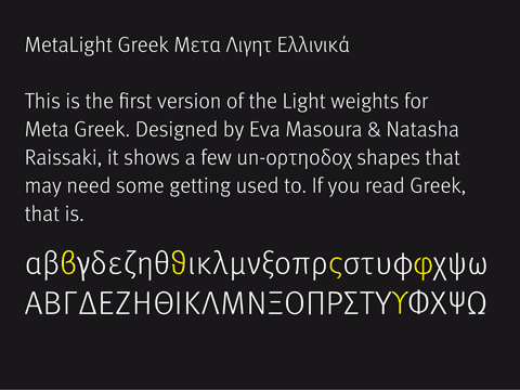
Apart from working on new typefaces, I have to keep expanding the existing families. OpenType not only represents the Latin alphabet, but can also include other character sets. Meta has long since had Greek and Cyrillic versions. MetaHeadline and MetaLight have not, however, been expanded to include those character sets.
Now, finally, two type designers in Athens have finished the first weight, MetaLight Greek. Thin and Hairline will follow.
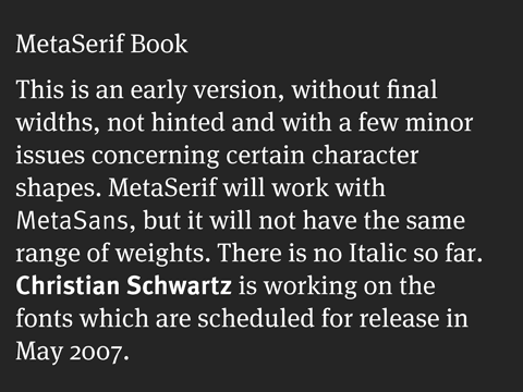
MetaSerif
This is the first public showing of the new Antiqua. Lots of details will still change, but the overall impression stays. A solid working serif which matches MetaSans in weight and x-height.
Get rich through typedesign?
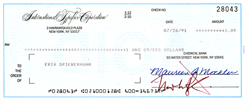
While sorting through old stuff (I’m looking for the first sketches for Officina) I came across the first cheque ITC wrote me in the summer of 1991. ITC Officina had officially been introduced in November 1990 after we had delivered data as early as 1989. In preparation for a TypeBoard Review Meeting on January 21st I had introduced my concept:
„My favourite idea = a correspondence face, on the same lines of thinking as Stone Informal; a face for business correspondence that reads better while taking up less space than Courier or Pica, but still doesn’t look too much like a proper “designed” typeface – because once you’re using a real typeface, the whole page wants to be laid-out, to be designed. A business letter, an estimate, an invoice should be more neutral, not making a comment about its content. So we need something between Courier and American Typewriter, again perhaps both with and without serifs. Also the present versions of Courier and Letter Gothic available for LaserWriters by Adobe and Bitstream are too light to withstand more than one copy stage (ITC Officina).
Obviously, the name was in the air already. After that meeting, I made a proper proposal which I cannot find in my files right now. I am sure we’ll find that document soon so I can publish it in the course of this research into typographic history.
The first cheque came to the unbelievable sum of One Dollar and Nine Cents. The fees for cashing it would have been much higher, so I kept it as an original document. ITC Officina is still a bestseller in that library. And although the license fees are a little higher these days, I certainly couldn’t live from that money.
Meanwhile, at University
Just did a quick workshop in preparation for a proper workshop at the University of the Arts in Bremen. Those are the people who gave me the Professor title. While they don’t pay me for the work, it feels good to go back and confront young students now and again. We’re trying to come up with a concept for a big event this summer which will be under the heading of “Phantasy”. Not the type that gave its name to a film genre, but the stuff that conjurs up images of rainbows. The stuff that us rule-based designers have a hard time relating to.
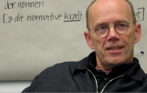
foto: johannes ellmer

Good information design
Good information design is very rare. Often, a printed instructional piece may work but look really boring and will usually be set in one of those institutional typefaces. More often than not, however, forms and instructions tend not only to be ugly, but also useless.
This mailing from the Royal Mail in the UK is different. The marketing people actually came up with a simple concept. There are only three classes of mail: Letters, Large Letters and Packets.. While measurements and weights are simply listed, a clever device makes all the difference: the size of the pieces is demonstrated by printing their same-size outlines onto the form, as well as a white slot representing the maximum thickness. A photo next to that illustration shows how one can simply hold a letter up to the illustration and check whether it would fit.
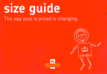
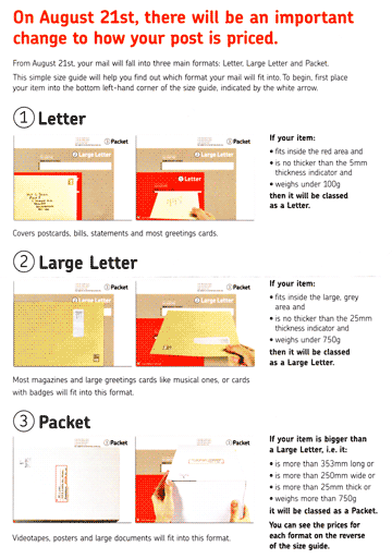
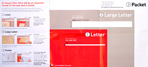
This is all designed clearly and modestly, without a designer trying to show what tricks she has learned in Photoshop. And it is set in a wonderful typeface: Chevin, by Nick Cook. FontFont users may have heard of Nick, as he designed FF Penguin, years ago. Today he runs the G-Type foundry.
Chevin is not the Royal Mail’s official corporate font and certainly wouldn’t be suitable for long, serious financial reports. It is charming without being cute, and very legible even in small sizes because of its restrained shapes and simple construction. I am pretty certain that this form has proven to be useful in many households and will not be chucked out, unlike most mailings that find their way into our letterboxes.
100 best typefaces, final result.
Jürgen Siebert of FontShop Germany has just announced the result of the search for the 100 best typefaces. The website, 100besteschriften, will be online very soon. The brochure in pdf form is already available for download at 100besteschriften. So far, there is only a German version, but with plenty of pictures.
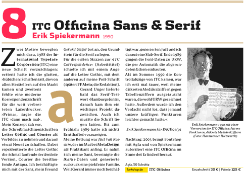
I can proudly announce that three of my faces made it: ITC Officina at number 8, FF Meta at 18 and FF Info at 53. This occasion seemed appropriate to republish a few remarks about the history behind Officina Display.
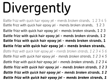
ITC Officina Display
ITC Officina Display und ihre Herkunft.
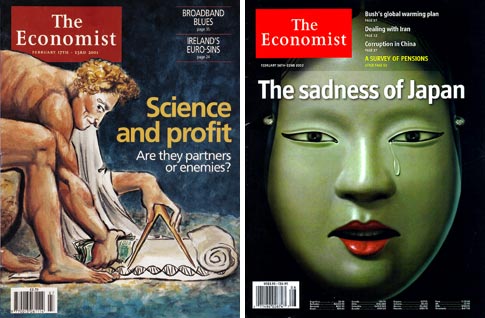
When we (Ben Acornley and myself at MetaLondon) redesigned The Economist magazine in London in 2000/2001 (the new magazine was launched in May 2001,) we picked ITC Officina Sans as the “information” face. All text is set in the Economist’s own typeface, which Ole Schäfer and myself redesigned for the relaunch. But all the graphs, tables, sidebars and captions are set in ITC Officina Sans for contrast and clarity. When it came to using that face on the cover in fairly large sizes, the client deemed it a little too “goofy”. Officina’s blunt edges, its explicit pseudo-serifs and oblique terminals were indeed very noticeable in the Bold and Black weights they were using for the cover.
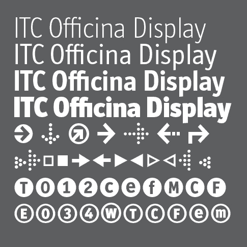
The display version I sketched out had sharp corners, the terminals are not as oblique, and the swings at the top left of the characters have all but gone. This allows the face to be set much more tightly and doesn’t draw too much attention to individual letters. Ole Schäfer had already expanded the original family of Book and Bold while at college and presented me his designs for comments and corrections. Out of or collaboration came the extended family with Medium, ExtraBold and Black weights, plus Small Caps and Italics, Old Style figures – the works.
Ole also did the initial digital work on the new Officina Display for The Economist. After two years’ exclusive use by that magazine, I decided to update the display family to include a Light version. The digital work was carried out by Christian Schwartz who used an extrapolated version that FontBureau had previously done for a client. Christian then improved the overall appearance of the Regular, Bold and Black weights and added a new Dingbat font. Officina Display now has the same x-height across all 4 weights. Ascenders, descenders and cap height have also been harmonized. In text faces, that would constitute a cardinal sin, as bolder weights tend to look smaller because of their reduced counter spaces. In display use, however, it is important to be able to compose word-sets and headlines with mixed weights. Nothing would be sillier than having to fix individual sizes in order to achieve maximum impact.
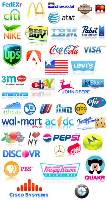
New logos for Web 2.0
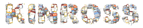
Some practical joker found the time to redesign well-known logos according to Web 2.0 fashion: gradations, reflections below, bright colours. Seen on flickr, where else. The very compressed jpeg below doesn’t show the effect properly.
Internet Explorer is not so broken anymore
It certainly seems that way if you look at this site using IE 7 or even IE 6 (!), as a some people still may be doing. I use a Mac, of course, wirh Safari and Firefox, and in both browsers I see things exactly the way my very limited HTML and CSS knowledge allow me to build them. Under IE, however, images either disappear or turn up in the wrong position.
Joely and I have been working on improving this. I have removed a lot of old tags from the import of my previous blog and a few days ago, the site validated under the w3 validator. As, however, I do not have IE installed and have no access to a Windows machine, I still cannot see what it really looks like for the rest of you.
Now that the comment function has been turned on in my blog, I’ve already got quite a few useful hints. You can also email me directly, see contact.