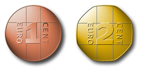
Two countries will introduce the Euro as currency on January 1, 2008, Cyprus and Malta. The fronts of the coins look the same as that of all other countries, while national symbols are displayed on the back.
This reminded me of the occasion when I got asked by the German news magazine Der Spiegel, back in 1999, to design my own version of the yet to be introduced new European coins. They also asked a few other designers whose solutions I cannot show as I have no data for them.
I noticed back then how little systematic thought had gone into designing the new coins. While there were and still are three different types of metal and several separate sizes and bevels, It would be pushing it to talk of a comprehensive design system. Much worse, however, is the fact that one still can only distinguish some of the coins by looking very closely – not a good idea for money that needs to be available at – dare I say it – the flick of a coin. One ought to be able to sort one’s change inside a pocket and count it even in the dark.

As you can see, the coins are all of slightly different sizes, albeit not different enough to distinguish by touch only. The 2-Euro piece has a diameter of 25.75 mm, the 50-Cent coin is hardly smaller at 24.25 mm, while, strangely, the 1 Euro is smaller than the one half its value, 23.25 mm. The 21.25 mm 5-Cent piece is also larger than the 10-Cent coin, which is worth more but only 19.75 mm in diameter. The different metals can only be told apart in good light.
The 20-Cent piece is the only one with a different bevel, but still hardly distinguishable from the 5-Cent piece of almost the same size. Embossed lines are to be found on the right and on the left or at an angle, but too thin and closely together as to offer any hints for probing fingers. The outline of Europe is more of a political statement than useful for identification.
The backs of the coins are look different from country to country. That offers some interesting choices but doesn’t help keep different nominations apart.
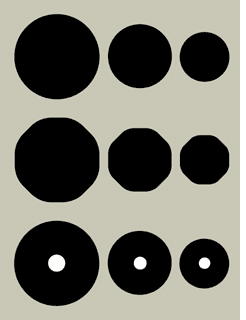
I first distinguished the groups: Ones, Twos and Fives.
The Ones, i. e. the 1-Euro coin, the 10 Cent and the 1 Cent piece, are simply round and each one approx. 20% smaller than each other. If my Euro were 23.25 mm – as is the present one – then my 10 Cent would be 18.50 mm in diameter (about the size of the present 2-Cent piece) and 1 Cent would be 16.50 mm – instead of 16.25 now.
The Twos, that is 2 Euro, 20 Cent and 2 Cent, are octagonal with very round corners, making them distinguishable in the hand. They are of the same diameter as the round coins, but appear a little larger and weigh heavier, while of the same thickness as the Ones.
The Fives are as round as the Ones, but a little thicker and with a hole in the middle, like some Scandinavian coins have been forever. There is no 5-Euro coin as yet, but the system allows for it because it makes sense. The hole in the coin can be felt with the fingers and also looks quite distinct.
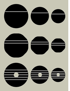
Apart from these distinctions if shape and size, the nomination is also symbolized by horizontal lines, of which there are one, two and five (!) The three Euro coins are made from silverm the 50, 20, and 10 Cent pieces from “Nordic Gold” and the three smallest nominations are coined from copper, as they are now.
At first these coins may appear a little sparse and empty. The present design is another one of these compromise as with the design of the Euro banknotes. Nothing was to be recognized as a national symbol of any country. The map of Europe is really quite contradictory in these circumstances. It is incorrect gepgraphically, as Europe is not an island with clear contours. And it is politically touchy as the map includes countries that are not part of the European Union. And where does Europe end? There are big chunks of land missing in the north and the east, and the smaller Balearic islands have been sacrificed to small scale.
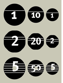
Clear figures and letters are not only less ambivalent, but also help when counting. And I could always incorporate Greek and Cyrillic letters if required.
I’ll show my proposals for the backs of the coins some other time. For now, here are two renderings from my 1999 proposal.
I guess it’s all about politics (again). I have the impression that at the time, the EU had no clue about how to use designers for this job and what to ask from them. So they prepared a whole lot of stuff with their own haphazard intuition as a guideline, mixed in, no doubt, with some ‘advice’ from politicians and EU managers who would not take no for an answer. Finally, some hi-profile design professors were called in as a jury. I remember one of the members telling me how apalled they were by the goings-on at that session: at the one crucial moment when there was still a possibility of changing direction, nobody was interested in hearing any expert opinion at all. And it’s not just the design — how about the necessity, or lack thereof, of a one-cent-coin in an era in which that amount represents the value of a fragment of a second-hand piece of chewing-gum? It’s like the EU logo. When it comes to design, bureaucracy and arrogance reign. But maybe things have gotten a little better?
PS:
…and of course, Erik, your proposal was infinitely better.
Although ‘systematic’ is possibly not the key concept.
The Dutch coins were a chaotic bunch of small and big coins in (only) two kinds of metal, no holes, just circles. But it worked intuitively, and very nicely, because there weren’t too many coins and they were very different. And of course, we’d gotten rid of the 1-cent-coin years before the EU reintroduced it.
Although ‘systematic’ is possibly not the key concept.
Systematic doesn’t mean it has to look like my sketch. Approaching this task systematically means that the result should have considered making the coins easy to use, by whatever means necessary. Having fewer of them is one way, dividing into different parts another (like in Holland, where there were quarters, i.e. 25 cents), and making them all very different from another. Not just designing a pseudo-system which only relies on the colour of the metal and not much else.
Graphic designers offer graphic solutions. Erik omits very important things from his design: weight, thickness and edge relief. I can count euro’s before seeing them.
What’s more: a hole in a ticket, document or anything else has meant ‘worth nothing’ for ages (outside scandinavia). And the most valuable coin is not the biggest, it’s the heaviest or the one mdae out of the most expensive metal. So, there’s more than the two dimensions to which Erik’s post and his design are limited.
All very true. But I only did this for a magazine article, it was never a proper commission. Of course I would consider thickness, weight and edge relief. That is what distinguishes coins from paper notes. And I am not necessarily convinced that holes in coins are the most perfect way to go. My sketches are not real coins, they were just meant to point to the fact that one ought to approach a design project like this by looking at it like a design project, not a redesign of existing coins, taking the worst of Europe instead of the best.
Even though this proposal needs refurbishment in many areas–and I am sure you are aware of that–it is still indeed infinitly better than the coins we have now.
Perhaps you should file a proposition to the EC
I fully agree that this would provide a great improvement on the coin system that exists in Europe. The 1 and 2 and 5 cent coins are nearly impossible to distinguish and this could solve this problem. However, I really question the necessity of a 2 cent coin. Yes, it fits nicely within the framework you established of the “1” coin family, “2” coin family, and “5” coin family, but it doesn’t seem practical at all.
Can hardly wait to hear your thoughts on the new design(s) for the UK coinage (now that you’ll be posting whatever you feel like…)
I’ll be writing about that in my column for form magazine soon.
Nice Blog….did u know about antioues like 1616 LIBBO coin and it’s amezing functions and it’s lakh of crores dollars.?