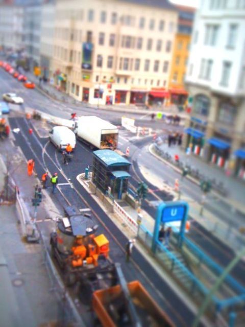
November in Berlin doesn’t look so bad when it’s turned into a toy town, courtesy tilt/shift photography.
Blogging from the iPhone
All this twittering has taken all my attention away from my blog. Perhaps using the WordPress editor on the iPhone will encourage me to once again properly publish my observations, findings and interventions.
Arial do and Arial don’t
Arial is an ugly typeface, most of us would agree. For non-designers, however, there may practical reasons now and again to use it as a quasi non-typeface.
But why use this ugly systemfont in metal, stone or another durable material? I see more and more of those applications, and I cannot think of one good reason why anybody should do this.

The example below is an appropriate use of Arial. Setting a Zimbabwean banknote for 100 Billion Dollars in anything else would have been an insult.

Mexico City
What surprised me most was the amount of public sculptures in the city. And some at an amazing scale. This one, 10 stories high, covers up a vent from the Metro, as we learnt from our taxi driver.
Webfonts
This subject is so important that people are making movies about it. This is an interview with me by Stephen Coles from FontShop about Typekit, the new service for webdesigners.
FontCast #5 — Webfonts Week: Erik Spiekermann from FontShop on Vimeo.
Numerous numbers
Good to see that I am not the only one who has to photograph numbers wherever I see them. Wardour Street in Soho ist still home to many colour labs, film-, sound- and design-studios. Someone decorated this facade by printing out hundreds of numbers and sticking them on the window.

Cheap Type
Before we had cheap digital printers and everybody started setting their little shop notices in Arial, there were dedicated systems for displaying messages in shops, bars and cafés. One of these were black boards with holes in them and letters with the appropriate pegs. You took them from a box, stuck them into the holes and had fairly neat rows of words and numbers. A shop in London rediscovered this old way of making type, making art out of necessity: If you don’t have enough type in one size or colour, take another one, but do it deliberately.
This sign showing the brands available was “art-directed” by Richie Crago at The Three Threads in Charlotte Road, Shoreditch.

A head full of letters
Apparently there is a trend to make portraits from letters only. I was very surprised to find my head in a list on typography portraits, right above that of Obama. The designer, Thierry Eamon, calls it, not surprisingly, “… a tribute to Erik Spiekermann”. I have taken the liberty to copy this picture and show it here.

Form & Function
Metal shutters in front of shop windows are hardly ever pretty. Especially not when the shop seems to be closed forever. I have no idea whether these three letters have any meaning, but they were purpose-designed for the site, with their horizontal shading painted into the grooves of the corrugated shutters. Apocryphal design at its best.


Hotel art
Hotel hallways are long by necessity and not meant to be places to spend time in. Looking out from the lift door all you normally see are the signs with the room numbers on them. Often barely legible and hardly ever designed in the typographic sense. The Sheraton in Bozen, resp. Bolzano, seems to have thought about this situation and came up with this still-life. Many small LEDs remind us of the bright lights used by hotels near railways stations in order to attract passing travellers. Not exactly literature, but more than the usual thoughtlessness extended to temporarily homeless guests.
