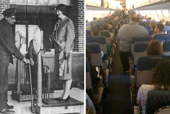
Next week I have to fly to China, and I’m already dreading the 12 hours or more on the plane. I can only hope that this man won’t sit next to me. He was photographed by a Stewardess aboard a flight in the US. These days, we’re charged for every kilogram (or pounds or ounce) of extra luggage. Sometimes I long for the days at the beginning of air-travel when every passenger – including women – would be weighed. The pilot had to know the exact weight of the plane in order to guarantee lift-off. Even with my post-christmassy 164 pounds I would qualify for a bonus compared to some folks…
An interview with Erik Spiekermann by Adrian Shaughnessy – Part 1
Taken from the book – Studio Culture: the Secret Life of the Graphic Design Studio. This is a shortened version of an interview with Erik Spiekermann. During the 1970s Spiekermann worked as a freelance designer in London before returning to Berlin in 1979 where, with two partners, he founded MetaDesign. In 2001 he left MetaDesign and started UDN (United Designers Network), with offices in Berlin, London and San Francisco. Since January 2009 he has been a director of Edenspiekermann, which employs over 100 people and has offices in Berlin and Amsterdam.
Unusually among contemporary designers, Spiekermann has a sophisticated set of theories relating to the layout, structure and management of design studios. His theories have been extensively road-tested in the various creative enterprises he has founded and run during a long career.
The interview was conducted in the offices of AIG, London.
Adrian Shaughnessy: You have a vision of your perfect studio. You’ve even got a name for it – The ‘Rundbuero’ Studio (see diagram). Can you describe it?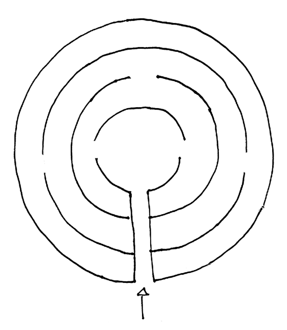
Erik Spiekermann: Ideally it’s a round space. It’s made up of three or four concentric circles. At the centre is a reception area. This is where everybody enters. It is linked to the rest of the studio by a corridor. In the central reception area are the people who answer the telephones, do the emails and make the photocopies. It’s where all the machinery is – the printers, the espresso machine. Everybody has to go in here several times a day to pick up printouts, pick up mail, get coffee and so on. Now, the further you go from the centre the quieter it gets. People in the outer rings have windows, others don’t. The walls are maybe only shoulder height. If a secretary wants to see if I’m in the outer ring, she can get up and look across and see if I’m actually there.
So the walls don’t go all the way up to the ceiling?
Not at all. You can shout across the studio. The people in the third or outer ring are the ones who need privacy. These guys spend time on the phones, and do conceptual work. People like me, in fact. All we have is a desk and a laptop – this is laptop country. In the second ring, there are proper computers with monitors. This is where the designers are; they actually spend all day working on screens. These people do physical work. There might be another ring, where people have cutting tables and boards. These are people who have to make shit.
OK, so looking at your diagram, I see four rings joined by a corridor.
Yes, in order to get anywhere you have to cross through the various rings. Every time you do anything, you have to meet other people. So, unless you never go for a pee or a coffee, you have to meet other people at least twice a day.
Clearly you think this traffic and human interchange is important to the life of a studio?
Yes. Something happened to me once that taught me an important lesson. I was with one of my ex-partners at Meta. We had an in-house restaurant run by a proper chef. There were 120 of us, but we could only make about 50 lunches, no more. Some of our people would choose not to eat there, but our clients would come every lunchtime. I was freelancing at the time and I often dropped by at 12.30pm for lunch. I was standing with five or six people and I said hello to one of them. My former partner was there and actually asked me to introduce this person to him. I said this is so and so from Siemens. But there was another person there and he held out his hand and said ‘I’m Michael, I’ve been working here for two years.’ My partner didn’t know him. With 120 people, that’s a bit embarrassing.
To me, the only way to run a studio is to have perfect knowledge about the people and the work. The idea that you can ignore areas and not get involved is unthinkable. Do you agree?
I would come in at 8.30am and spend the first three hours just walking around the place, and once a day I talked to everybody. Sometimes only just to say hello. I usually knew their names or their sisters or dogs and various members of their family. But in the end, this old-fashioned ‘managing-by-walkabout’ wasn’t popular with my partners. It led to questions such as ‘why isn’t he at his desk?’
Today, I’ve got 30+ people in Berlin, but even when I had 100+ I could present any project within half an hour’s notice. I knew enough about it. I was involved in the brief. I was at the meetings. People would come to me with questions, often with just a choice of type or whatever, but I always knew enough to do all the presentations. I find that incredibly important, otherwise you’re a manager and not a designer. I’m not a very good designer or manager, I’m ‘medium’ at both. But I’m a good motivator. Designers want to talk shop; they want to talk about design, even to an old git like me. My philosophy is that I want the physical space to inhale the traffic. I don’t want anyone slipping out unnoticed.
I want people to know that if they are slackers, or go to the toilet too many times, or take 50 smoking breaks, there is some social control. That’s not fascism, that’s simply… good management. Whenever I design a space these days, it’s the traffic that’s important. Circulation for any architect is a big issue. The blood supply has to go in and out. It’s very simple but I know so many studios that have no interaction at all.
I was always told that Germany didn’t have design studios in the British or American sense, and that most of the commercial work was done by advertising agencies. Is there such a thing as a model for the German design studio?
I hate to say this, but I think I invented it. I started in 1979 while I was working at Wolff Olins in London. We had a few German clients, and I went back and forth to look after them. One day they gave me a project because they just couldn’t handle it. Production at British companies was weak, compared to what was the standard in Germany at the time. Michael [Wolff] knew this, and Wally [Olins] knew this, and so they handed me this project and this is how I started MetaDesign, while commuting between London and Berlin every two weeks. This was 1979, early 1980s even, when the largest German design studio was about six or seven people. It was usually a boss – a famous guy – with a couple of assistants, usually fresh out of school. And more often than not, German designers were also teachers, so they had a regular income to fund their studio. The rest of the people in the studio would be students, usually unpaid.
Was this the model for Otl Aicher’s famous studio?
His studio became famous for the Olympics in 1972, but the work started in 1969. All the people he employed were from this school in Ulm. Literally, his entire class. I’m not saying they didn’t get paid, but it was a group of kids in their early 20s. For a long time, this was the German model – one guy with a few assistants. The studio layout would echo that. The main guy would be in a corner of his own office, and then there would be the studio floor, but never more than six people. In 1983 or 84 I had eight people, including interns and we were the biggest studio in the country – outside of packaging and advertising. So corporate design was done by advertising agencies and packaging designers. They were the ones who always put the stripes on the packaging, you have this brand and then you make it like this [makes diagonal motion with hands], with lots of stripes for the ‘light’ version. Then you have the specialized people and they tend to be in Hamburg for some reason. All the newspaper and magazine work, until today, was pretty much done in-house.
So you moved back to Berlin with the aim of starting your own studio?
At the time – the late 1970s – Wolff Olins was 75 people. I thought if they can do it in Britain, surely we could do it in Germany? So I came back to Berlin with the intention to build a large studio. It went up to about 16 or 18 people in the middle of the 1980s, which was quite large, and we started getting the projects that we should have been getting before. We got some large signage projects and some large corporate design projects. But the whole market in Germany was one generation behind Britain, which was one generation behind the States. And then in 1989 I realized this was getting too big for myself or too small for the big markets, so I realized I had to do something else because I’m not a businessman. I decided to bring in a businessperson.
Is there a magic number for studio size?
You can have 125 people, but the work never gets done by more then five people. The teams are never bigger than that. It’s all about group dynamics. More then seven people and you don’t increase efficiency or effectiveness, you just have more meetings. If you have 12 people, you don’t work twice as much as six people, you work 50% more, so in other words you lose money. Seven people round the table, six people plus a project manager, maybe seven plus an intern. We know this from perceptive psychology – the magic number seven – and there’s a good reason for that.
Can you talk about recruitment – how do you go about hiring people?
Until the mid-1990s there were no employed designers in German design. The advertising people employed designers but the designers in the design studios were all freelancers. People wouldn’t want to be employed. I had a really hard time finding people. The German scene was very much what the Americans call a ‘Mom and Pop shop’ – Pop did the work, Mom did invoices. This has perpetuated the idea of a strong studio being one fellow and a couple of assistants until well into the mid-1990s. And if you talk to German designers – designers in their 30s, 40s or 50s – I’m afraid many of them worked with me at one time or another. Every year we do a sort of MetaDesign anniversary, a picnic in the park, and we had up to 300 people. I trained about 600 people in the years I was there. We looked at the personnel files once, and there were always two or three interns, so that would be 20 interns a year over five years. That’s already 100 people; over ten years that’s 200 people. And if you count those, and if you count all the employees, that’s well over 600 people who I’ve personally employed at one time.
A second part of this interview will be released in this section next Wednesday 13th of January.
The full version of this interview can be found in the book Studio Culture: the Secret Life of the Graphic Design Studio, edited by Tony Brook and Adrian Shaughnessy, published by Unit Editions. The book is available to AGDA members at www.uniteditions.com
Magnetic Clarendon
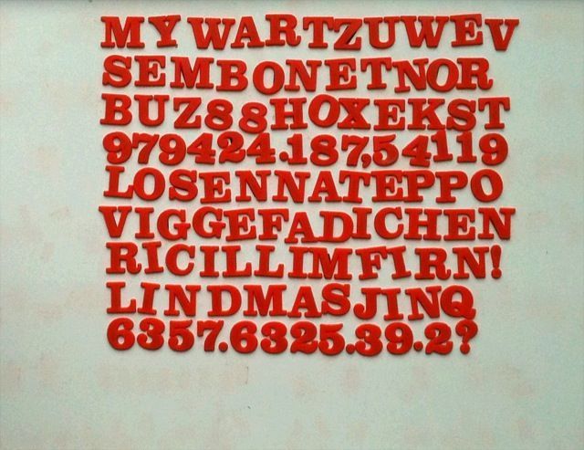
The previous post showed that blogging from a phone still leaves a lot to be desired. But I still want to make the point that technology shapes design. In this case it created a Clarendon (ca. 15mm tall) that doesn’t exist anywhere else. Similar effects can be seen with type that was produced for other methods of reproduction, from transfer type à la Letraset to wood type made for small presses that printed labels and signs for shops.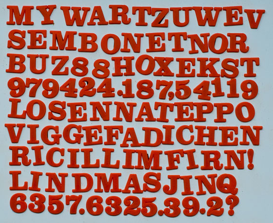
Magnetic type
This naïve rendering of Clarendon is a good example for how the material makes the shapes.
Also an example for blogging from the iPhone, including what little photo editing there is.
Real printing
I’ve had a new platen press (the previous one burnt down in 1977) and a Korrex proofing press for a while now (see Proofing press upstairs). There is also quite a bit of type and everything else I need to start work; but I still haven’t printed anything. Meanwhile, as reminder and inspiration, here is a lovely video from the US showing business cards being printed on a platen press.
Keegan Meegan Press & Bindery from :::: MAGNETIC ARCHIVES :::: kiva on Vimeo.
Toy Station
TiltShift photos make every picture look like a scene from a toy train catalogue. As the iPhone will not take really good “real” photographs, I prefer to apply effects like TiltShift, even with an app that fakes the effect by applying artificial focus to over-saturated images. At least that generates cool-looking pictures for on-screen use. This one shows the Gare de Lyon in Paris.

The Helvetica movie – more
Somebody has taken the trouble and uploaded some extra material from the Helvetica DVD to You Tube:
Bauhaus: a style?
Another column from Blueprint magazine. I think it appeared in the november issue.
For more than 40 years my letterhead has consisted of a red bar at the top of the page, with my name reversed out of it. Some of my educated friends still feel they have to make remarks about that device, especially now that the Bauhaus celebrates its 90th birthday and Berlin is covered in posters emulating what is obviously perceived as a specific style.
Perhaps we Germans should be glad that we have created at least one world-famous and perhaps even popular style, but, know-alls that we are, we have to point out that the Bauhaus was much more than a simple style. Having been invented in Germany (if not entirely by Germans), it had to have a theory as well as a serious message to mankind.
Herbert Bayer paraphrased the Bauhaus proposition as ‘combining the areas of utilitarian design, after researching their constituent elements, under the purpose of “Bau” (German for building or construction)’. ‘Researching their elements’ meant discussing economical, social, formal and ethical topics to form a theoretical, scientific basis for design, in order to move away from personal, purely artistic attitudes. ‘Bau’ meant every artefact, not just buildings made from stone or steel.
One of the main problems with most of what we know about the Bauhaus (and other periods or styles, for that matter) is that we have only seen these artefacts filtered through some intervening technology: photographs of buildings; scans of book pages, more often than not reproductions of reproductions and hardly ever at the original size. This process tends to be kind to the printed pieces from the Bauhaus workshops. What was actually fairly crude typesetting from a very limited choice of fonts and plain letterpress printing on bad paper, today appeals to us as lovingly handmade, put together by charming, bespectacled gentlemen, sporting interesting facial hair-styles, under enameled lampshades in cosy mid-European ateliers. I bet the poor compositors who had to work to detailed sketches from designers such as El Lissitzky hated every minute of it. They would have much rather set straightforward columns of plain type instead of having to compose impossible illustrations from metal rules and 12-pica full points. At the same time it must have been frustrating for Lissitzky and his colleagues to have their imagination constrained by the tight limits of a mechanical craft that was more rule-based than the most Teutonic of engineers could have wished.
Crude as it was, this new way of constructing pages, rather than simply setting them from the top down and centred, soon created a demand. In 1928, Bayer observed that more than 50 per cent of the orders taken by printers in Frankfurt were specified to be set in the ‘Bauhaus Style’. By that time this had been reduced to big dots and heavy bars or, worse still, ornaments and imitations of nature by means of typographic materials. The original concept of being true to the material had come full circle.
If the Bauhaus concept had already been reduced to a mere style as early as 1928, while it was still going – perhaps even as strong as in the beginning – how can we be surprised that today a red bar is enough to evoke it? What would it mean today to be ‘true to the material’ when the material consists of invisible noughts and ones? How would we define ‘utilitarian design’ when we are supposed to invent experiences and virtual worlds for the consumer to get sucked into?
What’s left? Discussing economical, social, formal and ethical topics may well be desirable again when we design not just artefacts but processes, politics and, in fact, our future. Connecting these issues under the topos of design is what the Bauhaus invented. Creating networks, thinking across disciplines. What we call networks but tend to only get in the shape of cables is the way out for designers. The way out of their isolation, caught between clients asking for free pitches and competitors ready to do the same work for half the fee. The way out of the alienation and isolation caused by unlimited technology, which, by definition, is irresponsible.
If the red bar on my letterhead reminds me of this premise, I can live with the fact that, for most people, the Bauhaus is just another style.
Easypeasy
While avoiding writing my next column for Blueprint magazine, I found the piece I wrote last year about the same topic, Japan. There is no other reason to publish it here and now except the fact that I have it right in front of me now, an unformatted text file.
When Japanese products first turned up in the West, they were cheap and generally not very challenging technically. Those were the days when Japanese companies would hide their identity behind English or better still, American-sounding names like Bridgestone, Panasonic, JVC, and NEC. A product from Japan was generally a poor imitation of the real thing and lacked originality. Price was the main feature, brand loyalty unlikely.
It was easy for the established brands to exploit widespread prejudice against Asian products and dismiss them as inferior. How could a country that nobody knew much about and that had been devastated by nuclear bombs possibly challenge western standards? Didn’t they all still sleep on the floor in wooden houses, eat rice out of wooden bowls and communicate with primitive brush strokes?
In the late Fifties, when they were first seen in the USA, Japanese cars looked like pocket-sized versions of large American models, fins and all. The first models did very badly in the USA. Pocket-sized, however, was the operative word: while in the US bigger was better, Japanese products always had to deal with the fact that a population of 100m has to live on a narrow coastal strip along a few rather small islands. Things made in Japan were small and kept getting smaller because a normal household there has as much space at its disposal as one car does in America. Japan has no natural resources, no room for landfills and a culture that doesn’t like ostentatious display of wealth. (The first facts may actually be the reason for the third). The opposite of Texas, as it were. Making things well and as small as possible seemed to be as natural to a Japanese engineer as over-engineering was to his German colleague. Where else would you find a book describing 101 ways to package an egg? The package itself was not seen as something merely to guarantee safe transportation, to be discarded at the end of that journey, but as serving its own aesthetic purpose.
It was in this spirit that in 1979 Sony introduced the first truly portable music player, the Walkman. It didn’t need to look like a traditional tape-recorder, because its purpose was to package music, not cassettes. It was also the first device that isolated its users from the world around them by introducing headphones as the only output for sound. Anybody who has ever travelled on public transportation in Tokyo will appreciate why that can be a blessing for both sides. With the Walkman, Sony had become a major global brand and a quality standard.
While Japanese products stood for mass production before, now they symbolized innovation. Suddenly, hitherto unpronounceable brands like Yamaha, Mitsubishi, Hitachi or Toyota not only became household names in the West, but also stood for premium brands that didn’t need to be cheap to sell. Some of the biggest Japanese companies still make products under western-sounding pseudonyms: Epson (Son of Electric Printer, really!) printers are made by Seiko Epson Corporation from Nagano, Roland synthesizers by Rorando Kabushiki Kaisha from Shizuoka and Bridgestone is still the trade name of Kabushiki-gaisha Burijisuton from Fukuoka. In other cases, the Japanese language provides a nice consonant-vowel pattern, making names like Nikon, Canon, Honda, and Nissan, sound pleasant and instantly familiar to western ears.
It has, however, taken Japanese brands a long time to be confident about their heritage. About 10 years ago, we worked with Lexus to reposition its brand in Europe. When we told the gentlemen who came to visit from Japan that it was a good idea if it owned up to being Japanese instead of pretending to be a pseudo-Mercedes of unknown origin, they thought we were quite mad. We showed them that Japanese qualities like modesty, precision and attention to detail produced cars that afforded the utmost luxury: the absence of stress. Luxury doesn’t have to mean ostentatious displays of gold chrome, but can also mean a Zen-like concentration on the essential. They never quite believed us, and it has taken Lexus another decade to arrive at the current positioning which is self-confident and relaxed.
Japanese brands don’t have to prove anything anymore. They are now imitated by those they tried to emulate 40 years ago. In a globalized world, only authentic brands will survive, and heritage has become a virtue, not something to hide. Cheap products now come from elsewhere. In a country without oil, gas or minerals, the human brain has become the most powerful resource. The lesson we can learn here in Europe is that progress is not about making more, but better.