Our bookshelves in Berlin run over two floors. The only way to get to them is by using a harness.
Bookshelves
If you – like me – have more than one book and never know how to arrange them, watch this movie. It was made by the owners of Type bookstore in Toronto.
My ideal studio
Creative Arte TV gave me 8 minutes to draw my ideal studio space. For those of you who have already commented on the practical issues, like where the daylight might come from and where the toilets are: this is an idea, not a plan.
Little Printer
Connected to the Web, Little Printer has wide range of sources available to check on your behalf. We call them “publications”. Subscribe to your favourites and choose when you’d like them delivered. Right on time Little Printer gathers everything it needs to prepare a neat little personalised package, printed as soon as you press the button.
Check out the website or watch the video:
Fear of the First Line
Now and again, Blueprint magazine publishes one of my monthly columns on their website. This is the November column.
ONCE I KNOW what topic I want to (or have to) write about, the most critical decision becomes inevitable: how to begin? No evening class in Creative Writing, no journalism course fails to mention how important the first sentence is for the impression a text makes upon the unprepared reader. Norbert Miller, a German literary historian, published a collection of essays about what he called this ‘radical decision’. The first sentence compresses the infinite space for reflection into a finite object, settling on one version out of a multitude of variations and possible strategies.
Consider these alternatives: ‘It was a dark and stormy night.’ and ‘One morning, as Gregor Samsa was waking up from anxious dreams, he discovered that in his bed he had been changed into a monstrous verminous bug.’
The first example is by the Victorian novelist Edward George Bulwer-Lytton, who thus began his Paul Clifford. The second is, of course, from Franz Kafka’s Metamorphosis. After a beginning like this, you know Kafka’s novel is not going to be light reading, while Bulwer-Lytton’s turn of phrase does not bode well if you’re looking for world literature. Its author gave his name to the Bulwer-Lytton Fiction Contest, which challenges entrants to compose bad opening sentences to imaginary novels. The 2011 winner, Professor Sue Fondrie from Oshkosh, Wisconsin, wrote: ‘Cheryl’s mind turned like the vanesof a wind-powered turbine, chopping her sparrow-like thoughts into bloody pieces that fell onto a growing pile of forgotten memories’.
If you spend any time reading press releases, this style of writing won’t surprise you, even though the topics may be less personal. Mixing as many unrelated metaphors as possible into one statement seems to be considered a high art in those circles. Many trades have developed their own style of templated writing. You can actually find bullshit generators online that provide ready-made statements, such as this from artybollocks.com: ‘My work explores the relationship between acquired synesthesia and emotional memories. With influences as diverse as Nietzsche and Roy Lichtenstein, new synergies are crafted from both.’
If that isn’t good (or bad) enough for your purpose, there are alternatives: ‘My work explores the relationship between the tyranny of ageing and skateboard ethics. With influences as diverse as Kierkegaard and John Lennon, new combinations are generated from both simple and complex meanings.’
Increasing levels of complexity, cliche and incomprehensibility are on offer. I am sure that there are bullshit generators for architects and designers somewhere. I haven’t bothered to look for them yet for fear of being infected.
Before one even gets to the first sentence, though, potential readers have to pass another obstacle: the title of the book. While the Bulwer-Lytton Fiction Contest encourages people to write original lines just for the contest, the Bookseller/Diagram Prize for Oddest Title of the Year, commonly known as the Diagram Prize, is a humorous literary award that has been made annually since 2000. The winner is decided by a public vote on the Bookseller’s website. The very first award in 1978 went to a publication by the University of Tokyo Press about medical studies using laboratory mice with inhibited immune systems, accordingly but somewhat surprisingly titled Proceedings of the Second International Workshop on Nude Mice.
The 2000 winner delighted with High Performance Stiffened Structures, published by the Institution of Mechanical Engineers. Then there’s Highlights in the History of Concrete, by CC Stanley, published by the British Cement Association. It stormed the Oddest Title in 1994.
What is almost as difficult as starting a text is finishing it. At the end, you are supposed to offer some closure, like answering the rhetorical question posed in the first paragraph; revealing an unexpected answer to a problem that your article had discovered, or at least wrapping up your ramblings with a phrase that would make punters happy about just having grown older by 10 minutes reading it without immediate danger to their health. There could even be a conclusion that would add lasting benefit to all that intellectual activity.
This time, I got to my 800 words or so rather cheaply: a quarter are quotes. To get maximum benefit from reading this, you should look online for bullshit detectors and humorous literary awards. If nothing else, it’ll help against the dreaded Fear of the First Line: you can always do better.
Creative block
This seems to be a “trending topic”. Just read about seven tips by Mark McGuinness to avoid Creative Block (yes, captitalized) and went on to look what I had written to Alex Cornell two years ago when he asked me “What do you do to inspire your creativity when you are in a rut?”
I sent my answer in a short email, without thinking about it too much, mentioning only six strategies. I have since added a seventh. BTW: Alex is writing a book about the topic, to be published soon by Princeton Architectural Press.
I have seven strategies for this situation:
1. Avoid
Do something else, wash the car, back-up your data, do errands…
2. Think
Sit back and think about the issue, just let your mind go…
3. Research
Look up stuff, go through your old projects, but avoid Google — it takes too long to find anything useful…
4. Collect
We all have lots of stuff; there must be something in there that is waiting to be used…
5. Sketch
Drawing is great, even if you have no talent. Just visualising the simplest things makes them come alive…
6. Deconstruct
Take the problem apart, look at the parts and then put them back together…
7. Talk
Find somebody to talk to. I cannot really think unless I talk, and as I do, ideas come up.
I have uploaded a little brochure from the series that we publish at Edenspiekermann now and again. This one features the essay by Heinrich Kleist “On the gradual completion of thoughts during speech”. The brochure has the text in German and English, and the languages start at either end of the printed piece. The PDF, therefore, needs to be turned around to read it properly in English.
Warning to all bike thieves!
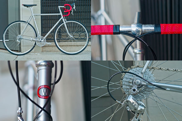
My old Rivendell road bike was stolen in June. I’d had it for a long time and losing it did hurt. I think stealing a bicycle like that is more than just a little misdemeanour; it is a wicked crime and shows really bad character.
The only way I could get over the loss was by going to see Bradley Woehl at the American Cyclery in San Francisco and have him build me a new bicycle. The frame is made by Waterford in Wisconsin, the paint job is pretty much the same as my Rivendell and the parts are mostly Campagnola. We put 28 tyres on it, which looks less elegant than 23, but if you have seen the roads here in San Francisco, you know that even that is too thin.
I’m publishing a few pictures here as a public record. If anybody dares steal this bike, there’ll be lots of people looking out for it.
On 9/11, by John Perry Barlow
John sends occasional messages to a list of friends. This particular one arrived on Sunday, September 11, 2011. All the sunday papers were full of statements, predictions, analysis and opinions about what happened and what it meant. But nothing I read was as concise and comprehensible as what JPB wrote – yesterday and ten years ago.
A warning, ten years on…
Ten years ago, on the afternoon of September 11, 2001, I sent the text appended below to the BarlowFriendz List. I resend it now, less with the smugness of having told you so – since there was little any of us could have done to prevent what followed – than with a heavy heart over how accurate my prediction proved to be.
The answer to terrorism is not fear. Nor is it violence. Nor is it transforming our country in the very ways Al Queda wished, thus betraying everything America stood for and becoming an arbitrarily violent and surveillant nation that routinely tortures perceived enemies and incarcerates them indefinitely without due process.
If only we’d had the courage and self-assurance to say, “Nice shooting, Assholes, but we have lots of tall buildings.” And left it at that. If only we’d had the courage to respond to terrorism with a steadfast unwillingness to be terrorized. If only we’d recognized the trap we were being led into. But we didn’t.
Now America is a parody of what it was that day 10 years ago. We have bankrupted ourselves and slaughtered tens of thousands with pointless wars of reaction. We have gutted our enlightened guarantees of civil liberty and governmental restraint. We have lost our way. And we have become the very monster Osama bin Laden perceived us to be.
This is a sad day indeed. Not merely because it refreshes the tragedies of that terrible day, but because it also reminds us of all the tragedies – most of them far worse and more permanent in effect – that we subsequently inflicted upon ourselves and on countless innocents here and abroad in reaction to those events.
In any case, this is what I said then:
This morning’s events are roughly equivalent to the Reichstag fire
that provided the social opportunity for the Nazi take-over of
Germany.
I am not suggesting that, like the Nazis, the authoritarian forces
in America actually had a direct role in perpetrating this
mind-blistering tragedy. (Though their indirect role deserves a much
longer discussion.)
Nevertheless, nothing could serve those who believe that American
“safety” is more important than American liberty better than
something like this. Control freaks will dine on this day for the
rest of our lives.
Within a few hours, we will see beginning the most vigorous efforts
to end what remains of freedom in America. Those of who are willing
to sacrifice a little – largely illusory – safety in order to
maintain our faith in the original ideals of America will have to
fight for those ideals just as vigorously.
I beg you to begin NOW to do whatever you can – whether writing your
public officials, joining the ACLU or EFF, taking to the streets, or
living visibly free and fearless lives – to prevent the spasm of
control mania from destroying the dreams that far more have died for
over the last two hundred twenty five years than died this morning.
Don’t let the terrorists or (their natural allies) the fascists win.
Remember that the goal of terrorism is to create increasingly
paralytic totalitarianism in the government it attacks. Don’t give
them the satisfaction.
Fear nothing. Live free.
And, please, let us try to forgive those who have committed these
appalling crimes. If we hate them, we will become them.
May God – or Whatever you want to call It – bless us all. We’ll need it.
Courage,
John Perry
My palm, interviewed
Normally, I don’t believe in horoscopes, Tarot cards, clouds in my coffee or reading the lines in my hand. Except when it suits me.
When Jesi Khadivi from Soma Magazine asked me to send him a scan of my right hand for some art project or other, I did so. Couldn’t do much harm and I tend to support most crazy arty ideas that people write to me about.
Little did I know that this was part of a major project that has Lena, a “professional” palm reader analyze peoples’ palms without knowing who they are. With uncannily accurate results, at least in my case which is the only one I can judge.
So here is my palm, between Moby and Tifanny Shlain’s – not such a bad neighbourhood.
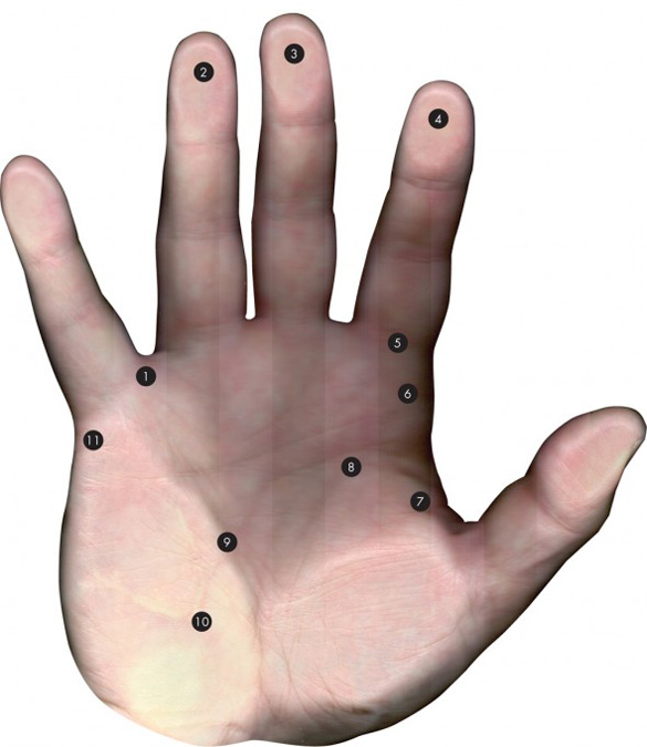
This reading is by Lena, who has no idea this palm belongs to Erik Spiekermann.
1. He thinks outside the box and, as for his lifestyle, he hasn’t even noticed where the box is as he doesn’t live inside boxes of any sort.
2. A great risk-taker and gambler. He enjoys it, but the money he wins doesn’t stick around very long.
3. For someone as loud, intense and emphatic as himself, he is surprisingly gentle with babies, kittens and grandmothers’ teacups.
4. His senses are aware of the fine details and differentiation in all sensory input. An incredibly fine tuned sense of touch, taste, smell and visual aesthetic.
5. This is a person who is NOT in the least bit into self-denial! He wants what he wants and will go after it directly.
6. In most situations, he will automatically assume that he is in charge and then be very surprised if anyone objects or challenges his authority. It doesn’t bother him to be challenged, just very, very surprised.
7. Not in the least bit passive-aggressive. If he is angry at you, he will let you know immediately and emphatically.
8. He can be extremely moody, with bouts of both depression and elation throughout his life. A little more tendency to the depression, but has genuinely upbeat times as well. Working on projects that use his imagination will always lift him up as creativity is his best escape from depression.
9. A love of the written and spoken word: music, poetry and literature. A well-turned phrase delights him as much as a well-turned omelette. If this person is not a writer, he should be.
10. Creative, imaginative thinking is as natural to him as breathing.
11. Innately and naturally monogamous in his true love relationships. He may have a bit of a roving eye and a roving hand, but he doesn’t have a roving heart.
There is also an interview:
It was Erik Spiekermann himself who said, “Typography is like air. We only notice it when it’s bad.” And it’s true, while we are surrounded by design everyday—because design is part of living itself—seldom do we notice its intricacy or how integral it is to our day-to-day existence.
Look closely and its patterns will reveal themselves. Look even closer and you’ll recognize the work of the legendary typographer and communication designer Erik Spiekermann.
Personally, I see his work every day when I ride the public transportation in Berlin—he designed the network plans and signage—but his influence extends far beyond the German capital. Keep your eyes peeled during the course of a normal day and Spiekermann’s work is never far out of sight: he has worked on high profile projects for Bosch, Nokia, Audi and Volkswagen, and his redesign for The Economist can be seen on just about every major newsstand.
Erik Spiekermann’s history in the field comprises of leadership roles in a string of innovative firms. Currently the principle at Edenspiekermann, Spiekermann co-founded the influential MetaDesign in 1979. In 1990, he founded FontShop International with Neville Brody, which has grown to be one of the largest manufacturers of digital typefaces worldwide.
Erik Spiekermann has received numerous awards for his work, including the German Design Prize for Lifetime Achievement, the German government’s highest honor in the field of design. “The Face of Type,” a solo exhibition of the designer’s work opened in late March at the Bauhaus Archive, and the MoMA acquired FF Meta, his best-known typeface, for its collection in January.
Spiekermann took a few minutes to talk type with SOMA via email in April.
What compelled you to begin working with type?
My neighbor when I was 12. He gave me a little printing press and some type.
Do you have a favorite typeface? Please describe some of its qualities.
I have hundreds of favorite typefaces. My new favorite is always the one that happens to be perfect for the job at hand. Or it excites me because it does something very well, is a fresh take on an old category or because a good friend designed it. And I love all my own typefaces because they are my babies.
What are some of your upcoming projects?
We are about to design the international magazine for a German premium car brand; more information will get me killed. Nice project—what are magazines these days and how do they fit in with cross-media applications?
I also just finished the fontfont.com website—showing fonts in a different way for quick selection and lots of tools for finding and choosing them. It’s an interface without fuss, decoration or gimmicks.
Plus the e-commerce website for Germany’s biggest Apple dealer, Gravis. We did their new brand three years ago and it worked so well that Apple so far has only opened three stores in Germany because Gravis is such a strong brand.
Lastly, we are just getting into a hardcore typographic project for De Gruyter, publisher of science books. No covers, just the inside pages with lots of chemical and mathematical formula, ancient languages and other weird science stuff that we have to design new typefaces for, plus the rules for page layout to be followed by authors as well as typesetters across the world. Not much money, but plenty of glory.
And finally, can you explain the point of Wingdings?
No. Never used them, never will. I design all my own arrows and don’t need anything else.
– Jesi Khadivi