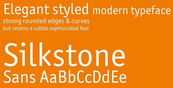
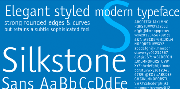
A new typeface that is introduced with such bad grammar (it should be “elegantly styled…” and “sophisicated” instead of “sophisticated” is a dead give-away) is off to a bad start. It only takes one look to see that this description
… The Silkstone Sans font was originally created to fill a void in the typeface market and is aimed at people looking for a classic elegant styled modern typeface suitable for a vast array of projects and designs. Designed and produced by Paul O’Connell of POCT, it is a sans serif typeface created with many flavours and influences, but still manages to retain its originality and is a tribute to many of today’s modern fonts …
is a load of bollocks. Silkstone Sans is an unashamed rip-off of my ITC Officina. Raising the crossbar on the e a little and straightening the top left on the n hardly constitutes a redesign (the m has been left alone), neither does extrapolating the face to a thinner weight. Making the i-dots square instead of round and taking the serif off the i takes away some of Officina’s strong character without adding originality, so why bother?
I am surprised that no-one at MyFonts saw this. It didn’t take very long after its release that lots of people saw it, recognized the deceit and tweeted about it. I am surprised that Paul O’Connell has had the nerve to so publicly expose his lack of shame. Or has stealing someone else’s work suddenly become something to brag about?
The original:
The fake: 
I hope they won’t call this ‘inspiration’…
It’s been 5 hours since MyFonts got the news. It’s strange they didn’t react right away and just deleted it in five seconds which would be the only decent thing to do.
At least they could have done the kerning right. Shame.
He’s actually changed the i-dot and took the serif off the i. That could fool a lot of people …
totally shameful! MyFonts = we sell ‘quality’ typefaces from any Joe Blo with a computer. And we charge less!
Welcome to the era of Gaga.
POCT… does that stand for Piece of Crap Typeface?
the nerve some people have…
S H A M E ! Shame, for Paul O’Connell and MyFonts.
WTF! Paul, wht were u thinking??
Looks like officina melted with acid on the edges. After the earthquake of course…
Unbelievable rip off, it doesn’t surprise me people do this, what does surprise me is that they think people won’t be bother by it or even notice it has been done! Piggy backing somebody else’s hard work, and not even ,managing to improve it!!!!
from @CreativeEgg
I have to agree with Steve. Looks like these people don’t know how to imagine something of their own.