Our workshop at Galerie P98a in Berlin has been producing posters for a while now, plus other stuff. In our cellar, we also keep some of my older products, like the metal house numbers I designed for Design Within Reach in San Francisco a few years ago. We now have a shopping cart installed that makes buying posters or house numbers or all the other stuff painless – apart from having to pay for them, of course.
You can also book workshops here.
All posts by erik
3-letter word project
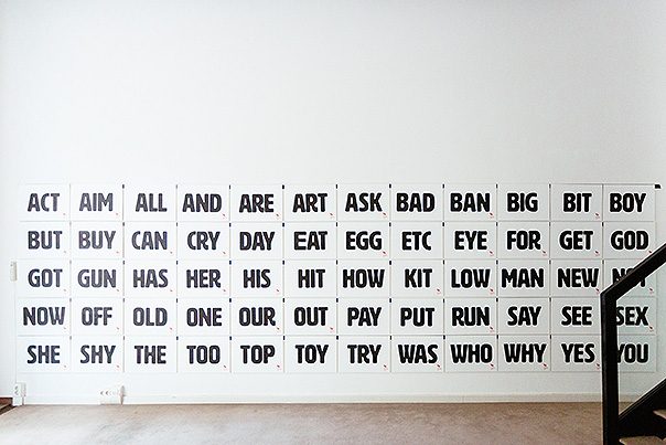
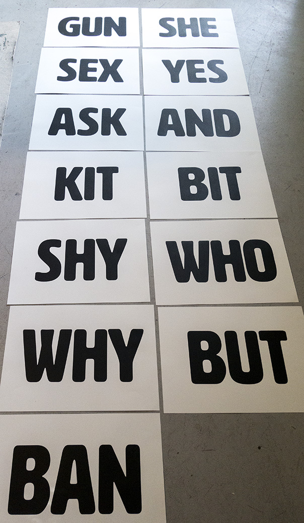
The wall of words, untouched
We printed 60 small posters with one word in each of them; all in English and with just three letters. These words are now up on the wall in the shop on Potsdamer Strasse 98, outside our letterpress workshop.
The idea is that you’d pick up as many of these words as you like and make a sentence with them. You hang the boards on the wall opposite and we take a photo. That’s it.
If you like, you can also crank out a poster on our small proofing press as proof of you having been there.
We’ll start this Friday, September 18, at around 16:00 and will also be there Saturday and Sunday afternoons.
Adrian Frutiger RIP
Diesen Nachruf habe ich heute morgen geschrieben. Er wird leicht redigiert am Montag, den 14. 09. in der Süddeutschen Zeitung erscheinen.
Adrian Frutiger, Schriftgestalter.
* 24. Mai 1928 in Unterseen bei Interlaken;
† 10. September 2015 in Bremgarten bei Bern
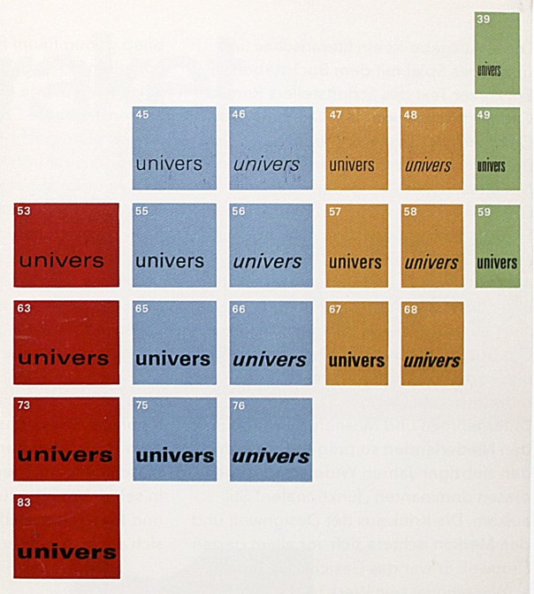
Schriftentwerfer kennt man nicht, so wenig, wie man den Müller kennt, der das Mehl gemahlen hat, aus dem das Brot gebacken ist, das wir täglich essen. Auch Schrift gebrauchen wir täglich, mehr noch als Brot. Adrian Frutigers Schriften kennen wir alle, seinen Namen kaum jemand: die Schilder am Münchner Flughafen sind aus seiner Schrift Univers gesetzt, die schon 1957 entworfen worden war, als erste Schrift überhaupt in einem System angelegt von 21 miteinander harmonierenden Schnitten. Im Ausland wurde die Univers nicht so schnell angenommen wie ihre schweizerische Halbschwester Helvetica, die im gleichen Jahr erschienen war. Aber spätestens zur Olympiade in München 1972 wurde sie schlagartig allen Gestaltern weltweit bekannt. Otl Aicher hatte mit seinem Team ein Erscheinungsbild entwickelt, in dem die Univers eine zentrale Rolle spielte.
Für den Pariser Flughafen Roissy (heute De Gaulle) hatte er Anfang der 70er Jahre das Leitsystem entwickelt und dabei beobachtet, dass seine Univers doch nicht optimal für solche Zwecke geeignet war. Also zeichnete er eine neue Schrift, die Frutiger heisst. Er schrieb selber dazu:
»Mein Meisterstück ist die Univers, aber meine Lieblingsschrift bleibt ehrlich gesagt die originale Frutiger. Wahrscheinlich ist es die Schrift, die in der Mitte der Schriftenlandschaft steht. Es ist wie ein Nagel, der eingeschlagen wird, an den man alles anbinden kann. Sie entspricht am ehesten meinem inneren Bild.«
Adrian Frutigers Methode, mit der Schere aus schwarzem Papier Formen zu schneiden und diese dann zu Buchstaben und Zeichen zusammenzusetzen, geht nach seinem eigenen Bekenntnis auf die Tradition seiner Heimat Interlaken zurück. Sie hat ihm das beste Werkzeug an die Hand gegeben, sein untrügliches Gefühl für Innen- und Aussenform, für Rhythmus, Kontrast, Spannung und Regelmässigkeiten in Formen umzusetzen, die mehr sind als alphanumerische Zeichen. Er hat einmal gesagt, dass er zwischen Architektur oder Bildhauerei schwankte, aber dann herausfand, dass Schriftentwerfen beides vereint.
Er steht neben Namen wie Garamond, Caslon, Bodoni, Renner, Gill, Meier und Zapf als ein Schriftgestalter, der eine ganze Epoche in Buchstaben ausgedrückt und festgehalten hat.
FF Real
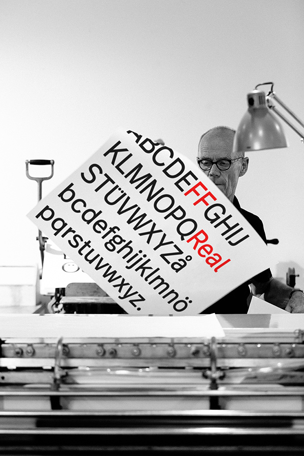
The new typeface I designed with Ralph Du Carrois was released by FontShop under the FontFont label last week. Alexander Roth designs all the cool printed stuff for FontShop in Berlin and had us at P98a print a poster from the wood type we had made for the Regular weight of FF Real. Norman Posselt took the photograph of me pulling a sheet from the Korrex proof press.
Only the first 25 buyers of FF Real will get one of the 25 signed and numbered posters we printed.
New posters
We do design, set and print a new poster every month, but somehow often forget to announce it, here or on the workshop’s site: The last one here was the May poster “Don’t work for assholes”.
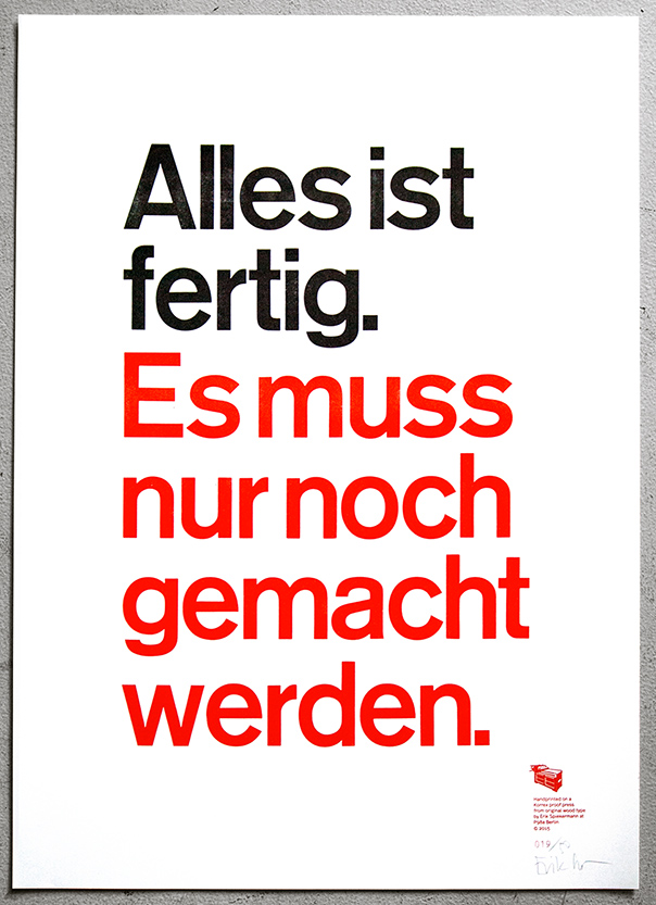
We have since printed two more posters, one of them being yet another version of a popular motif: “Alles ist fertig. Es muss nur noch gemacht werden.”, which translates as “Everything is ready. It just remains to be made.” In spite of it being in German, the two previous editions have been bought by a lot of people outside of Germany. As every print is limited to a run of 50 and the type is then put back into the cases (i.e. the “artwork” is destroyed), a new edition is different by definition. But we also make it different by setting it in a different typeface. This time in Akzidenz Grotesk 16 cicero (a little larger than 16-line or pica – although sizes in wood type do not mean very much in terms of exact measurement) and it’s printed in our two favourite colours, Black and Warm Red.
For the latest print (the poster for July, I suppose), we picked a saying that I might not have underwritten a few years ago: “Better done than perfect”. When we worked for print alone, everything had to be as perfect as possible. It is, however, much more difficult if not impossible to control the results of anything published online. It is also changed very quickly, often with just a few keystrokes. Getting the colour wrong or discovering typos used to be a disaster, whereas code is updated within seconds, often before anybody has actually noticed our mistakes.
I picked our Akzidenz Grotesk Medium in 20 cicero because that filled the paper nicely. I did not check the amount of each letter in the case. There should have been six lower-case e’s and four t’s. But when I came to the last word, I realized that we only have four e’s. I could have inserted an e from the Bold weight, which we happen to have in the same size. I already used that trick for the missing o in “Don’t work with assholes”. A little boring, I thought and, actually, the word prfect perfectly illustrated itself with that missing e.
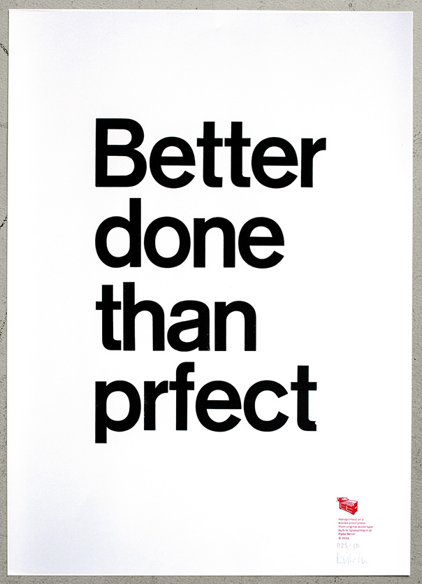
As always, the poster is printed on MetaPaper Rough Warm White 160 gsm in Black and Pantone Warm Red ink. From original wood and metal type on our Korrex Frankfurt, 50×70 cm.
The 50 posters each are numbered and signed by Erik Spiekermann. We ship everywhere and you can pay by PayPal. Price is the same in these currencies: £, $, €; always 98, including tax (where applicable) and shipping, wrapped in a solid cardboard tube. Please go to spiekerstuff to order. Hopefully, the shopping cart will finally work. You can also check out the other prints there as well as the metal housenumbers I designed a few years ago. Some of them are still available from spiekerstuff.
Three-letter words
The first few words of this project have been printed. Set in our new 40cicero HWT Artz wood type (i. e. approx 170mm tall), freshly cut by Hamilton in Wisconsin.

Before we continue with words containing problematic combinations like AY, LY, LV and others, we need to upgrade to a professional kerning saw. Type this size is too expensive to risk destroying by swinging at it with a handheld jigsaw.
The words are printed on 35×50cm (i. e. half the size of our monthly posters) MetaPaper Warm White Rough from original wood type on a Korrex Berlin proof press. There will only be 20 of each word and we haven’t quite decided if we want to sell them. Once all 30 or 40 words will have been printed, we may display them at our studio. As soon as the first three or four were printed (by my son, Dylan, and my assistant, Ferdinand), the two of them started making sentences. Which is the point of the exercise.
We may add a list of German words, but they will have to be with four letters.

Kerning for large wood type
Making awkward combinations like A and Y look better is hard work when you have to apply it to large type made from wood. You have to cut a bit from the top right of the A and another bit from the bottom left part of the Y. Cut too much and the letter won’t align properly anymore. Most of those bad combinations can be dealt with by adding space between the other characters. In the case of the HWT Artz typeface, however, too much such tracking makes it look weak and wobbly. So we got the jigsaw and cut P, A and Y. While at it, L and V also got this treatment.

The poster is printed on MetaPaper Rough Warm White 160 gsm in Black and Pantone Warm Red ink. From original wood and metal type (HWT Artz 16cicero and Akzidenz Grotesk Medium 60pt) on our Korrex Frankfurt, 50×70 cm.
The 50 posters each are numbered and signed by Erik Spiekermann. We ship everywhere and you can pay by PayPal. Price is the same in these currencies: £, $, €; always 98, including tax (where applicable) and shipping, wrapped in a solid cardboard tube. Orders with shipping address please to info@p98a.com.
Poster for May
The trouble with limited runs is that popular motifs run out very quickly and we have to disappoint a lot of people. We cannot simple reprint the same subject, as that would contradict the principle. We have, however, redesigned and then printed the same statement before: »Alles ist fertig, es muss nur noch gemacht werden« was so popular that a second run had become inevitable, albeit looking quite different from the first one.
The other very popular theme has been my motto »Don’t work for assholes, don’t work with assholes«. The former part of this statement is the one that most colleagues want to display on their studio walls. So we went ahead and printed just that sentence. It is set in 20cicero (about 21pica) Akzidenz Grotesk Medium. These large fonts do not have very many characters in a set. When we ran out of lower case o, we had to insert the last one from the Bold weight of the same typeface. It is a little larger on the body but ends up looking as if we wanted to stress the meaning of the word with an extra large o. Necessity as the mother of invention. BTW: 20cicero is a cap height of approx. 85mm.
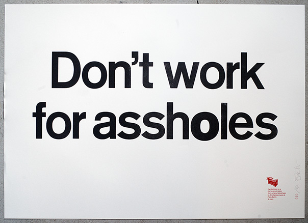
As always, the poster is printed on MetaPaper Rough Warm White 160 gsm in Black and Pantone Warm Red ink. From original wood and metal type on our Korrex Frankfurt, 50×70 cm.
The 50 posters each are numbered and signed by Erik Spiekermann. We ship everywhere and you can pay by PayPal. Price is the same in these currencies: £, $, €; always 98, including tax (where applicable) and shipping, wrapped in a solid cardboard tube. Orders with shipping address please to info@p98a.com.
Poster for April: late but ready.
Easter holidays and travel have delayed the production of our poster for April. The first run wasn’t good enough because even with wood type there is a limit to what can be done without kerning. The word PAY in all caps (and that’s all I have for the HWT Artz font) falls apart and becomes illegible. So Ferdinand and Jan had to get the hacksaw out. Spot the difference (and the other manual kern):

As always, the poster is printed on MetaPaper Rough Warm White 160 gsm in Black and Pantone Warm Red ink. From original wood and metal type (HWT Artz 16cicero and Akzidenz Grotesk Medium 60pt) on our Korrex Frankfurt, 50×70 cm.
The 50 posters each are numbered and signed by Erik Spiekermann. We ship everywhere and you can pay by PayPal. Price is the same in these currencies: £, $, €; always 98, including tax (where applicable) and shipping, wrapped in a solid cardboard tube. Orders with shipping address please to info@p98a.com.