Round typefaces keep going in and out of fashion, for many reasons. One of them always has been the media the face would be used for: type on screens and back-lit signs suffers from radiant light. Sharp type will look blunt, and the amount of bluntness that occurs is usually unpredictable. Enter a font already blunt, i.e. rounded.
Way back in letterpress days, some of the most successful typefaces for everyday printing (then called jobbing) were faces like Reklameschrift Block with its wobbly outline and blunt corners. The letters looked hand-painted, spontaneous, or pre-destroyed. Even bad treatment on platen presses couldn’t make them look bad.
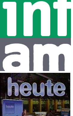
When I designed FF Info, the corners were made blunt to counteract light shatter on signs at the Düsseldorf airport, where this typeface was first used.
Otl Aicher designed a typeface for Germany’s second TV channel, the ZDF, in the early 70s, which was basically Univers with very round corners. TV then was very low-res.
Other typefaces used round corners – the “Frankfurter (as in sausages) look” – to convey friendliness and were often used for food packages.
Then came Web 2.0 and rounded typefaces made a major comeback. I think they are here to stay, both as a fashion statement and for physical reasons, like in the old days. There will always be bad media which needs indestructible fonts.
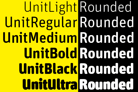
FF Unit Rounded started as an exclusive typeface we designed with Christian Schwartz’s help for Gravis, the biggest Apple dealer in Germany. They needed something friendly but precise, to be used on-screen, on signs, in print and on T-shirts.
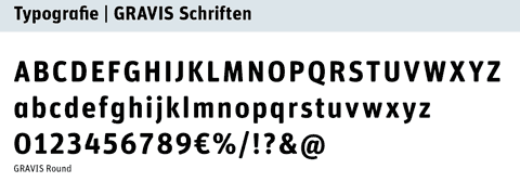
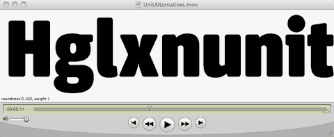
Gravis Round only has two weights, and when I wanted to make a complete family, I turned to Erik van Blokland, inventor of the Superpolator software. You can download one of the little movies here to see the Superpolator live in action. Well, almost.
Above:
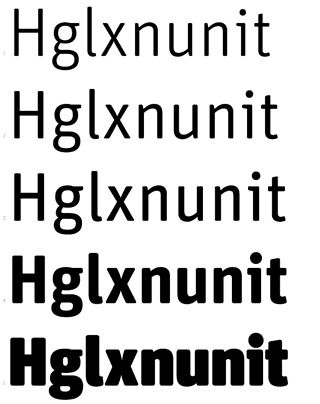
The Superpolator at work.
Each frame of the movie stands for one instance. The amount of radius on the terminal changes independently from the thickness of the strokes. The lighter strokes needed less of as flat bottom than the heavy ones. Without any flatness at all, you get the pure sausage effect.
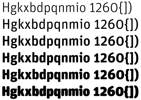
Erik ran several trials to establish the right amount of roundness for each weight. The lighter weights have almost no flat bottom, whereas the bold weights have straight bottoms on the main strokes, met by rounded corners. The radius had to be different for each weight, so Erik showed me alternatives as little movies with a slider to try out different versions. They all had a number to them so we could decide what worked best for which weight. The Superpolator also took care of a lot of the issues with internal curves and those problematic areas where curves meet straight lines or – even more complex! – diagonal ones.
Above:
EvB and his Superpolator provided many choices
and made decisions for the right weights and the amount of roundness quite easy.
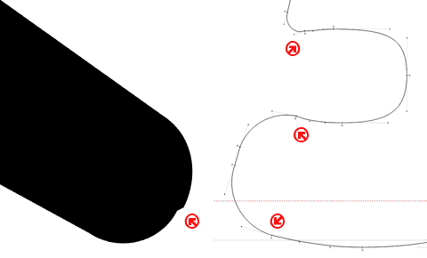
There remained quite a bit of manual intervention which was carried out by FSI’s able experts who end up with all the detailed stuff that us type designers are too lazy for. Just look at these screen grabs: the software wants to insert curve point at the extremes of each curve. In this case, however, that not only added unnecessary points, but also created weird artefacts. So all these point had to be removed by hand. And we are talking about 450 glyphs per weight.
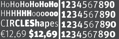
FF Unit Rounded is OpenType and has all the features
that come with that format, like four different types of figures.
FF Unit is serious enough to be rounded without becoming a sausage face or one only suited for comic strips. It looks friendly without losing its precision and changes its appearance quite dramatically as it grows in size. The Rounded version should be available at your local FontShop any day now.
Congratulations on Unit Rounded! A note about the tools mentioned in the article. Superpolator was used make the animations and various proofs Erik used to determine the right curvatures. The actual rounding corner code was developed by TypeMedia alumni Frederik Berlaen. For each Unit master I made several versions with different degrees of roundedness. Those masters were then processed in Superpolator. Cheers!
Personally, I admire rounded type faces. I don’t know why, but they just seem to be a “laid back” type-face. I think it is the more organic feeling they portray than such a sharp edged “Helvetica” font face does. But don’t get me wrong, I work with Helvetica and “Helvetica-esque” fonts just as much.
I think it boils down to logo work. Something like the Gravis “G”. It seems so natural, yet at the same time, holds a humanistic property that is entwined with the techy-era that we live in.
I can’t wait to see what I can do with Unit Rounded, or to read this article again – when It isn’t 4AM and I’m getting ready for work.
Gravis. Cool brand. Cooler typeface.
http://www.youtube.com/watch?v=Kwe8jqfgcNg