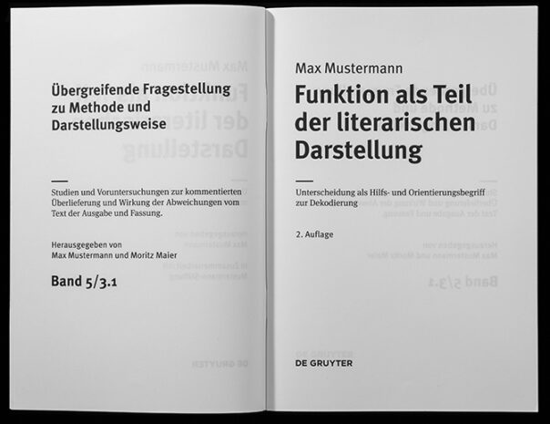
Going through this blog at the end of 2023 reminded me of the work we did for De Gruyter, a publisher of science books in Berlin, in 2011. After we (at Edenspiekermann) had finished designing layout templates for the science books, Ralph du Carrois and I designed a family of typefaces for these books which would need mathematical and chemical symbols, letters for extinct languages (!) and many more very specific applications. They are extensions of FF MetaSans and FF MetaSerif, each with four weights, and each one of those with approx. 2500 glyphs.
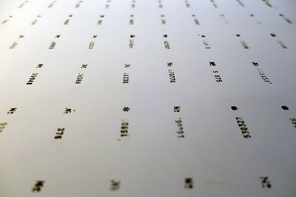
As always, our friend and typographic expert, Andreas Eigendorf, did all the quality control on the fonts and produced this “spitter”: a document with all the characters in it. I made it into a movie, which is the least painful way to see them all.
True typomaniacs will notice that quite a few characters hadn’t had their overlaps removed at the time.