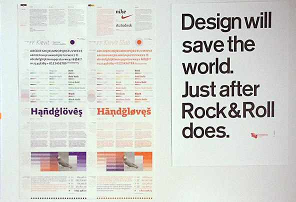
We (my new gallery and letterpress workshop, P98a in Berlin) printed a poster as a New Year’s gift for clients and friends at Edenspiekermann. Set in 16 cicero (approx. 17 pica) Akzidenz Grotesk Halbfett (aka Medium) type made from Plakadur, Berthold’s resin-based material for large display type. Two colours, 50x70cm (work it out for yourselves), printed on our Korrex Frankfurt. 100 posters, signed and numbered. Here it hangs on the wall of Ferdinand Ulrich’s office at the University in Halle.
The poster next to it is by Alexander Roth who works at FontShop International in Berlin and designs cool stuff, e.g. this site for FF Mark.
More bicycles
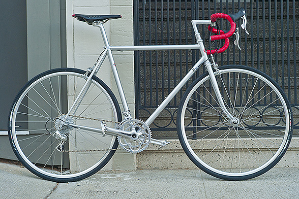
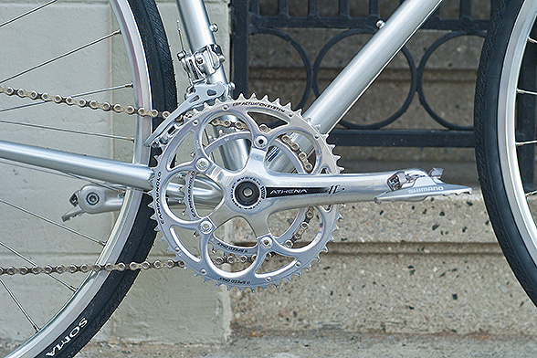
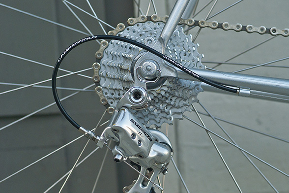
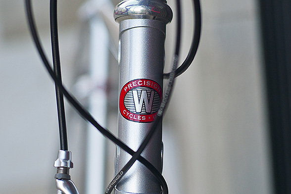
Well, one more for now. Here in San Francisco one needs a few more gears. I had a bicycle put together for me by Brad Woehl at American Cyclery in the city. The frame was made by Waterford Precision Cycles in Wisconsin. I like Campagnolo and need 11 gears here in the hills. Athena is good enough for my less than professional needs.
I published these pictures before on this site, albeit smaller and with a warning to bike thieves.
Still rides like a dream.
Bicycles
My remarks in interviews and videos about owning 13 bicycles have created quite a correspondence. Here now the proof, or rather, some proof that these bicycles do exist. I recently took pictures of the ones in Berlin (the others will follow). As you’ll see, there are only nine bikes here. Two more are in our little house in California, two others at my son’s house in London and one more in Amsterdam, parked downstairs from the Edenspiekermann offices there. Which would actually make it 14 bicycles if it wasn’t for the fact that one of them is not mine, but Susanna’s. I had it made for her birthday, so it gets a picture here but no count.
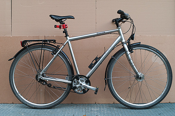
The Swiss Cresta is the all-purpose bike for Berlin when the weather is bad (like now in snow and ice) and when I have to carry more than my iPhone.
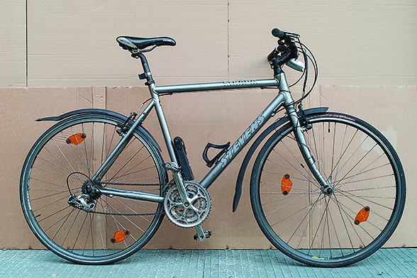
The Stevens trekking bike has been with me on the week-long rides somewhere in Germany every year. It is rugged enough for dirt roads and has plenty gears to climb comfortably.
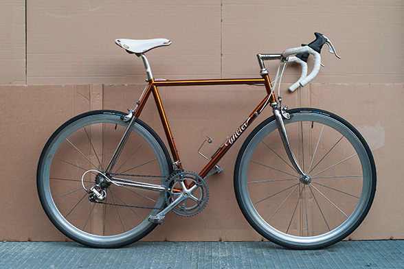
I bought this Wilier from my friends at Cicli Berlinetta, mainly for its colour. It rides well but is too short for me and actually a little too shiny and flash.
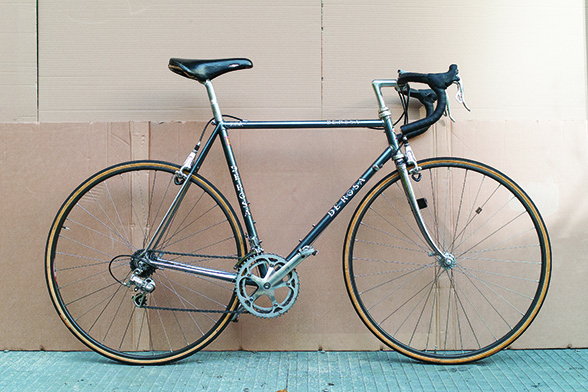
The De Rosa is also a little short for me but rides well. Its main attraction, however, are the infamous Delta brakes. They look great, but don’t ever try and adjust them – takes the best part of a day.
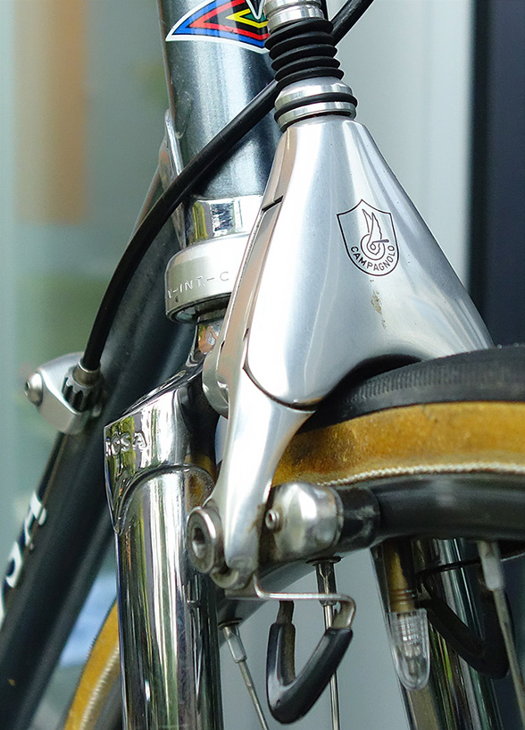
The infamous Delta brakes on the De Rosa.
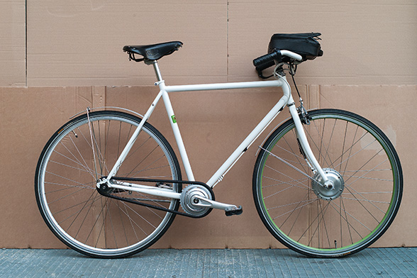
I bought this electric bike just to see whether it actually works. It doesn’t look as heavy as other pedelecs, but the battery on the handlebars doesn’t exactly look elegant either. It was designed by an architect, Hadi Teherani, and looks great, but at the expense of function. Quite frankly: I have never really used it, apart from around the block. But perhaps one day I’ll be grateful for some electric assistance.
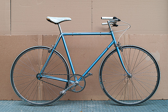
This is a single speed, converted from an old Viner frame. 48×16 gearing makes it slightly heavy to get going but fast once up there. My favourite bike for running around Berlin. Light enough to take it inside instead of locking and losing it.
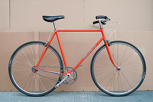
This single speed was also made from an old racing bike, a Patelli. Susanna got it for her birthday in 2012. It runs 48×19, so lighter to start but not quite as fast as the other single speed.
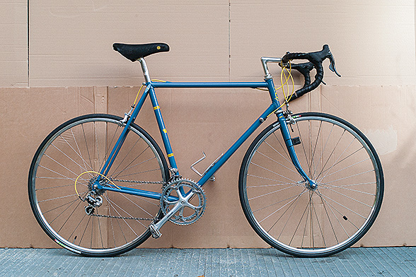
This was made for me by Dustin at Cicli Berlinetta. I take it out into the Grunewald but not into traffic around town.
Mijksenaar interviews Spiekermann
When I was last in Amsterdam, I took the opportunity to go over to the office of Paul Mijksenaar, my favourite information designer. And Paul used the opportunity to make a short interview on video. Dutch subtitles make it more useful.
Interview Erik Spiekermann from Paul Mijksenaar Award on Vimeo.
Sheep 3.0
An interview I gave to the people from Peachpit when the third version of my book Stop Stealing Sheep and learn how to use type properly came out.
1. How did you first become interested in typography?
A printer in our neighbourhood gave me a small tabletop platen press and some type when I was 12.
2. Do you have a favorite typeface? Which one is it and why?
Historically it would be Berthold’s Block, because that was the first one I ever looked at closely and later redrew one of its variants as one of my first excursions into typedesign. But my favourite typeface of the day is the one that works really well for a project, whether it’s designed by myself or by one of my colleagues. It helps that I am friends with a lot of type designers, so using their faces is also very personal.
3. Your book, Stop Stealing Sheep, is celebrating its 20th anniversary. How has the design world changed over the past 20 years?
Do we have 500 pages and doesn’t everybody know the answer? Seriously, that is too big a question to answer in one paragraph. The good news is that design becomes ever more important as the world grows more complex. Designers are interpreters: we need to translate the world to people by making complex issues and processes visible.
4. Your book is now available in its 3rd edition. What new information will your readers learn in this edition?
Type is read on screen as well as on paper. We have new technologies and type has always adapted to technology. Choosing the right type hasn’t become any easier, so a few new conditions and rules are explained.
5. You book isn’t a tutorial on typeface, but rather an invigorating jaunt filled with history, examples, and opinions. Whom did you write the book for?
The original brief from Adobe back in 1992 was, (in their words, not mine) the “average secretary” who now had type at her fingertips.
6. Which companies do you feel make the best design and typeface choices?
Those that are aware of their true message, know who their public is, listen to outside experts and are not afraid to go out and try something new. Bullshit has never been a good adviser.
7. What’s a good example of a company or product using the wrong typeface?
All those that hide behind well-tried, popular choices without considering the actual situation, the readership, the intended impression. I think Apple could do better than using Helvetica which is neither original nor suited to small screens.
8. What elements do you consider when making a typeface decision?
Tone of voice, languages that need to be used, technical constraints, readership, cultural constraints (i.e. particular reading habits), the media involved, the budget…
9. You were quoted in the Design Council as saying that the staff of The Economist were “the best clients I’ve ever had.” What makes a good client and how does this help you as a designer? What can a designer or agency do to help create good clients?
Not take part in pitches (my company, Edenspiekermann, does not do pitches), listen carefully (which you cannot do within a pitch situation), have an opinion and not be afraid to voice it, do your homework, avoid doing things because they’re “in”, don’t perform for your peers. Be honest, learn to say no, consider yourself a partner and not a vendor. And don’t be afraid to ask for proper payment for the value you create.
10. You were a signatory on the First Things First 2000 – a design manifesto, which proposes “a reversal of priorities in favor of more useful, lasting and democratic forms of communication – a mindshift away from product marketing and toward the exploration and production of a new kind of meaning.” How have you incorporated the tenets of the manifesto into your work as a designer?
We have published our own manifesto and we will not work for clients whose aims we do not agree with. But that has to do mainly with their attitude, not their products. I call it the “asshole rule”: we do not work for assholes, however cool their product may be.
11. You say of Helvetica that it doesn’t have any contrast to it. But you have also called it beautiful. Can you please clarify your position on Helvetica?
It is perfect for what it is. Helvetica was designed to have no specific character and the designers achieved that. So it is beautiful in that sense, but not suited to a lot communication tasks that require an attitude, a voice. Neither is it suited to be used small on screens because too many of its characters can be confused with each other, like l and I, 3 and B, or rn an m.
12. In your keynote conversation with Jeff Veen at Gigaom, he commented that there is a tremendous amount of fashion involved in typography, which changes all the time. What’s the latest fashion in typography?
By the time you read this, it’ll have changed. Right now, we have many fashions going on at the same time. One that’ll be around for a while is the handmade look. Even electronically generated typefaces are made to look like there were printed letterpress from damaged type, or handwritten with wobbly pens.
13. In your book you mention that typefaces that were legible only a few decades ago can hardly be read by modern audiences – that it has to do with cultural perceptions, not the physical properties of the typefaces. Based on trends in modern typefaces, are there certain typefaces today that will be barely readable in another 50 years?
Perhaps those that depend on the look of a technology, like bitmaps. But all type that has its origin in writing will be legible because we’ll still have hands and pens. Or will we?
14. Other than your own book, which resources would you recommend to someone who is interested in learning more about typography?
There’s a list in the back of the book, too long to repeat here. There are great websites and blogs, just google type and typography and you’ll be surprised.
15. Why do you own 13 bicycles?
Because they’re all different. Some have different uses, like for racing, for the city, for carrying loads, for going cross country. And some are just plain beautiful.
16. You have a fondness for vintage Leica cameras. Why, and do you actually use them or just collect them?
I never collected, I just bought an old one back in the 70s because I couldn’t afford a new one, then upgraded to a new M3, then to a new M6 (all analog film cameras), then a few digital Leicas which weren’t all that good (nor too expensive), then the first really useful digital M8 and recently the new M. Okay, perhaps there are a few old ones in that I found and had to rescue. But I never went looking, don’t belong to a collector’s club. I don’t know the serial numbers of my cameras and I can use every lens I ever bought because Leica hasn’t changed their standard.
17. You appear very fit. Do you attribute this to your love of type?
It’s all the long-distance reading.
18. What are you most excited about regarding your upcoming TYPO conference, to be held in San Francisco on April 10-11? What do you hope people get out of it?
Find out that there are other typomaniacs out there, that typography is not a closet activity anymore. It is great to listen to inspiring lectures and hang out with your peers. We all need to get out and see what’s happening.
P98A: our new workshop and gallery
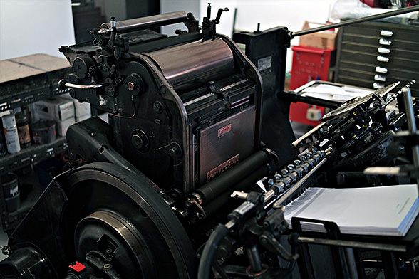
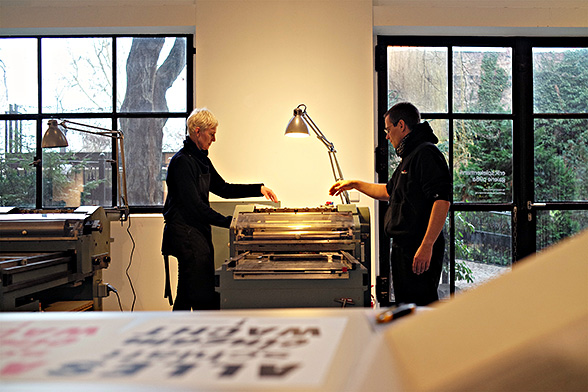
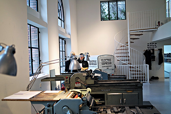
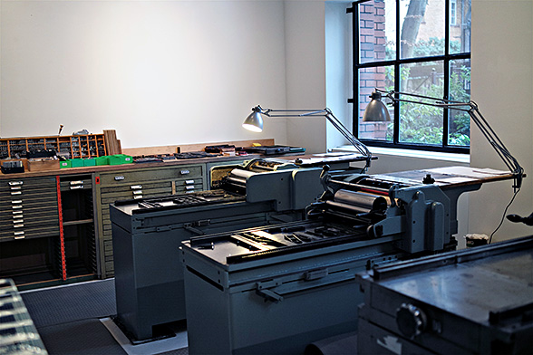
We now have two FAG proof presses, one Grafix, a Korrex Berlin, a Korrex Nürnberg, a Korrex Frankfurt and a Heidelberger Tiegel (platen). We won’t even mention all the small platens in the shop. And as off last week, all the presses are up and running, although the latest FAG needs cleaning up and repainting.
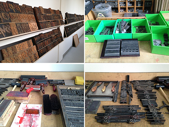
On top of that a surprising amount of large display type, made from wood or Plakadur, Berthold’s resin material from the 50s. And lots of lead type, old and new, including freshly cast Akzidenz Grotesk and Block in sizes from 8 to 24 point Didot. Reglet, quads and furniture, iron and aluminium, are waiting to be sorted. A second row of cabinets is on order.
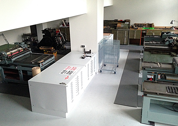
Sheep book 3.0 ready
The English version of “Stop Stealing Sheep and learn how to use type properly” has been out for a while. Peachpit still offer a big discount if you buy from them direct:

Roadmap 2013
This is the video of my conversation with Jeff Veen at the Gigaom conference in San Francisco this week:
Ready to print
We will have six proof presses in the shop:
1 Korrex Nürnberg 35×58, 1 Korrex Berlin 50×65, 1 Korrex Frankfurt 61×86, 1 FAG 35×58, 1 Grafix 35×58 and one more FAG coming next week.
The Heidelberg Windmill is waiting to be put together and all the type needs sorting.
Ready to go any day now.
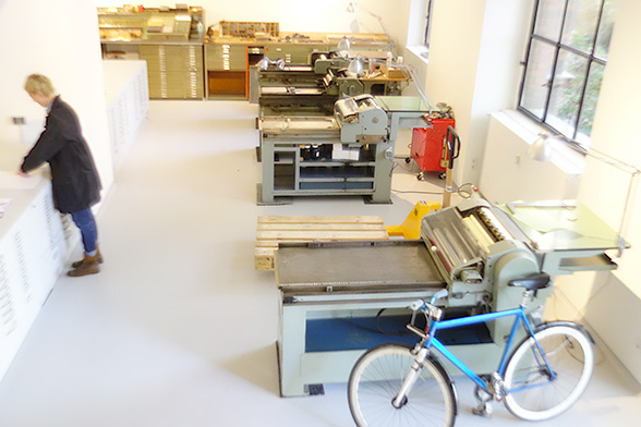
4 small presses waiting for another one
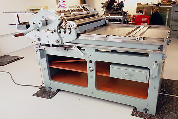
The big Korrex is all electric. It makes noises like a battleship in action.
TDC interviews Spiekermann
This interview is more than a year old. Made when I was in New York on the occasion of the TDC giving me their Lifetime Award .
Erik Spiekermann from Type Directors Club on Vimeo.