type specimens

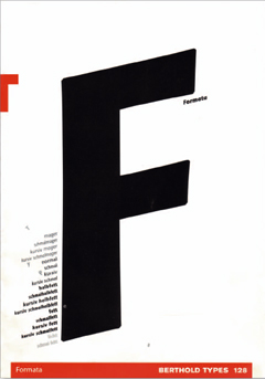
Back in the 80s, foundries spent a lot of money printing specimen booklets. I recently found some of the brochures we designed back then.


I scanned 23 brochures and put them into one document. For the purpose of this blog, I made low-res PDFs (still 2.2 MB): While you cannot appreciate typographic details at that resolution, you’ll still discover some faces you’ve probably never heard of. A lof of designers at MetaDesign had a go at these specimen brochures. I don’t remember who did which one, so I cannot credit individuals for fear of forgetting some of them. They could write and remind me.

bertholdtypes_brosch.pdf

Design is an intellectual process

My short answer to a frequent question:
How do you define what you do?”


Design is first and foremost an intellectual process. Contrary to popular belief, designers are not artists. They employ artistic methods to visualize thinking and process, but, unlike artists, they work to solve a client’s problem, not present their own view of the world. If a design project, however, is to be considered successful – and that would be the true measure of quality – it will not only solve the problem at hand, but also add an aesthetic dimension beyond the pragmatic issues.

I consider design not to be a series of “creative” one-offs, but an integrated process, from planning the appropriate communications strategy to designing functional and beautiful objects as well as – for example – implementing electronic stationery on clients’ systems.

What clients say and what designers hear are too often very different things. Design is a powerful tool to help clarify the problem. It is only when a common understanding has been established between client and designer that effective results can be
achieved.

Design quality needs an integrated approach: look more closely than expected, ask many questions, think laterally, get involved in things you shouldn’t, do more than you are supposed to and have fun doing it. Problem solving is one thing, aesthetic pleasure another. Combine the two, make the engineer sketch like an artist and make the artist analyze like an engineer, and you are half-way there.

Type for a purpose

What makes a good typeface?
Here are some answers.


1. What makes a good typeface is decided by the users, not the designer.

2. Most good typefaces have been designed for one purpose, they do not come from a designer’s whim. Bodoni designed all his faces for specific books, Times was
designed for the newspaper, Frutiger for signage at Charles de Gaulle airport, Helvetica to appeal to certain graphic designers, Bell Gothic for the American telephone books, Gill for a shopfront, Century for a magazine, Meta for the German post office.

3. there are certain laws of perception as well as cultural traditions which a typeface has to adhere to.

4. it has to look almost like all the others, but…

5. just be a little different

form condensed, 3.

From my monthly column in form magazine.

You are what you wear.


Recently in Frankfurt, a public debate on the occasion of the German Design Council’s 50th anniversary: the place is festive and people are dressed accordingly. It is easy to distinguish between those active in the design profession and those who commission design, comment on it or run the business part of it. The real or the intended proximity to the profession seems obvious, simply judged by the absence of decoration around men’s necks. Real designers don’t wear ties. What does that tell us? On the one hand, that it is both easier and more difficult for women. They need to do more than just leave their neckties at home in order to signify a creative background. On the other hand, it means that Paul Klee was spot on in saying “Only appearances are not false”. You are what you are seen to be. This makes it easy for clients to write us off as artistic weirdos, when more often than not we are just too lazy to shave every day. Isn’t it amazing that such an unspectacular act of refusal is enough to qualify a whole profession? But maybe there has been some progress. Graphic designers don’t have to wear one black and one white shoe to stand out from the crowd anymore, and certain product designers can give up wearing a heavy white sweater in all weathers, just to be instantly recognized as a designer.

On the other hand, voluntary uniforms can turn out to be very practical indeed, on both sides. If your client wears a striped tie with a navy blazer, you can take this as an obvious hint for the choice of typeface: precise serifs and well-behaved centred setting. Architects in tight turtle necks à la Ulm will most certainly only let Rotis touch their papers. Oxford shirts with button-down collars spell Anglo-american preferences, for David Ogilvy perhaps. A period after every word helps here. Like. So. Bulbous diving watches and fat fountain pens are standard kit for alumni from Californian design schools. The image of the delicate, reality-shy creative is often signified by a little goatee which threatens to be blown away by the slightest breeze. Only, however, if our pale colleague exposed himself to the outside, whence his cool, air-filled sneakers would speed him up enough to arrive early for his next appointment. And that would be disastrous. Being caught in observance of an old-fashioned virtue like punctuality could almost be detrimental to a designer’s reputation.

RSS=Really Simple Syndication

How to subscribe to weblogs.

Go to the NetNewsWire website, download their software for a 30-day trial. Then go to my blog, click on “Syndicate this Site” under “RSS”, copy the url from the page that pops up
“https://www.spiekermann.com/mten/index.xml” and paste that into a new Subscription window in NetNewsWire. There are thousands of interesting, silly, informative and even great blogs out there.

my favourite typefaces

Here’s my list of favourite typefaces. Not the ones I use most, but the ones I love because they have influenced me or because I wish I had designed them.


1. Reklameschrift Block; the staple diet of pre-war jobbing printing in Germany, and the one typeface I had from 8pt through to 96pt (plus larger sizes in wood type) in my metal typeshop (which burnt down in 1977). I redrew some of the versions for Berthold in the 70s, making Block Halbfett into Berliner Grotesk Medium.

2. Akzidenz Grotesk Mager. The first font i bought from the Berthold foundry as brand new type; 8pt, half a minimum, which meant about 8 a, 9e, 2c, etc. 3.5kg of type which cost me half a month’s wages, except as a freelancer, I didn’t earn any.

3. Concorde. The first typeface whose design process (in 1968) i followed. GGL’s answer to Times, and much better.
4. FF Clifford by Akira Kobayashi (now type director at Linotype). Amazing book face by a Japanese designer. Not a revival, but in the baroque tradition. Only regular weight, but for 3 sizes plus great Italics and Small Caps. Try it!

5. Arnhem by Fred Smeijers (great website). Love it for newspapers, magazines, etc. Not so keen on the headline weights, they look too Dutch for my use (perhaps too Ungerish, but then Fred is also from Arnhem). But the text weights are a superb modern interpretation of a legible serif with an edge.

In real life, however, I use my own faces ( mainly Meta, Officina and Unit – I don’t have to pay for them) and corporate type like Frutiger, FF Transit, News Gothic, Minion (very versatile), Univers, Myriad et al and even Helvetica (for DB, the German railways, but that’s going to change).

form condensed, 2.

From my monthly column in form magazine. About controllers taking over design studios.

Effective, not efficient


Design companies call themselves studio, office, agency or even atelier, depending on were they come from and where they think they’re going. All these legal entities are usually run by designers. They may have studied product design or graphic design, often labeled as visual communications, but they never took courses in accounting, management, human resources or marketing. That knowledge comes along over time, gradually turning designers into managers and entrepreneurs.

Learning by doing works well for smaller outfits, where it is fairly easy to estimate how long a job will take and who’s doing what in the studio at any given time. As soon as more than a handful of employees have to be coordinated, it gets pretty tough to keep on top of things. You have to watch out for projects not only to be kept on track as far as the design part goes, but also to stay within the numbers given in the proposal and to make sure the client is still going along with it.

Enter the controller. I never properly understood what controlling is – that could well be a mental block on my part. In essence, I think, the idea is to generate numbers in order to have some control (sic) over expenses and revenues. That should enable you to tell whether a project is generating profit or going down the tubes. Once controlling has established the key figures and factors, it should not only be able to document who spent how much time on which project and for how much money, but should also predict future trends. Estimates could then be written more accurately and resources planned more easily.

So much for the theory. In the real world, controlling in a design studio meets two challenges: firstly, everybody knows that timesheets are usually filled out at the end of the week, with everybody trying to match the planners’ expectations. And secondly, this approach looks at the efficiency of the process, not the effect, ie the work. Not the result becomes the reference for success, but the way it was achieved. This totally distorts the reality in our profession. Our clients do not judge our work by how it came about, but by how it works for them. Is their brand stronger after the redesign? Does the product sell more? Is it manufactured more cheaply and swiftly? Whether we get there by working day and night or with handmade software, under the influence of substances or by being exposed to loud music – nobody cares, as long as the client is happy.

Owners or senior employees are responsible for the quality of the design work, as this is what clients look for in design offices, firms, ateliers, agencies and studios. Of course, they have to earn money, and controlling can provide very useful tools and standards for judging business parameters. If, however, efficiency of process becomes the most important one, the quality of work will eventually be compromised. No controller or accountant can decide whether design work is good or bad. They can only reward those who obediently filled out their timesheets – in my experience not the most creative people. Once the work gets mediocre because design quality is no longer appreciated by the system, design fees go down. Then one starts to make economies – like hiring cheaper employees, and the quality of the output sinks even lower. The whole purpose of controlling – earning more through efficiency – is turned on its head. Ergo: controlling in the design business is good, as long as it is controlled by designers.

10 Questions from Designer to Designer

An interview by email; December 2003.
A remark about the form of this entry (and many others):
Most of them have simply copied out of emails. That results in lower case writing (mostly and not very consistently), wrong apostrophes, wrong hyphens and wrong quote marks. Too bad, but inevitable in international correspondence. Pragmatic, not righteous.

| | | |


1. What is your profession?
type and typographic designer

2.What College did you attend (if any)?
Freie Universität Berlin

3. Do you feel that your schooling played a big part in your decision to become a designer?
nope (is that better than a plain no?)

4. What is your favorite car, and why?
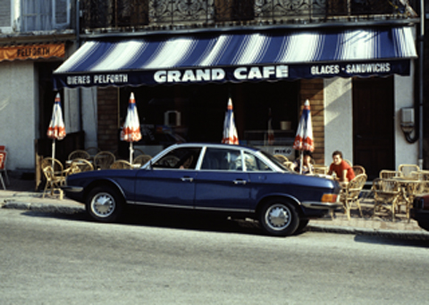
my NSU Ro80; i’ve had it for 1985 (it’s a 1977 model); it was the first sedan with a Wankel (ie rotary) engine and the first car to be designed to a wedge shape (see photo).
5. In a short paragraph, describe how you became interested in design.
i was a printer and typesetter, but my shop burned down in 1977. So i ended up making sketches (which i had also been doing as a typesetter) and giving them to a photosetter instead.

6. Do you feel that design is art? Why or why not
of course it isn’t. A designer visualizes a client’s issues, problems, brief. An artist his own. Designers and artists use artistic means to show their concepts and designers also use intuition. Thus the confusion. But if i wanted to work like an artist, i would have become an artist and not a designer. I also use science more than an artist would.

7. Where do you see design in the next five years?
questions like this are silly because even if i had any idea, i wouldn’t be stupid enough to predict the future. Anything can happen.

8. Serif or sans serif? (and why)
Both, whatever fits the purpose. If i designed more books or newspapers, i’d use more serifs. As i design a lot of information systems, i use more sans — less noise (and i haven’t designed a real serif face yet)

9. Are there any designers that you look to for inspiration on your own work?
my colleagues in the office and wherever i meet them

10. If tomorrow your life depended on the loss of either your eyes or you arms, which would you prefer to give up?
my arms. I could always use someone else’s, but not without my eyes.

Bonus Question.
Were you really told to “stop stealing sheep,” or is that a watered down version of what was said for letter-spacing all caps?
frederick goudy said that “men who would letterspace lower case would shag sheep’, as that was (and is) considered a cardinal sin by typographers. Letterspacing caps, however, is done and should be done generously.
Rotis

Is Rotis a typeface?
The truth about Rotis. Taken from an online discussion on the AtypI website, www.atypi.org.


Robin Kinross writes: Isn’t the truth about Rotis, that the sans works quite well in very large sizes, as an architectural and signing letter (as Foster Associates realised); but that it is just mediocre (the sans) or actually incompetent (the seriffed fonts) as a typographic letter; ductus is pretty important in the way letters work together. I can’t see that these ill-fitting, ill-suited letters are even an honourable failure, as has been suggested warm-heartedly, because it’s not clear that their designer had any coherent purpose in mind. Otl Aicher was a good graphic designer, a fine photographer, made some very nice posters, and did some pretty good magazine design work, but – despite what he liked to think – he wasn’t a good typographer or book designer. His work in that sphere is very formalist: just disposing areas of grey texture around the page. He thought lines of text should form an even block of tone, without visible line space (he told me this proudly when I interviewed him, and it is explained in his book “Typographie”, as I remember). I suppose Rotis was made with that view of text in mind.

Erik Spiekermann responds: Isn’t the truth about Rotis, that it has some great letters, but they never come together in one typeface. It looks best on gravestones and similar large architectural applications, as Robin suggests. We have a word for that in German: Rotis is a “Kopfgeburt”, it is born from (by?) the head. Aicher wrote a great theory about how one would have to make the most legible typeface ever but then proceeded to prove with Rotis that a theory makes a typeface not. He was a graphic designer, and the difference between us and them is that they start with an image of a page (preferably with all type looking evenly grey) and assemble elements – images, headlines, text – until that mental image corresponds to the look of the page. We – the typographic designers – read the text, think about who might read it and where, choose a size for the publication, a typeface, a column width, margins, etc. The resulting page may never win prizes and certainly won’t be art (in the “creative” sense), but it’ll be legible, even readable and it should also be aesthetically pleasing.

As many designers seem to lack critical faculties (present company obviously excepted), they judged Rotis by the theory cleverly provided and not by the evidence in front of their eyes. Whenever i speak out against Rotis, i am accused of jealousy and not giving credit to a fellow typedesigner. It is interesting to note that not one “real” type designer considers Rotis a typeface. Aicher certainly didn’t do himself a favour by aiming so high with his first proper type design (he had previously adapted Univers for Bulthaupt and the Traffic typeface for Munich airport).