Proportionen

Wieder eine Frage per email:
Was bedeuten für Sie Proportionen?


Alle meine typografischen arbeiten beruhen auf einer proportion. Selten die DIN-proportion, weil die weder sehr harmonisch ist noch aufregend. Alle formate haben die gleichen verhältnisse, und die sind auch noch entweder zu kurz oder zu schmal. Ich nehme meistens das 2:3 verhältnis, weil dabei die doppelseite dann 3:4 ist, die nächste wieder 2:3 und so weiter. Für grosse CD-programme haben wir auch schon mal seitengrössen entwickelt, die nur eine seite mit DIN gemein haben. Der WDR hat eine schmale formatreihe – 297 hoch und 198 breit und eine breite, 210 breit und 315 hoch, also 2:3. Bei den AUDI drucksachen haben wir auch seitlich 12 mm abgeschnitten, weil das schmalere format eleganter aussieht und auch
wieder in der 2:3 proportion ist.

Bei büchern und zeitschriften baue ich raster, deren einzelteile die gleiche proportion haben wie das ganze; zb eine seite aus 12 rechtecken 12x18mm, also 144x216mm, schon wieder 2:3. Den goldenen schnitt verwende ich beim schriftentwurf als fibonacci reihe 5:8:13 und immer, wenn ich kleine, schmale bücher mache, die nicht im DIN format sein müssen. Bosshards “Technische Grundlagen der
Satzherstellung” ist meine bibel, auch wegen der ausführlichen abhandlung der proportionen.

form condensed

I write a monthly column in form, the German design magazine.
This one is about claiming other people’s work. Which is not bad style, it is theft.

Imitation is not flattery


We’ve had two break-ins at our office recently. Surprisingly, nothing was ever stolen. At least nothing that we could see. We have no idea whether any data was secretly lifted from the server or ideas copied from all the sketches and print-outs on the walls. And if it had been, how would we measure the damage and report it to the insurance? What is there to steal from a design studio, except electronic gadgets and lots of cables?

There are hundreds of books out there whose only purpose is to serve as inspiration for other designers. And it can be flattering to find work that you know had been influenced by your own work or that of your team. There is, however, a thin line in our business between copying, adapting, imitating, quoting or just being inspired by someone else’s work. And let’s face it: hardly any project warrants invention, because most clients feel more comfortable with something similar to something else which is tried and tested.

Occasionally, thieves deliver themselves inadvertently. I have seen lots of portfolios, printed or online, where someone claimed authorship for a project I knew they had not – or only marginally – been involved in. Large projects like the ones I have been working on over the past 25 years always need more than one designer, plus a host of other trades, be they programmers, typesetters, project managers, assistants or numerous interns. And all of these can claim a piece of the action. But having worked on a project with other designers in a studio doesn’t mean you alone were “the designer”. Whenever I show a project, I speak of “us” and I always try to credit as many people as the client will let us. I know that people move on and it does me proud to hear and see them mention the work we did together. As long as they speak the truth.

It should be easy: show the project, explain what your role was (maybe simply “member of the design team”) and give credit to the agency or studio who you worked for at the time, whether employed or as a freelancer. Don’t forget: potential clients or employers know that it is easy to copy and paste a complete portfolio. I know that most designers I have worked with have a better archive than me, and I also know where most of their many fonts came from. What surprises me is the stupidity: people show me projects that I worked on and they didn’t, or they use versions of fonts that I know were never publicly available. And if they don’t send their portfolios directly to me, looking for work, I see it when judging competitions or visiting friends’ studios. This is a small business – at least some of us are friends first and competitors afterwards, and we talk to each other. And we do talk about applicants for jobs.

Claiming other people’s work is not bad style, it is theft. And being deliberately unclear about the exact authorship is not modest, but dishonest. Intellectual property is what we create and thus own. And taking that from a designer is not flattery by imitation, but a crime.
One thing only

Another big question: What is the ONE thing you think every student of typography should know?


That you are designing not the black marks on the page, but the space in between.

Typographic poster

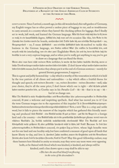
For an exhibition in London, I was asked to design a poster featuring a speech of my choice, for an audience who mainly (only?) spoke English.


A FOURTH OF JULY ORATION IN THE GERMAN TONGUE, DELIVERED AT A BANQUET OF THE ANGLO-AMERICAN CLUB OF STUDENTS BY MARK TWAIN.

I chose the speech by Mark Twain because all my other favourite speeches would have been in German, and thus no good to an audience in London. This excerpt comes from Twain’s essay “The awful German Language” and, while large chunks of it are in what he considers to be German, it is still comprehensible to an audience who doesn’t speak my language. It uses the prejudice you all have about us, the Krauts. Our language shows that, indeed, we are a nation of mechanically minded perfectionists. And then again, we’re not. The ability to laugh about ourselves is not too highly developed, but I certainly understand Twain’s frustration with that awful language of ours. But at least he went there, learnt it and thus understand that a culture can only be appreciated through its language. How can anybody who doesn’t speak or understand the language say that Germans have no sense of humour? If we did, he wouldn’t know.

The poster designed itself: the English text is set in Caslon, the typeface that George Bernard Shaw always specified for his writings; the German copy is set in Fraktur, the typeface used for setting German and other northern languages since Gutenberg. If it hadn’t been for the Nazis misusing these faces for their sinister purposes, we would still be reading Fraktur. It is the typeface of Goethe, Martin Luther, Karl Marx and Hegel. And it is perfectly suited to set our long words and interminable sentences, still evoking Gothic cathedrals and narrow streets with timbered houses. The one used is called Wittenberg Fraktur, after the town where Luther nailed his theses on a church door in 1517.

twain_poster

Typographic rules

A student asked in an email: Can you tell me about any particular typographic rules or details?


I hate those big questions. Any particular rules? Hundreds! All written down in my books. One particular one quickly: Text is usually set too tightly and with too big a wordspace. One of the legacies of Quark Xpress. Always set the optimum wordspace (under H&J) to 80% or less in unjustified setting. And increase tracking by at least 2 units (that’ll be 10 in InDesign) for sizes under 12 pt. If that makes the copy run too long, simply decrease the size by 0.1 or 0.2 pt. That actually increases space between lines (aka leading) and by giving the type a little more room to breathe, makes
a more legible even though it’s a little smaller.

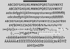
Don’t open tracking for my new typeface, FF Unit, as i have designed it to be generous at small sizes.

Interviews statements thoughts

Questions

I get asked a lot of questions from students, colleagues and friends and I write articles, columns and the occasional book. And it takes a lot of time going over the same stuff. So this blog is the beginning of a collection of emails and other writings plus gossip, hearsay and things I find interesting; unedited and in no particular order. And in both English and German. You have to sort it yourself. There’ll be new stuff every day – I have a very large hard drive.