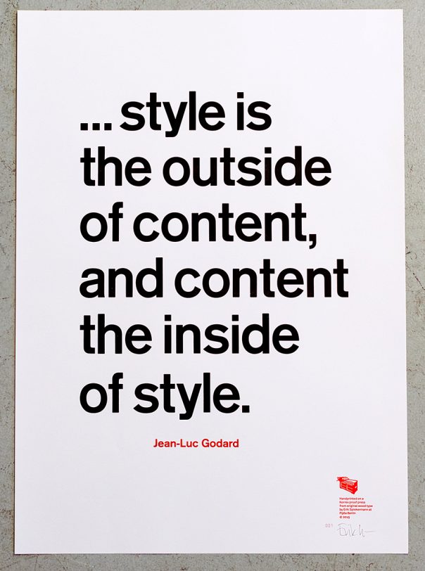
 This quote by Jean-Luc Godard has always intrigued me. The discussion about style versus content is as old as the profession of graphic design, and he puts it into perspective.
This is a longish quote which uses quite a few characters (eight lower case /e and five /o – all we have in that size), so we couldn’t resort to our larger Akzidenz Grotesk, but had to go to 12 cicero instead. In the end that turned out to be a wise move as the copy wouldn’t have fitted the page at the 16 cicero (i. e. pica or lines in English) size that we normally use for short quotes.
As always, the poster is printed on MetaPaper Rough Warm White 160 gsm in Black and Pantone Warm Red ink. From original wood and metal type on our Korrex Frankfurt, 50×70 cm.
The 50 posters each are numbered and signed by Erik Spiekermann. We ship everywhere and you can pay by PayPal or credit card. This poster as well as a few others is on sale now for half price. Please go to p98a to order.
http://cdn.myfonts.net/s/aw/720×360/277/0/142092.jpg
Klar. Das ist Werbung.
http://www.typografie.info/3/page/Schriften/allelisten.html
Eine verschrobene Welt. Wird man öfters verlinkt und dadurch öfters angeklickt, kommt man plötzlich darauf, dass man nur noch per Anmeldung Einsicht erhält.
Reaktion: Man hilft die Klickrate zu reduzieren, weil man sich keinen Datenfreigabezwängen aussetzt, was sich auch auf die Werbeeinnahmen auswirkt. :-}
at the University of St. Thoma spent the last seven years writing a pangram every single day: Craig Eliason’s Pangrams.
http://myfonts-wtf.s3.amazonaws.com/c4/c448812056a07bc569792a460a44e7ed.46185.jpeg