This is the first public showing of the new Antiqua. Lots of details will still change, but the overall impression stays. A solid working serif which matches MetaSans in weight and x-height.
This is the first public showing of the new Antiqua. Lots of details will still change, but the overall impression stays. A solid working serif which matches MetaSans in weight and x-height.
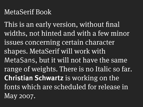
I hope you won’t mind an early hairsplitting from a guy who will be fielding a lot of excited requests. Is it “MetaSerif” or “Meta Serif”?
Not sure yet. Christian keeps calling it MetaAntiqua. We should really rename the whole family into MetaSans and MetaSerif, but that is not a practical option. The naming also has to work with font menues and keep the 2 families together.
What do you think?
Don’t forget to mention Kris Sowersby! He’ll be doing most of the heavy lifting on this. He and I have been figuring out the italic over the last week… it’s an interesting puzzle.
I had no idea the fonts were scheduled for May 2007 release. We’ll have to pick up the pace now!
Righto—May release it is then. Christian mate, we’d better get cracking!
Need a beta tester?
:-)
I would expect the space. “Meta Serif” to go with the existing “Meta Sans” and upcoming “Meta Brush Script”.
Great to see Kris on the job. He’s a genuine up-and-comer with a keen understanding of type forms and nuance.
Actually, the sans version of FF Meta should keep its name sans “Sans”. Old users have already had to endure two two name changes.
Two questions:
1. How much will the font cost?
2. Can I pay more?
Ha!
VR/
ps. Interesting definitions of “Meta.”
So when you guys are planning to release this another history?? Loved this face.
All the best.
/.satya
Good news this Meta Antiqua (I like that name!). The top serifs miss some of the funny features from Meta, sadly. Perhaps you kept them as a swash feature for italics?
To be even more precise, doesn’t make sense to call it Meta Serif. Generally, we call more the original serif version of a family Erik, then Erik Sans, than Erik Serif and Erik.
Its why I think Meta Antiqua (in reference to german practises with the word Antiqua?) is better or even a fully different name…
The problem with “Antiqua” is that most English speakers don’t understand its meaning. To them, it means “antique” or “old” — certainly not what this typeface is.
That may be the case but it hasn’t prevented other Antiquas becoming a success world-wide. Most of them had had the Antiqua suffix dropped in common usage, but Meta will have to keep it because the Sans is the default and the Serif the extension.
I’m still not 100% convinced, so thanks for your opinion.
>To them, it means “antique” or “old”
Well, its a case, a Serif version is more traditional on its style than a Sans. Its perception its clearly more traditional. Antiqua fit better than Serif on this case. If you have a Meta Serif, people will begin to search or a Meta Sans…
And using Meta Antiqua is nice, because Serif/Antiqua/Sans is story to add during lectures and deserve a paragraph about it in the Meta Antiqua type specimen. People love such things… :)
Erik Spiekermann: visionnaire or provocateur?
I join the thread late (as usual!) but Meta Antiqua as a name certainly gets my vote; much better than Meta Serif because it will oblige the English speakers to show some flexibility and ah, maybe learn something about other people’s naming conventions for a change.
I for one, can’t wait to print out the entire character sets of “Antiqua”, Meta and Officina and compare!
* Another vote for the name Meta Antiqua!
Is the intention of Meta to emulate a certain existing style of serif type, or to produce something new? I ask because I am writing a piece on new type categories, including a category for new serif designs that do not fit into existing categories.
Every text typeface has to emulate an existing style, or it won’t be accepted. All text faces look alike by 90%, there is very little room to be individual within one category. Meta Antiqua has to be a sturdy, hard-working companion to Meta Sans. If it needs to work in small sizes, on bad paper, perhaps printed on less-than-high-resolution printers, it needs to have low contrast, sturdy serifs and well-defined counters. Just as the Sans does.