For years I had imagined how cool our German Autobahn-signage could look if set in a better typeface than our boring, predictable, stiff old DIN. I never thought that one day I might actually iss that typeface.
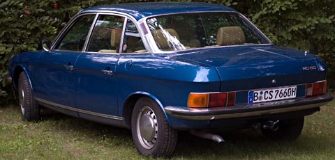
When I first got the numberplates for my NSU 22 years ago, those were also set in DIN. Cars that are older than 30 years can get Oldtimer status and an H for historic on the plates. As the Ro80 had first been registered in 1977, that time had just come up.

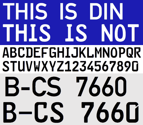
The official typeface for our license plates is now called FE-Mittelschrift, with FE meaning it is Fälschungs-Erschwert, i.e. difficult to forge. Apparently car thieves, terrorists and notorious law-breakers had been exploiting DIN’s geometric construction principle and turning E into F or 3 into 8 etc by simply using a bit of black tape or white paint.


Just as well that those perpetrators obviously do not possess the typographic wherewithall to make their own alphabets for their license plates.
“No policeman would notice if you invented new characters instead.”
A security expert I show this to points out that the purpose of the change is not for humans, but for automated number-plate scanners.
i imagine here (Uruguay) if someone would like to copy this FE font, will create DIN characters!!!
Maybe german policeman are going to linotype often…
:) great blog!
You might be interested in reading Susanne Schaller’s article on this subject.
i love martin fredrikson’s typeface based on this, sauerkrauto. always a favourite of mine: http://www.fountain.nu/catalogue/sauerkrauto.asp
This is an AWESOME writeup on font usage. Thanks!
I just found this today. Is it an “R” or “12”?
Who can say?
http://www.flickr.com/photos/davidcowie/5151633406/in/pool-56028645@N00/