Every typeface needs its own layout that will make it look good and appropriate. An Italian producer of plastic furniture with a showroom in an old industrial building in San Francisco could do worse than displaying its name in large Helvetica letters. Rotis or Meta would have been totally wrong there.
Local designer Graham Hicks shot the wall mid-painting.
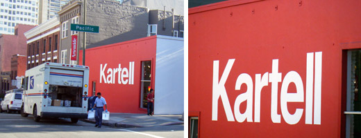
Terrific shot… The Kartell showroom in Paris uses a big Helvetica display as well, albeit within the store, a few inches back from the window, which creates an equally striking contrast with the building’s stone facade. They certainly know how to use it to the best effect!
I agree
In your Helvetica interview, you said something along the lines of Helvetica being a big guy who would look silly in a tight t-shirt. This is the perfect example of it — other less “meaty” typefaces would look like an idiot; a skinny guy in a big shirt.
However, it is less effective than it would be, say, 20 years ago because of the saturation of Helvetica everywhere. The question of whether a work is judged based on just “looks (conventionally) good and works well” or “is original yet works well” comes to mind.
i don’t understand why meta would be so bad? wasn’t it designed to be read at angles? I guess it was also designed for readability at small size maybe thats the problem? but what the hell do i know i only just learned this from wikipedia :)
Thank you, Stephen. Your showing me that photo reminded me that I should’ve taken that photograph years ago. This is a few minutes from our house here in SF and I walk by there almost every day. There’s something about a plain colour with that plain typeface.
BTW: Meta also would have looked good, on a Herman Miller showroom for example. But the authority that often makes Helvetica look boring and tired, here works in its favour.
That is the point to make: you can make any typeface look really bad, and you can make (almost) any typeface look good.
It’s beautiful and timeless in that context – a big red wall with typography like that in a normal city street. It gets interesting when you see these furniture companies competing for attention all in one place like the milan furniture fair each year. Kartell, Capallini, Knoll, Poliform and many others – all using restrained helvetica identities, all sort of looking the same. It’s not a fair comparison or context in that environment, however it does make you search harder for the spirit in each brand.
couldn’t disagree more. any number of sans-serif fonts would provide more substance here. and there are many that could do so while mimicking helvetica greatly, but provide slight changes in such a way as to express uniqueness.
this to me looks like a huge wall saying ‘kartell street’
how many companies have you seen with a solid color background with a white helvetica word. such a burden leaves a lot to be asked for from the word in itself to carry the remainder of the message and character of the company. the name ‘kartell’ does not suffice.
@bcd:
Really? I don’t think I’ve ever seen a street name rendered on the side of a building like that. The use of a painted load-bearing masonry wall announcing its tenant has more historic connotations than any suggestion of a street sign.
The company was founded in the Midcentury. It produces Modern and contemporary furniture. Helvetica makes sense in that it is connected with the Modern movement but has few of the retro connotations of many Modern typefaces. (In essence, Helvetica posits a Modernism that attempts to be timeless.) It clearly states the movement from which Kartell was born yet does not feel dated.
Also, the assumption is that you either know Kartell or you don’t. If you don’t, you’re not their target customer. If you do, you know the identity has been fairly consistent over the years.
(Why are the last few letters of “Kartell” cut off at the bottom?)
I love Helvetica, but the combination “rt” in that typeface always looks horrible to me.
Doesn’t it bother you that they have the exact same logo as Knoll? Two identical red Helvetica “K–ll” logos, in the same industry even.
when we get into these discussions about things like helvetica and it’s use in a logo like this, i always wonder what the average public would say.
from a pure design perspective, helvetica with a good amount of negative space looks good. it looks clean, and it looks high end. i’m not saing this to defend helvetica, i’m saying it because it’s true. while it’s not going to inspire, it’s not going to offend either. and it might even get people wondering what kartell is. i think the plain helvetica logo on the side of the building has an air of mystery that makes me want to know what is in there. i also don’t think that this is inherently true with only helvetica. univers or avenir would have a similar effect, but have not evolved into default status.
i’m also sure that kartell has had this logo since helvetica wasn’t such an oft used typeface.