For an exhibition in London, I was asked to design a poster featuring a speech of my choice, for an audience who mainly (only?) spoke English.
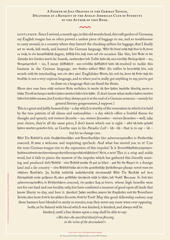
A FOURTH OF JULY ORATION IN THE GERMAN TONGUE, DELIVERED AT A BANQUET OF THE ANGLO-AMERICAN CLUB OF STUDENTS BY MARK TWAIN.
I chose the speech by Mark Twain because all my other favourite speeches would have been in German, and thus no good to an audience in London. This excerpt comes from Twain’s essay “The awful German Language” and, while large chunks of it are in what he considers to be German, it is still comprehensible to an audience who doesn’t speak my language. It uses the prejudice you all have about us, the Krauts. Our language shows that, indeed, we are a nation of mechanically minded perfectionists. And then again, we’re not. The ability to laugh about ourselves is not too highly developed, but I certainly understand Twain’s frustration with that awful language of ours. But at least he went there, learnt it and thus understand that a culture can only be appreciated through its language. How can anybody who doesn’t speak or understand the language say that Germans have no sense of humour? If we did, he wouldn’t know.
The poster designed itself: the English text is set in Caslon, the typeface that George Bernard Shaw always specified for his writings; the German copy is set in Fraktur, the typeface used for setting German and other northern languages since Gutenberg. If it hadn’t been for the Nazis misusing these faces for their sinister purposes, we would still be reading Fraktur. It is the typeface of Goethe, Martin Luther, Karl Marx and Hegel. And it is perfectly suited to set our long words and interminable sentences, still evoking Gothic cathedrals and narrow streets with timbered houses. The one used is called Wittenberg Fraktur, after the town where Luther nailed his theses on a church door in 1517.