Magazines and newspapers are suffering, everywhere. Everywhere? Apparently, one of them is doing extremely well: The Economist. Michael Hirschorn argues in this article in The Atlantic that is has to do with their attitude, style of writing, careful research – in other words quality. In Hirschorn’s words, The Economist may be proof for the fact that »although digital media is clearly supplanting everything analog, digital will not necessarily destroy analog. A better word might be displace.«.
Hirschorn does not mention design, so I’ll have to do that. As I wrote in January 2007 in this very blog on the occasion of the publication of ITC Officina Display, I was responsible for the redesign of The Economist in May 2001.

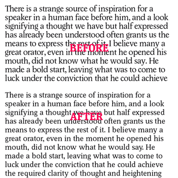
As seen here, we touched everything, including the text face. It was set smaller in the new version, but the client always thought we’d increased the type size, because it appeared bigger on the page. The images below show two typical spreads, one before, when the newspaper was printed black and white with a bit of red only, and one after, when we had gone to full colour. While I am very pleased that our design held up so well, I think that every publication needs its design evaluated every six or so years. It’s been eight years already for The Economist. Is anybody reading my blog in St. James’s Street?

Good job on the redesign! It is really hard to convince clients that this typeface is better than the other, unless they have some basic creativity knowledge. Recently I made a small opening program sheet for a showroom, and the creative department told me…’but please set it in Times New Roman, that is the font we use for all the materials’… ‘Oh, ok, I said’… (!?)
It is very easy to convince clients to use a typeface that actually reads better. Just put it into the current layout, print it out and let them judge for themselves. That’s what we did with The Economist. Our type is a little smaller than the old one, but still reads better. We left the leading and increased the tracking. Now the type can breathe.