Category Archives: writings | texte

Craft

The human impuls to make something for its own sake, to do it as well as you can.

The craftsman’s realm is far broader than skilled manual labor; the computer programmer, the doctor, the parent, and the citizen need to learn the values of good craftsmanship today. The result of physical work, made from things which have passed through many hands, is imbued with its process. It carries a message beyond the mere practical application.

In English it’s called “coming to grips with something”. In German the word is “begreifen”. Without our hands, our brain does not work properly. At p98a we call our craft Post-Digital Printing or Hacking Gutenberg. 

Preservation through production.

Digital pre-press enables us to make productive use of the old equipment which connects us with our industrial and cultural heritage. Apart from looking after old hardware, we need to maintain expert knowledge and professions otherwise threatened by extinction. Quite a few of the old machines and processes are still around; they are in working order and will probably survive all of us, but using them for commercial projects is difficult. Taking part in one of our workshops in Berlin will reconnect you to the basics of the design process; you’ll realize that slowing down is fun, constraints are relaxing and using your hands is a skill you may have forgotten but will quickly appreciate again.

Workshops at p98a can accommodate up to 12 participants.

Back to Basics – why the old is new

Graphic designers have been bending over backwards for years, pulling all the stops in order to turn a message into communication. We’ve spent hours finding the right typeface, fussed with tiny increments in size, introduced refinements in OpenType fonts containing hundreds of ligatures, alternate characters and content-sensitive positions.

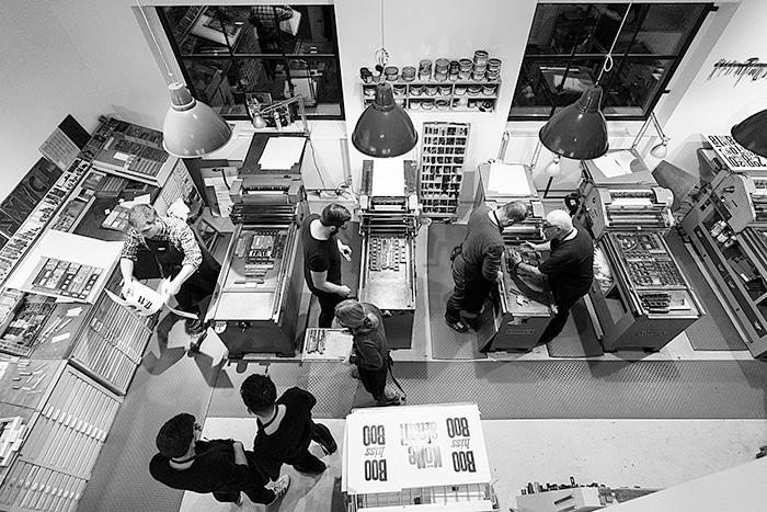
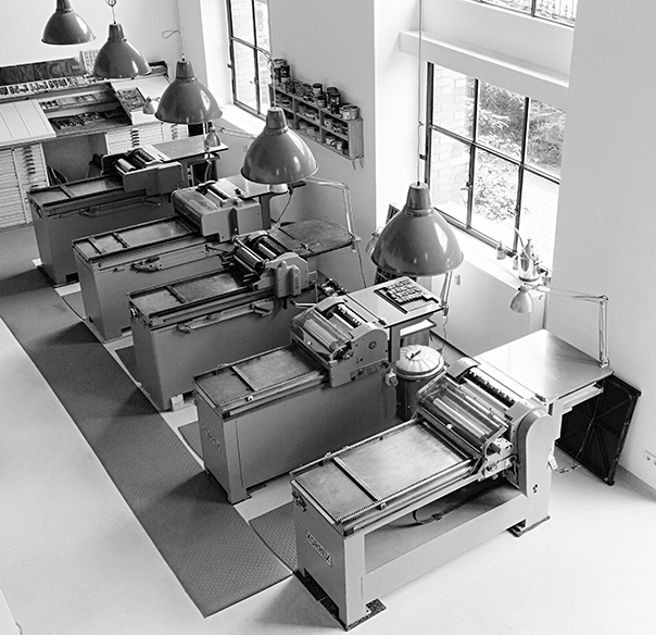
The workshop at Potsdamer Strasse 98a in Berlin

And now “letterpress” is back. Suddenly we’re happy to take a lowercase l and use it for a figure 1 because that particular typeface doesn’t have enough figures? WTF? Wood type sucks when it comes to kerning because you would have to cut away bits of the letter itself in order to achieve “perfect” spacing. There are no half sizes, let alone fine increments in letterspacing, unless you want to spend hours inserting slivers of brass or thin paper to refine a line of type. The material defines not only how you work but also what the result will look like. If you only have a large wood type font in one size, you run out of certain characters very quickly. So you’ll pick a smaller size which will have more of each character or you’ll choose another typeface altogether. If that doesn’t help, you’ll change the message.

The typographic system of letters and spaces – horizontal and vertical ones – has been refined since Gutenberg first invented printing with movable type almost 600 years ago. The whole system is one giant grid systems that can be divided and multiplied in myriad ways. Pages will always look good as long as you work within the constraints, time being one of them. If you spend too much time tweaking the system, things will look mannered and inappropriate. Modesty is a virtue when working with well-defined but finite elements and tools.

You need to know what quads are, spaces, reglet, furniture. You learn to use a composing stick, chases, cases, hacksaws, pincers, awls, spanners, screwdrivers and heavy lifting equipment. You’ll be working with dirty rags and virgin white paper, inks, grease, machine oil and petroleum. And you’ll find out that the work isn’t done until all those materials are back in their proper places and that cleaning up can take almost as long as setting up without being any fun. Everything you touch is either very heavy or very delicate. Or both.

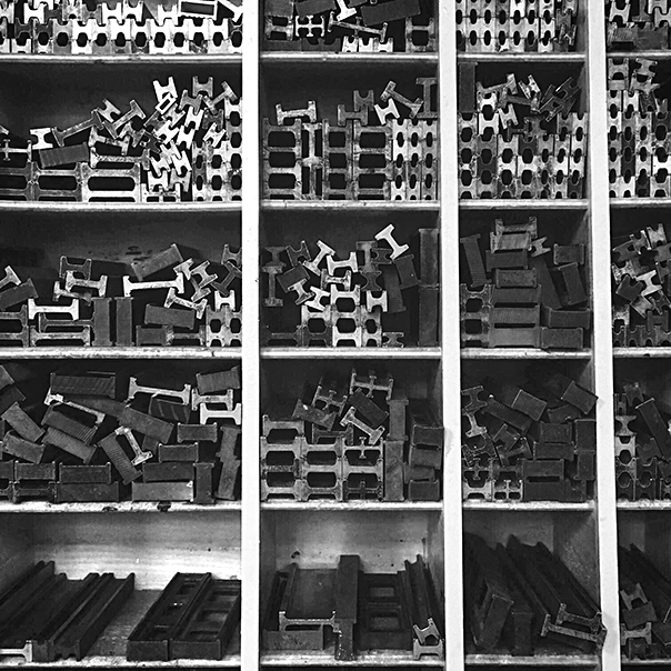
p98a_stege_bwFurniture and reglet, the “invisible” parts of the page

You’ll never have the right size type, never enough characters and you’ll always run out of the right size paper just a few sheets from the final print. At the weekend. Mistakes will manifest themselves in loss of materials and too much time spent in the shop. But there is nothing like setting up a forme (yes, with a silent e at the end) from bits of lead, steel, aluminium, brass and wood – a very messy sight, as these materials have all been around and aged differently – and then running a clean white sheet of paper through the press and over that colourful forme. Suddenly and quite magically, there is a message: words on paper, exactly where you wanted them.

You know what it took to compose the words into the forme, with all those bits of metal in between. (No return key here and no tabs either; the white space isn’t.) The dear reader doesn’t know, nor needs to. But she senses that this message is the result of a physical process, made with things that have been touched by many hands. The process communicates itself. It doesn’t get in the way of the message, it enhances it.
Photos: Norman Posselt

From metaphor to maturity

This article was published in Blueprint magazine in 2011 (too lazy to check which issue exactly). It was then re-published by John Boardley in his Codex magazine, albeit slightly edited. I re-re-publish it here because the discussion about digital kitsch and appropriate metaphors has just come up again, mainly because Apple’s OS Lion now also features faux leather and adds pseudo-physical features like animated turning of pages to the interface which first appeared on the iPad, a populist device, not a computer that the likes of us depend upon for work.

The list of available fonts on iOS mentioned at the end may be out of date, but you’ll get the message. Since I wrote this, the new iPad has appeared, featuring the amazing Retina high-resolution screen. Its sharpness suddenly shows up the flaws in typefaces. To me – an old person – this reminds me of the discussion we had when photosetting took over hot metal type in the 70s. And everybody makes the same assumptions again. Mostly the wrong ones, looking for a solution in technology instead of design.


“A typographer who hasn’t found the appropriate typeface may not have decreased the informational value of a text, but gave up the opportunity to considerably increase its effectiveness.”

Thus wrote G.W. Ovink, Dutch typographer and historian, way back before he knew any other media besides paper.

Every medium has always had constraints for the type that goes with it. Whether you design a newspaper, a poster, a stamp or a website: you have to consider the technical environment, the reader, the client, the content. As the surfaces of substrates used for printing got smoother, the resolution of type went up along with it. If you look at a Gutenberg Bible through a magnifying glass, you’d never believe the craters, bumps and blotches that look like gorgeous letters from a safe reading distance. Bright and shiny, smoothly coated paper for high-quality offset printing requires the letters to be sharp and well-defined, even though the human eye doesn’t like too much contrast. Technology, being what it is – a means to promote itself if not mankind – kept providing more resolution and thus invisible detail than we ever needed. Once printing could hardly be more refined, along came the Cathode Ray Tube, and all the high definition that the suppliers of typesetting and printing equipment had declared not only inevitable but vital, was broken down into crude bits of colour, red, green and blue only. Type suddenly looked like Lego bricks when compared to the refinement a printer like Bodoni had been capable of at the beginning of the 19th century, long before photosetting and offset printing, let alone coated stock.

The web has always just been bad paper. Now it’s starting to look like good paper and designers will have to treat it as such. But as always at the beginning of a new paradigm, we have to imitate the old one while we get used to the new possibilities that people over a certain age always consider a challenge. Apart from what technology will allow us to do, there are physical laws – our eyes, our brain, light, contrast; we cannot ignore those if we want to communicate. Cultural parameters like reading habits, literary culture (or lack of) – our deeply embedded fear of change, all these give an excuse to imitate the old, even though there are no technical reasons to do so. But we read best what we read most.

Every new medium raises the same questions. Things which were thought mature in one media will take a while to mature in a new one. Look at the new electronic books, particularly those on Apple’s amazing iPad: a book is presented as a reproduction of the traditional stack of bound pieces of paper. Going from one page to the next is accompanied by an animation of it being turned, even with the sound of paper being rustled. While you keep thumbing pages, however, the stack stays equally thick on either side, turning the metaphor into a lie, into digital kitsch. It feels wrong and it is wrong. Metaphors are useful because we do not really want to know what goes on in the digital maze under the bonnet that the operating system hides. Superfluous visual noise doesn’t make the reading any easier, it just presumes that we’re too stupid to notice the difference between a stack of glued paper and a battery-driven piece of plastic. If people really wanted to emulate the whole physical experience, why not give us the musty smell of old books, the scent of printing ink?

Worse than those misguided and patronizing metaphors is the fact that publishers can no longer decide which typeface their text is set in. Apple provides just five (Baskerville, Cochin, Palatino, Times, Verdana), and only one of them (Palatino) can be considered a book face suitable for reading on a screen. Somehow, the dichotomy seems weird between cool aluminium shapes, high-tech displays and amazing technology on the one hand, and wooden bookshelves on the other, as a metaphor for an online bookshop which provides books that look older on screen than they do in the real world. Perhaps the individual design departments responsible should talk to each other? The industrial designers certainly seem to be ahead of the User Interface people at Apple.

Still, while electronic books have a way to go (the Kindle is actually a little further ahead in typographic matters), there are signs that the web will soon allow the same degree of typographic refinements that we’re used to on traditional paper. Not only can we use every existing typeface to be displayed in a browser, but new mark-up languages will give us typographic treats like ligatures, small caps and old style figures that printers in the 15th century developed for their books which we still consider benchmarks today. If only somebody could invent a battery that lasted as long as paper does.
Fear of the First Line

Now and again, Blueprint magazine publishes one of my monthly columns on their website. This is the November column.

ONCE I KNOW what topic I want to (or have to) write about, the most critical decision becomes inevitable: how to begin? No evening class in Creative Writing, no journalism course fails to mention how important the first sentence is for the impression a text makes upon the unprepared reader. Norbert Miller, a German literary historian, published a collection of essays about what he called this ‘radical decision’. The first sentence compresses the infinite space for reflection into a finite object, settling on one version out of a multitude of variations and possible strategies.

Consider these alternatives: ‘It was a dark and stormy night.’ and ‘One morning, as Gregor Samsa was waking up from anxious dreams, he discovered that in his bed he had been changed into a monstrous verminous bug.’
Continue reading

From Metaphor to Maturity

This is a piece I originally wrote for my Achtung column in Blueprint magazine. When John Boardley asked me to contribute to his forthcoming magazine Codex, I was too busy to write anything from scratch. As, however, I considered the overlap between Blueprint’s and Codex’s readership to be negligible, I offered this article. John suggested sending him a photography of my infamous bookshelf that runs over two floors in our house in Berlin, where the top shelves can only be reached by strapping oneself into a climber’s harness which is moved up and down by an electrically operated winch.

I don’t think John edited my piece very much, but I did notice that he changed my British aluminium to the US aluminum. As you can see below, I would have insisted on my original spelling. No idea why one would ever change that word in the first place – in German word we also write (and say) Aluminium. John did me a favour though: he found the source for the Ovink quote below. Thank you, John, for that and for Codex.
Continue reading

Year Zero?

I have just returned from the OFFF festival in Barcelona. Earlier this year, they asked me for a statement about the future. They announced this the Year Zero, a restart. Go back to zero, wipe out the past, etc. Not sure I agree with that, but that’ll be the topic for another comment.

Usually, I deny these requests because I don’t like making predictions about subjects I don’t know. But they insisted, and in the end I sent them this little piece:


Rethink Design, Redesign Thinking.
As a designer, I like the future.

After centuries of being dominated by technology – from cutting wood to printing negatives, from baking mud bricks to reinforcing concrete – designers of all disciplines now have the tools to present and make anything imaginable. There is no excuse for not coming up with new concepts. Designers and architects can no longer blame their shortcomings on the limits of technology. There will always be clients to blame – that has not changed since the Pope asked Michelangelo to paint the ceiling of that little chapel in the Vatican.

The best thing, however, is the fact that we are beginning to realize something else: we have talents that go beyond making things work well and look good. We can also take apart ideas, look at them, throw away what is not needed and put them back together again. Designers can redesign thinking. And we need to, because nobody else will.

The dog ate my homework!

Every day I get emails from students who have a project to finish. They ask me about my work, my opinions and often want me to send them my fonts as that would make the design of their thesis much easier. More often than not they ask about things they could have found out about if they had only spent a bit more time looking around or by going to a library, instead of just checking the first page of a Google query. So I tell them that I will answer proper questions that are directed at me and that concern my work, my experience or even my opinions, but that I will only do so once they’ve done their homework.
Just the other day I got a request from a student who is interested in the typography on football shirts. Great topic, and one that has been written about a lot. But he obviously hadn’t looked anywhere before writing to me. He even asks me why this »information is limited and difficult to get hold of?«.
But read our correspondence for yourselves.

***


Dear Mr Spiekermann,
My name is Rajeev Saroy and I am currently studying Graphic Communication at the University of Wolverhampton. The final year of my degree requires me to write a dissertation on a topic of interest related to a major subject within my degree. Football is a very big part of my life and I have always questioned the typography on football t-shirts. This is the subject that I have chosen to explore and investigate.
I am having great difficulties in gathering information around my chosen subject and I have put together a few questions that I would like you to answer in as much detail as you possibly can.

1.     Who designs the typefaces that are employed on football t-shirts?

2.     Why is this information limited and very difficult to get hold of?

3.     Why is it that many football teams cannot choose their own shirt numbers and fonts?

4.     In the English Premier League, all teams are obliged to obtain the same typeface. Who authorises this?

5.     Typefaces and the arrangement on football t-shirts is special job for graphic designers. How many designers have contributed towards this that you are aware of?

6.     If typefaces are not designed by Graphic designers, who has created them in the past and who has it been approved by?

7.     Do FIFA, UEFA and the FA have a set of rules and regulations, which restrict the true form of type? Is it due to these rules that type is deformed, chopped and changed?

8.     Once a typeface is created, who approves it?

9.     Is typography neglected on football t-shirts? If the answer is yes, why is this? Is it down to mega corporations or is it due to the lack of typographic knowledge by football organisations?

10. Are there any contemporary typographers that can contribute their skills towards type on football t-shirts?

11. Can new/existing typefaces replace ones that have been manipulated?
If there are any issues or views that you would like to mention, please feel free to do so.
May I thank you for your time and co-operation.

RAJEEV SAROY.

***


Dear Rajeev,
most of your questions can only be answered by the people in the football business. How should I know who approves the design? Why do you ask me why this information is difficult to get hold of? Aren’t you the student who is supposed to do the assignment?

Could it be that you haven’t done your homework? Surely this is something the FA or FIFA will answer. Those are scary bureaucracies, but I’m not going to tackle them on your behalf.

There is plenty of information out there, on the blogs, on typophile.com. The makers of kit, like Puma, Umbro, Adidas et al commission this stuff, of course, because they make it.
One designer in London has actually designed type for football shirts (Puma?): Bruno Maag, of Dalton Maag.

Ask him, but do more of your homework first. If football is a very big part of your life, then get off your arse and look around. Of course it’s difficult, but it is also difficult for me to spend part of my spare time on a saturday answering emails from kids who haven’t even looked at the information from the associations, the makers of kit.

Being a student means learning to learn, not simply writing an email and hoping that somebody else will do the work for you. There was a world before Google.

Learning from La Vegas

My column in Blueprint magazine always covers the main topic of the issue. This time they asked me to write about Las Vegas.

Las Vegas is
a cartoon of itself, a standing joke, but without the slightest hint of irony, or self-distance. It is perhaps the most American of US cities, built evidence to the fact that bigger is better and that better is bigger. Nothing in Las Vegas started as an original idea, and nothing seems older than 10 years, but the sheer amount of borrowed images makes the whole totally incomparable.

Continue reading

Easypeasy

While avoiding writing my next column for Blueprint magazine, I found the piece I wrote last year about the same topic, Japan. There is no other reason to publish it here and now except the fact that I have it right in front of me now, an unformatted text file.
Continue reading