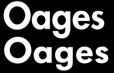
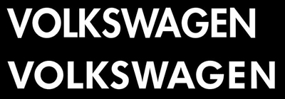
I have often found that supposedly perfect typefaces turn out to be less so on close inspection. Consider these examples for Futura: the version from Adobe (top in both examples) is clearly badly digitized. Early days, they were still learning — it’s not about blaming anybody, but about getting our client — Volkswagen — a decent typeface. If Futura’s O is supposed to look like a perfect circle, why does it look like an egg? And look at the counters in a, g, and e! Those are also supposed to be circular, not egg-shaped. So we took the typeface apart and reassembled it. If your VW had egg-shaped wheels, wouldn’t you complain? Or excuse it as an expression of the designer’s creativity?