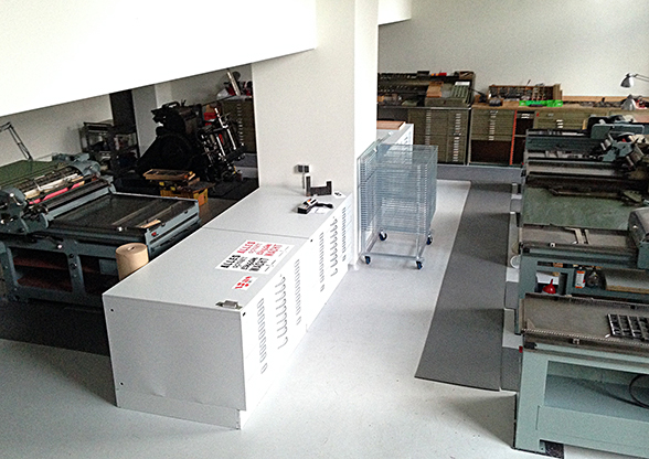
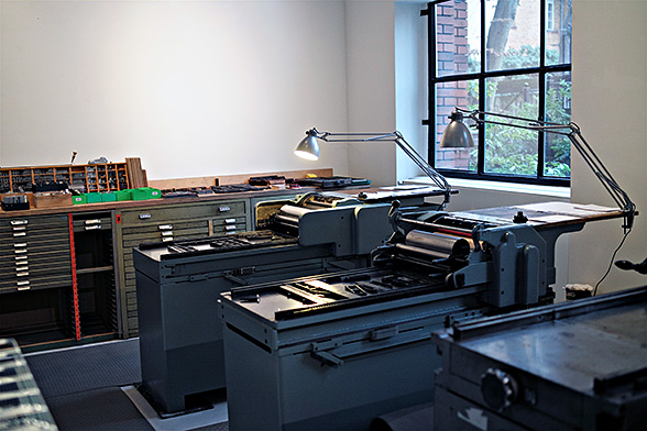
We now have two FAG proof presses, one Grafix, a Korrex Berlin, a Korrex Nürnberg, a Korrex Frankfurt and a Heidelberger Tiegel (platen). We won’t even mention all the small platens in the shop. And as off last week, all the presses are up and running, although the latest FAG needs cleaning up and repainting.

On top of that a surprising amount of large display type, made from wood or Plakadur, Berthold’s resin material from the 50s. And lots of lead type, old and new, including freshly cast Akzidenz Grotesk and Block in sizes from 8 to 24 point Didot. Reglet, quads and furniture, iron and aluminium, are waiting to be sorted. A second row of cabinets is on order.
Category Archives: news | neuigkeiten
Sheep book 3.0 ready
The English version of “Stop Stealing Sheep and learn how to use type properly” has been out for a while. Peachpit still offer a big discount if you buy from them direct:

Roadmap 2013
This is the video of my conversation with Jeff Veen at the Gigaom conference in San Francisco this week:
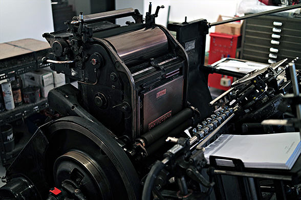
Ready to print
We will have six proof presses in the shop:
1 Korrex Nürnberg 35×58, 1 Korrex Berlin 50×65, 1 Korrex Frankfurt 61×86, 1 FAG 35×58, 1 Grafix 35×58 and one more FAG coming next week.
The Heidelberg Windmill is waiting to be put together and all the type needs sorting.
Ready to go any day now.

4 small presses waiting for another one
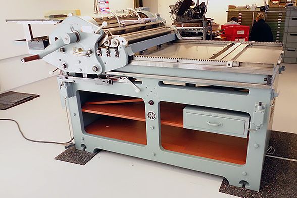
The big Korrex is all electric. It makes noises like a battleship in action.
Better screens
Discussing the quality of type on a smartphone screen is difficult without the actual object at hand. I posted screenshots, but they were reduced, changed in resolution, uploaded and rendered in a browser. Far removed from the real thing.
While that remains elusive, here’s another try at doing our work and that of the Firefox OS team justice. This is an attempt at uploading one of the screens at the same size and resolution it was sent to me. Who knows what WordPress and the browsers will do to it…
Then again, if our typeface survives this, it’ll be well suited for even modest resolution on a small screen. The original screenshot is 320x480px at 165ppi.

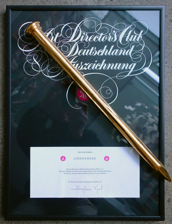
Another Lifetime Achievement
It could be a signal to quit: this is my fourth lifetime award since the German Design Council gave me their award in 2011, followed by SoTA (Society of Typographic Afficionados) and the TDC (TypeDirectors Club New York). The German Art Directors gave me their award last friday here in Berlin. It is a golden nail. Honi soit qui mal y pense…
Thank you.
Warning to all bike thieves!
My old Rivendell road bike was stolen in June. I’d had it for a long time and losing it did hurt. I think stealing a bicycle like that is more than just a little misdemeanour; it is a wicked crime and shows really bad character.
The only way I could get over the loss was by going to see Bradley Woehl at the American Cyclery in San Francisco and have him build me a new bicycle. The frame is made by Waterford in Wisconsin, the paint job is pretty much the same as my Rivendell and the parts are mostly Campagnola. We put 28 tyres on it, which looks less elegant than 23, but if you have seen the roads here in San Francisco, you know that even that is too thin.
I’m publishing a few pictures here as a public record. If anybody dares steal this bike, there’ll be lots of people looking out for it.

Founding FontShop
Stephen Coles interviewed me about the history of FontShop.
John Walters lauds Erik Spiekermann
John gave this short speech on the occasion of me receiving the Lifetime Achievement Award from the German Design Council.

John Walters

Andrej Kupetz and Erik Spiekermann
When I went to Berlin a couple of years ago, in preparation for Eye 74, our Berlin special, I kept running into Erik Spiekermann. Not literally, though I did later spend a pleasant evening in the company of Erik and his wife Susanna. But I quickly realised that I couldn’t avoid encountering Erik and his legacy. For a start, nearly every person I met had some connection to him: either they had collaborated with him, or worked for him, or they’d been taught or otherwise encouraged by Erik early in their career. And even people who didn’t know him very well, or who had never met him, seemed to have an opinion about him. They knew him as a designer, as a typographer, as a type evangelist and as a writer – chiefly on the subject of typography, but with opinions about every other subject: politics, society, culture, art, music and so on. Also, quite apart from all the people I met, there were traces of Erik everywhere I went, on the subway, in the signs and the many different civic and commercial public projects that bore the stamp of one of his design practices, or that used one of his typefaces.
So that’s why we called the Eye 74 piece ‘Six degrees of Erik Spiekermann’. We devoted a gatefold information graphic to all the connections that he had made throughout his career, spanning the years since 1979, when the company that would become Meta was founded, to the present-day activities of Edenspiekermann. Like Kevin Bacon, Erik seemed to connect anyone who was anyone in graphic design, visual communication, branding and typography. Yet if our world were Hollywood, Erik would perhaps be more like Steven Spielberg than an actor like Bacon.
Erik is both a generalist and a specialist. The first time I ran into him, at an international typography conference, he asked me how I could stand to be surrounded by so many ‘nerds’? He knows how designers and typographers think, in the most minute detail, because that’s the way he thinks, too. Yet he’s managed to lift his head above the cubicle that all too often restricts the graphic design world, and look dispassionately at commerce and government and charities, taking the time to understand how they think, too. I have daily reason to be grateful for Erik’s advice, since his ideas about the Rundbuero, expressed in Unit Editions’ book Studio Culture, helped me make some changes in the way I organise my own office.
William Owen described Erik (in Eye 18) as a ‘consummate pluralist’, while also taking on Erik’s own definition of himself as a ‘typographic designer’, who designs ‘from the word up’, a phrase later used for a slim volume on Meta’s work. William also noted that Erik ‘valued work of a kind he could never or would never want to do.’ But that is not surprising. It is almost the definition of a anyone with a rounded interest in culture and the world at large: you don’t have to sing opera to value Nixon in China, nor do you have to paint in oils to appreciate art.
I think it is Erik’s ability to work and show curiosity at both micro and macro levels (and all points between) that makes him a good writer, as well as a good designer. His writing is clear and to the point, whether in a column for Blueprint magazine or in an email containing directions to his house. Even if he had done little else, the book he wrote with E. M Ginger, Stop Stealing Sheep and Learn How Type Works, would be an international calling card of huge proportions, since it’s one of the few genuinely informative, entertaining and readable books about type written in the past few decades.
When I first watched the DVD of Gary Hustwit’s Helvetica, whose extras section includes an extended interview with Erik, I was amused to hear him say how much he liked being an ‘unknown designer’. Today’s ceremony seems an odd place to talk about Erik’s lack of recognition. Yet he was making an important point about the role of design – graphic design, type design and typography in particular – in civic life. As Erik explains in that documentary, neatly diverting the director from too many questions about a typeface he doesn’t much care for, a nation’s culture, the stuff that surrounds us, is made of good architecture and building, good food and cafes and supposedly nerdy things like the small type in timetables for public transport, or the signs in stations, or the little details that make your iPhone work intuitively.
Erik gets a kick out of being the unknown author behind some of this stuff, even when the money is terrible, and he has to fight ‘the system’ – the conventional way of doing something – to make things just a little bit better. Few people might notice, or remark out loud that the timetable has acquired more legible, readable type, or better navigation, but as Erik would say, ‘That is the point.’ Many designers get a kick out of making things better, or finding a solution, or being part of the team that did that, whether their name is on the finished product or not. So I think we could regard this prize as one that Erik can share, just a little bit, with all the unknown designers out there, who play their part in making our lives better, our small print more legible.
Around the time I became editor of Eye, we published an updated version of Ken Garland’s ‘First Things First’,* calling on designers to examine their priorities. The new manifesto included these sentences: ‘Unprecedented environmental, social and cultural crises demand our attention. Many cultural interventions, social marketing campaigns, books, magazines, exhibitions, educational tools, television programmes, films, charitable causes and other information design projects urgently require our expertise and help.’ Erik was one of 33 designers who put their names to ‘First Things First 2000’, and that statement sounds just as relevant today – throw mobile devices and social media into the mix and it still holds good.
I agreed to come here on the strict understanding that the Designpreis would not signify or herald any slowing down on Erik’s part. He still works at a furious pace. He even has a proofing press in his house, where he’s cooking up plans to combine digital and analogue, making plates with a laser cutter. And in addition to all the usual client work, he is publishing a series of booklets of writings that he likes, and more little red books of his own work – the thoughts of Chairman Erik.
These thoughts are worth sharing. Erik is concerned about nerdy details, yet he loves to construct the big picture. He’s a great advocate of design’s role in civilised society, all the boring, behind-the-scenes stuff, but he is also quick to spot what is new and cool, and to champion and mentor young talent – the new Edenspiekermann scholarship is a significant addition to this aspect of Erik’s life and work. For all these reasons, Erik is a worthy recipient of whatever awards get thrown his way – and they won’t go to his head.
By John L. Walters, editor, co-publisher, Eye magazine, 2011
* Published simultaneously with several other design magazines, including Blueprint, Form and Emigre, see https://bit.ly/FTF2000