Under download above you can still see the bad copy of the Typomania video that I did for the BBC almost 25 years ago. Two fellow typomaniacs have taken the sound track from that video and remixed it into Typefaces give us signals. See and hear for yourselves:
Category Archives: type | schriften
Four-letter words
My contribution to the world of spreadsheets is called Axel. It has been writen about quite a bit already, like here, but the naming still seems to need explaining. As the illustration shows, Axel saves space while still being legible, making it a welcome typographic alternative for those poor people who have to work in Excel and other spreadsheet apps every day. So these users tell me. But one of them, Dan Reynolds, thinks it could have been even better by being called Axl.
All my typefaces have four-letter names: Meta, Info, Unit. ITC Officina came earlier and is the exception. I wanted to name this one Exel, but the people at FontShop in Berlin were a little afraid that the big company in Seattle might take exception to the obvious reference. I don’t think that would have been a problem, but then I am not the distributor. Axel is homophone with Excel, and it has four letters.
Alternate a, again
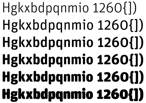
A German daily paper sets its headlines in FF Unit and uses the alternate cut for another level of hierarchy. It makes for a subtle distinction, and that’s obviously what they wanted.

Typographic half-knowledge
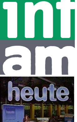
On the one hand I’m always flattered when I see a big German newspaper (Süddeutsche Zeitung in this case) use one of my typefaces. Especially so, when it happens to bring out one of its good characteristics, like being very legible in small sizes on rather coarse paper, as with FF Unit shown here.


On the other hand I am a little surprised that they would have used the alternate cut, the one with the round a and the single-decker g. That may have been deliberate although I don’t think that the round (Futura-)a is particularly legible. I do have my doubts about the designers’ typographic knowledge. When designing a table like this (and a TV programme is just a table) they must have realized that FF Unit both in the Type 1 and the Open Type version not only provides alternate characters but also a few different sets of figures. For a timetable like this it would have been much better to use Tabular Figures, so that all the hours and minutes would be positioned neatly underneath each other. That does not only look neater, it also makes things more comparable and better to understand in a hurry. The tabular figures in FF Unit still have slight Old Style characteristics, and if that would appear too noisy for some applications, there are Lining Figures as well, also all of equal widths.


Painted type
This painting shows a part of the Eastside Gallery in Berlin, a stretch of Berlin Wall along the river Spree. The only substantial part of the wall that’s been left standing because it is covered in pictures. Those get repainted now and again, as the painting by Edward B Gordon shows. In spite of his English-sounding name he is a German painter living in Berlin and has been putting out a painting a day for 900 days now. 
There are two reasons why I am showing this here:
1. Gordon’s paintings show the Berlin I know; not always romantic, not always bright, not always flattering, but always observed with affection and painted quickly, before the moment goes away. Great stuff, all Oil on Board, 15x15cm (i.e. 6×6 inches).
2. Although there are only three and a half letters to be seen, it seems enough to identify the typeface. Five steps away from the original – painted type on wall, painting of that scene, reproduction in the newspaper, scan on my desktop, reproduced on your desktop – I identified it as FF Typestar.
Except for that r. And the i. Seems like whoever painted these letters knew more about type than most graphic designers and certainly used the freedom of the brush to shorten that long hook on the r and the long top serif on the i. A clever solution to avoid a gap that would draw too much attention to this combination.
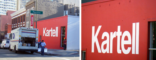
Helvetica can be nice
Every typeface needs its own layout that will make it look good and appropriate. An Italian producer of plastic furniture with a showroom in an old industrial building in San Francisco could do worse than displaying its name in large Helvetica letters. Rotis or Meta would have been totally wrong there.
News from SF
I haven’t been to San Francisco since January, and I have not published anything on this blog since then. There is just too much going on in Berlin: the office has more than 30 people now, we have a new house, thousands of books that need sorting, a lot of travel…
Here in SF there are only two people in the office and I can finally get down to some writing.
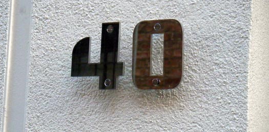
Around the corner from our little house here is the office for Dwell magazine that publishes under the motto “at home in the modern world”. And by the door I finally found an example for the stainless steel house numbers I designed for DWR last year. These are the “TECH” numbers without any diagonal lines. Design Within Reach has them discounted – apparently there is no market for “designer numbers” in the USA. Luckily, I have the rights to my designs and will be selling them myself very soon, also in Europe.
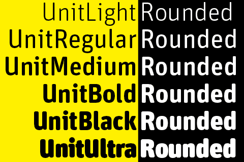
Unit Rounded
Round typefaces keep going in and out of fashion, for many reasons. One of them always has been the media the face would be used for: type on screens and back-lit signs suffers from radiant light. Sharp type will look blunt, and the amount of bluntness that occurs is usually unpredictable. Enter a font already blunt, i.e. rounded.
Way back in letterpress days, some of the most successful typefaces for everyday printing (then called jobbing) were faces like Reklameschrift Block with its wobbly outline and blunt corners. The letters looked hand-painted, spontaneous, or pre-destroyed. Even bad treatment on platen presses couldn’t make them look bad.
When I designed FF Info, the corners were made blunt to counteract light shatter on signs at the Düsseldorf airport, where this typeface was first used.
Otl Aicher designed a typeface for Germany’s second TV channel, the ZDF, in the early 70s, which was basically Univers with very round corners. TV then was very low-res.
Other typefaces used round corners – the “Frankfurter (as in sausages) look” – to convey friendliness and were often used for food packages.
Then came Web 2.0 and rounded typefaces made a major comeback. I think they are here to stay, both as a fashion statement and for physical reasons, like in the old days. There will always be bad media which needs indestructible fonts.
FF Unit Rounded started as an exclusive typeface we designed with Christian Schwartz’s help for Gravis, the biggest Apple dealer in Germany. They needed something friendly but precise, to be used on-screen, on signs, in print and on T-shirts.
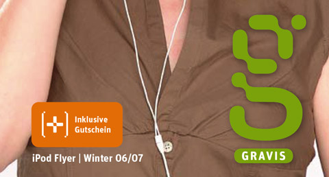
Gravis Round only has two weights, and when I wanted to make a complete family, I turned to Erik van Blokland, inventor of the Superpolator software. You can download one of the little movies here to see the Superpolator live in action. Well, almost.
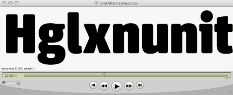
Above:
The Superpolator at work.
Each frame of the movie stands for one instance. The amount of radius on the terminal changes independently from the thickness of the strokes. The lighter strokes needed less of as flat bottom than the heavy ones. Without any flatness at all, you get the pure sausage effect.
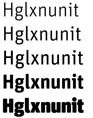
Erik ran several trials to establish the right amount of roundness for each weight. The lighter weights have almost no flat bottom, whereas the bold weights have straight bottoms on the main strokes, met by rounded corners. The radius had to be different for each weight, so Erik showed me alternatives as little movies with a slider to try out different versions. They all had a number to them so we could decide what worked best for which weight. The Superpolator also took care of a lot of the issues with internal curves and those problematic areas where curves meet straight lines or – even more complex! – diagonal ones.
Above:
EvB and his Superpolator provided many choices
and made decisions for the right weights and the amount of roundness quite easy.
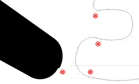
There remained quite a bit of manual intervention which was carried out by FSI’s able experts who end up with all the detailed stuff that us type designers are too lazy for. Just look at these screen grabs: the software wants to insert curve point at the extremes of each curve. In this case, however, that not only added unnecessary points, but also created weird artefacts. So all these point had to be removed by hand. And we are talking about 450 glyphs per weight.
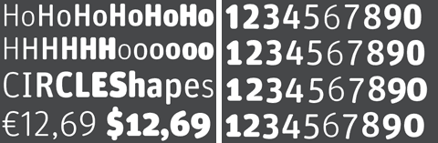
FF Unit Rounded is OpenType and has all the features
that come with that format, like four different types of figures.
FF Unit is serious enough to be rounded without becoming a sausage face or one only suited for comic strips. It looks friendly without losing its precision and changes its appearance quite dramatically as it grows in size. The Rounded version should be available at your local FontShop any day now.
Typographic detail, handmade
Applications like Indesign and fonts in Open Type format provide tools for making great stuff that older generations of typographically interested designers could have only dreamed about.
As we all know and can witness every day, these tools, however, are no guarantee for great design – not even for good craft. I find it even more gratifying and pleasant to behold when I see someone pulling all the stops to achieve typographic detail even when those tools are not all available.
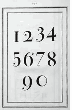
The van for this company that sells grilled chickens and other goodies on San Francisco’s Farmers’ Market has been carefully lettered, even though those letters may be a little worn by now. The designer had to use Frutiger for reasons I don’t know. But that didn’t prevent him or her from wanting to apply old style figures which are not available for that particular typeface. The simple solution for this problem is to simply move ordinary figures down below the baseline to achieve the effect. The 1 can just be cut off at the bottom as long as it doesn’t have a serif to lose. Figures 3, 4, 5, 7 and 9 look almost like the real thing when shifted down. The only problem is presented by the 2, as that should be redrawn to the size of the x-height and have no ascender.
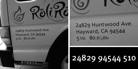
As seen in Bodoni’s Manuale Tipografico, the master took liberties when it came to designing his old style figures. He does draw a short 2, but doesn’t give descenders to 3, 4, 5 or 7.
Conventions are not necessarily rules, just habits.
Dublin Type 2
The art of writing or carving elaborate signs is all but dying out. Self-adhesive plots on vinyl have replaced painting signs with drop-shadows in fantasy typefaces that didn’t come from the FontBook or any other “proper” source.
It may only be a matter of time until these handmade signs will have disappeared from buildings in Dublin as well. These are a few that I found on a recent trip.
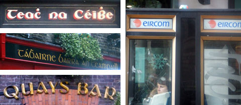
Uncial type has been the style of Irish writing since before Gutenberg. It doesn’t, however, look very convincing today when applied to everything in order to achieve that “Irish” look. (By the way: This version of Quay Sans looks weird indeed.) Perhaps time for a workshop on Irish typographic identity?