The art of writing or carving elaborate signs is all but dying out. Self-adhesive plots on vinyl have replaced painting signs with drop-shadows in fantasy typefaces that didn’t come from the FontBook or any other “proper” source.
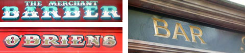
It may only be a matter of time until these handmade signs will have disappeared from buildings in Dublin as well. These are a few that I found on a recent trip.
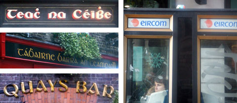
Uncial type has been the style of Irish writing since before Gutenberg. It doesn’t, however, look very convincing today when applied to everything in order to achieve that “Irish” look. (By the way: This version of Quay Sans looks weird indeed.) Perhaps time for a workshop on Irish typographic identity?
Time indeed Mr Spiekermann! Perhaps the next time you visit the University of Ulster in Belfast! On the subject of Irish type… I’d be interested to know what you think of the recent Guinness ‘brand tidy-up’ by JKR/Dalton Maag?
I’ll be in Belfast 8 February for the opening of the FFF15 exhibition, at the university.
Hello Mr Spiekermann, my name is Tom Foley and I am an MA Type & Language student at Central Saint Martins London. The subject of Irish Typographic Identity has become the focus of my studies, and I find your comment on the subject a bit of an inspiration.
My approach has been to analyses the political and social conditions that produced the uncial type’s historically associated with Irish Identity while making a contemporary typographic comment on the subject i.e designing contemporary fonts that take into account Ireland’s rich scribal and writing traditions while functioning as efficient usable types in the context of today’s Ireland.
Would you be willing to discuss the subject further?
Oh, and I’m Irish.