Graphic designers have been bending over backwards for years, pulling all the stops in order to turn a message into communication. We’ve spent hours finding the right typeface, fussed with tiny increments in size, introduced refinements in OpenType fonts containing hundreds of ligatures, alternate characters and content-sensitive positions.
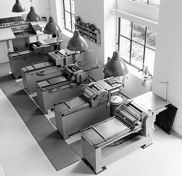
The workshop at Potsdamer Strasse 98a in Berlin
And now “letterpress” is back. Suddenly we’re happy to take a lowercase l and use it for a figure 1 because that particular typeface doesn’t have enough figures? WTF? Wood type sucks when it comes to kerning because you would have to cut away bits of the letter itself in order to achieve “perfect” spacing. There are no half sizes, let alone fine increments in letterspacing, unless you want to spend hours inserting slivers of brass or thin paper to refine a line of type. The material defines not only how you work but also what the result will look like. If you only have a large wood type font in one size, you run out of certain characters very quickly. So you’ll pick a smaller size which will have more of each character or you’ll choose another typeface altogether. If that doesn’t help, you’ll change the message.
The typographic system of letters and spaces – horizontal and vertical ones – has been refined since Gutenberg first invented printing with movable type almost 600 years ago. The whole system is one giant grid systems that can be divided and multiplied in myriad ways. Pages will always look good as long as you work within the constraints, time being one of them. If you spend too much time tweaking the system, things will look mannered and inappropriate. Modesty is a virtue when working with well-defined but finite elements and tools.
You need to know what quads are, spaces, reglet, furniture. You learn to use a composing stick, chases, cases, hacksaws, pincers, awls, spanners, screwdrivers and heavy lifting equipment. You’ll be working with dirty rags and virgin white paper, inks, grease, machine oil and petroleum. And you’ll find out that the work isn’t done until all those materials are back in their proper places and that cleaning up can take almost as long as setting up without being any fun. Everything you touch is either very heavy or very delicate. Or both.
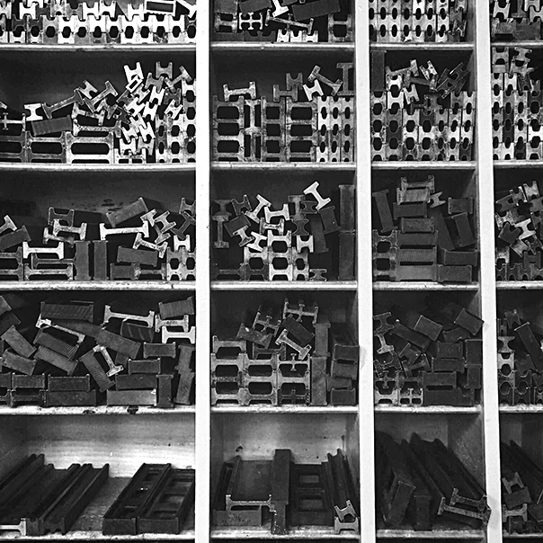 Furniture and reglet, the “invisible” parts of the page
You’ll never have the right size type, never enough characters and you’ll always run out of the right size paper just a few sheets from the final print. At the weekend. Mistakes will manifest themselves in loss of materials and too much time spent in the shop. But there is nothing like setting up a forme (yes, with a silent e at the end) from bits of lead, steel, aluminium, brass and wood – a very messy sight, as these materials have all been around and aged differently – and then running a clean white sheet of paper through the press and over that colourful forme. Suddenly and quite magically, there is a message: words on paper, exactly where you wanted them.
You know what it took to compose the words into the forme, with all those bits of metal in between. (No return key here and no tabs either; the white space isn’t.) The dear reader doesn’t know, nor needs to. But she senses that this message is the result of a physical process, made with things that have been touched by many hands. The process communicates itself. It doesn’t get in the way of the message, it enhances it.
Photos: Norman Posselt
Do you have any tips for anyone setting up a letterpress studio? – layout / workflow / what you did but would not do again etc
I am about to dig the foundations for the building and welcome any advice.
Many thanks.
Depending on where you are, buy a proof press quickly. Prices are going up all the time and have reached ridiculous sums in the US. I can still get a Korrex or FAG (like a Vandercook) for less than 3500 Euros in Germany, but in the US you’ll pay at least 12k for a pile of scrap.
Having your own wood type made may be cheaper than buying old stuff. All depends whether you want to do large size, hot metal type, wood type, polymer, small size, platen or cylinder press. Also depends on the studio. Big presses are a bitch to move and need solid floors.
If I could start again, I would keep my shop to one good press and very little but good type.
Too late. I have 10 or so proof presses, 500 cases of wood type and 450 cases of founders type. Crazy.
It is curious how prescient Mr Roger Levenson was in (‘Fine Print’) suggesting that the proofing press would become the future’s ‘handpress’ and while Vandercook Proofing Presses were designed to last at least 75 years with proper maintenance, the tendency I have observed is to ‘crank them’ and not pay any attention the mechanism.
With that said, it is true many printers are not interested in mechanics apart from letterspacing, the lift of a forme, or the intricacies of feeding whether by hand or automatic and these days in fastening down a photopolymer place or altering a planographic ink for relief printing. The craft and traditions of letterpress printing were often taught in schools or by means of manuals but the most of it was in revealed mysteries between members of the trade. For those who can read and learn this is not a hardship; for those who require the mysteries revealed in person, there is a problem.
At one time I felt some regret to see letterpress printing decline from its peaks but perhaps this is the way of all technology, especially one so intimately connected with thought and reliant on an industrial base (eg, tympan paper or strip spacing matter). In some senses, to speculate the ‘devolution’ would demand a hand mould, a hand press, in other words all the technology available in the early portion of the 16th century.
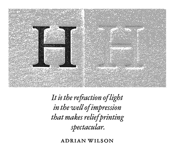
In the end good typography is just a good mind rather than the materiel. As Adrian Wilson said, it is a refraction of light in the well of impression that makes relief printing spectacular. But if the typographic mind is dull and decorative than one can understand why Jan Tschichold is more honoured than followed, apart from his influence on Penguin Press and thereafter. Technology is just the tool for the act, then, so I do not mind the decline nor privilege letterpress slavishly.
On the other hand, perhaps the codex as invented by the Patristic fathers in 300 CE may survive both the demise of letterpress and the rise of digital output. What interests me is that typography persists in spite of technological change, not that letterpress printing is chic or endangered. In any case, a pleasant website and many thanks for the vantage.
Best Regards,
Lee Engdahl.
I’ve used that Adrian Wilson quote many times, but people without a letterpress background do not get it.
Dear Erik, I don’t have too many experience in Type design but I always enjoy reading your tweets, and watching how you work, and is great to learn from a great living Master of design. God Bless You. Im Trying to do design with basic tools but is going great, and Im trying to stay positive.
Dear Orlando, you have such a beatiful name, it sounds exactly as like the names of great designers. Therefore I hope, that you become a big designer someday. I hope that I will hear from you in the media.
http://shop.gestalten.com/hallo-erik.html
It would be a tragedy to see your workshop shut down, what sort of contribution do you seek?
best would be a company who understands the importance of analog work and the usefulness of letterpress work in education young digital designers. The workshop costs about 150k Euro p.a. which i’ve been paying, while not paying myself. My money is gone.
You’re looking for a lump-sum corporate savior? Why not a gofundme where fans could contribute smaller amounts. I was happy to donate to SF’s Letterform Archive when they were going to their new space—I bet you’d find a wide swath of design/type/letterpress fans that might pool smaller amounts to at least slow the burn until a white knight steps up.
Thanks, David. I can last a little longer and rather concentrate my efforts on finding the White Knight than on all th trouble it takes ti gofundme or Kickstarter. Looking good already, I just wanted to start the conversation, and this certainly did.